Avatar
Display user profile images with customizable fallback content
Usage
import { Avatar } from '@hareui/vue'

<script setup lang="ts">import { Avatar } from '@hareui/vue'</script><template> <div class="flex items-center gap-4"> <Avatar alt="John Doe" fallback="JD" src="https://img.heroui.chat/image/avatar?w=400&h=400&u=3" /> <Avatar alt="Blue" fallback="B" src="https://heroui-assets.nyc3.cdn.digitaloceanspaces.com/avatars/blue.jpg" /> <Avatar fallback="JR" /> </div></template>Anatomy
HeroUI's Avatar.Image and Avatar.Fallback parts become props and slots on a single component, built on Reka UI's AvatarRoot / AvatarImage / AvatarFallback. The fallback shows until the image loads, or if it fails.
<Avatar src="…" alt="…" fallback="JD">
  <template #image /> <!-- optional: custom image component (Avatar.Image asChild) -->
  <template #fallback /> <!-- optional: replaces the fallback text (Avatar.Fallback children) -->
</Avatar>
ui keys: base, image, fallback.
Examples
Sizes


<script setup lang="ts">import { Avatar } from '@hareui/vue'</script><template> <div class="flex items-center gap-4"> <Avatar alt="Small Avatar" fallback="SM" size="sm" src="https://heroui-assets.nyc3.cdn.digitaloceanspaces.com/avatars/blue.jpg" /> <Avatar alt="Medium Avatar" fallback="MD" size="md" src="https://heroui-assets.nyc3.cdn.digitaloceanspaces.com/avatars/purple.jpg" /> <Avatar alt="Large Avatar" fallback="LG" size="lg" src="https://heroui-assets.nyc3.cdn.digitaloceanspaces.com/avatars/red.jpg" /> </div></template>Colors
<script setup lang="ts">import { Avatar } from '@hareui/vue'</script><template> <div class="flex items-center gap-4"> <Avatar color="default" fallback="DF" /> <Avatar color="accent" fallback="AC" /> <Avatar color="success" fallback="SC" /> <Avatar color="warning" fallback="WR" /> <Avatar color="danger" fallback="DG" /> </div></template>Variants
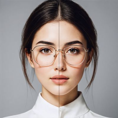


<script setup lang="ts">import { Avatar, Separator } from '@hareui/vue'import { Icon } from '@iconify/vue'const colors = ['accent', 'default', 'success', 'warning', 'danger'] as constconst rows = [ { label: 'letter', content: 'AG', icon: false, variant: 'default' as const }, { label: 'letter soft', content: 'AG', icon: false, variant: 'soft' as const }, { label: 'icon', content: '', icon: true, variant: 'default' as const }, { label: 'icon soft', content: '', icon: true, variant: 'soft' as const },]const images = [ 'https://img.heroui.chat/image/avatar?w=400&h=400&u=3', 'https://img.heroui.chat/image/avatar?w=400&h=400&u=4', 'https://img.heroui.chat/image/avatar?w=400&h=400&u=5', 'https://img.heroui.chat/image/avatar?w=400&h=400&u=8', 'https://img.heroui.chat/image/avatar?w=400&h=400&u=16',]</script><template> <div class="flex flex-col gap-4"> <div class="flex items-center gap-3"> <div class="w-24 shrink-0" /> <div v-for="color in colors" :key="color" class="flex w-20 shrink-0 items-center justify-center"> <span class="text-xs text-muted capitalize">{{ color }}</span> </div> </div> <Separator /> <div v-for="row in rows" :key="row.label" class="flex items-center gap-3"> <div class="w-24 shrink-0 text-sm text-muted">{{ row.label }}</div> <div v-for="color in colors" :key="color" class="flex w-20 shrink-0 items-center justify-center"> <Avatar :color="color" :variant="row.variant"> <template #fallback> <Icon v-if="row.icon" height="16" icon="gravity-ui:person" width="16" /> <template v-else>{{ row.content }}</template> </template> </Avatar> </div> </div> <div class="flex items-center gap-3"> <div class="w-24 shrink-0 text-sm text-muted">img</div> <div v-for="(image, colorIndex) in images" :key="image" class="flex w-20 shrink-0 items-center justify-center"> <Avatar :alt="`Avatar ${colors[colorIndex]}`" :color="colors[colorIndex]" :fallback="colors[colorIndex].charAt(0).toUpperCase()" :src="image" /> </div> </div> </div></template>Fallback Content

<script setup lang="ts">import { Avatar } from '@hareui/vue'import { Icon } from '@iconify/vue'</script><template> <div class="flex items-center gap-4"> <!-- Text fallback --> <Avatar fallback="JD" /> <!-- Icon fallback --> <Avatar> <template #fallback><Icon height="16" icon="gravity-ui:person" width="16" /></template> </Avatar> <!-- Fallback with delay --> <Avatar :delay-ms="600" fallback="NA" src="https://invalid-url-to-show-fallback.com/image.jpg" /> <!-- Custom styled fallback --> <Avatar fallback="GB" :ui="{ fallback: 'border-none bg-linear-to-br from-pink-500 to-purple-500 text-white' }" /> </div></template>Customization
Custom Image Component
Use the #image slot to compose with a custom image component, such as Nuxt's <NuxtImg> (the equivalent of asChild on Avatar.Image). Pass src on Avatar so it can track the loading state and show the fallback until the image is ready; the slotted element receives src, the image classes and the loading-state visibility.
<script setup lang="ts">import { Avatar } from '@hareui/vue'const SRC = 'https://heroui-assets.nyc3.cdn.digitaloceanspaces.com/avatars/blue.jpg'</script><template> <Avatar fallback="JD" :src="SRC"> <template #image> <!-- Any image component works here, e.g. <NuxtImg> or <UnpicImage> --> <img alt="John Doe" height="40" :src="SRC" width="40" /> </template> </Avatar></template>Tailwind CSS
Use the class prop for the root and :ui="{ fallback: '…' }" for the fallback:
<script setup lang="ts">import { Avatar } from '@hareui/vue'</script><template> <Avatar alt="John Doe" class="rounded-lg" fallback="JD" src="https://img.heroui.chat/image/avatar?w=400&h=400&u=3" :ui="{ fallback: 'rounded-lg' }" /></template>Global theme override
Override the avatar theme app-wide with createHareUI:
app.use(createHareUI({
  ui: {
    avatar: {
      slots: {
        base: 'size-16 border-2 border-accent',
        fallback: 'bg-linear-to-br from-purple-500 to-pink-500',
      },
    },
  },
}))
Styling Reference
ui key | data-slot | Description |
|---|---|---|
base | — | Base container with default size (size-10), Reka AvatarRoot |
image | — | Image element with aspect-square sizing, rendered when src is set |
fallback | avatar-fallback | Fallback container with centered content (text or #fallback slot) |
HeroUI's modifier classes correspond to props (HareUI renders utilities, not BEM classes, so style through class, ui or createHareUI): .avatar--sm / --md / --lg → size, .avatar--soft → variant="soft", .avatar__fallback--{color} → color. color only affects the fallback (it has no effect once an image has loaded).
API Reference
Props
| Prop | Type | Default | Description |
|---|---|---|---|
src | string | - | Image source. The fallback shows until it loads, or if it fails. |
alt | string | - | Alternative text of the image. |
srcset | string | - | The image srcset attribute for responsive images. |
sizes | string | - | The image sizes attribute for responsive images. |
loading | "eager" | "lazy" | - | Native lazy loading attribute of the image. |
crossOrigin | "" | "anonymous" | "use-credentials" | - | CORS setting for the image request. |
referrerPolicy | HTMLAttributeReferrerPolicy | - | Referrer policy for the image request. |
fallback | string | - | Fallback text (usually initials) shown when there is no image. |
delayMs | number | - | Delay in milliseconds before the fallback renders, to avoid flashing it while the image loads. |
color | "default" | "accent" | "success" | "warning" | "danger" | 'default' | Color of the fallback. |
size | "md" | "sm" | "lg" | 'md' | Size of the avatar. |
variant | "default" | "soft" | 'default' | Visual style of the avatar. |
ui | ComponentSlots<{ slots: { base: string; image: string; fallback: string; }; variants: { color: { accent: { fallback: string; }; danger: { fallback: string; }; default: { fallback: string; }; success: { fallback: string; }; warning: { fallback: string; }; }; size: { sm: { base: string; fallback: string; }; md: { base: string; }; lg: { base: string; fallback: string; }; }; variant: { default: {}; soft: { base: string; }; }; }; compoundVariants: { variant: string; color: string; class: { fallback: string; }; }[]; defaultVariants: { color: string; size: string; variant: string; }; }> | - | Per-slot class overrides. |
Slots
| Slot | Props | Description |
|---|---|---|
image | any | Custom image component (e.g. <NuxtImg>). Rendered in place of the <img>, receiving
src, the image classes and the loading-state visibility. Requires src. |
fallback | any | Fallback content (e.g. an icon). Defaults to the fallback text. |
Emits
| Event | Payload | Description |
|---|---|---|
loadingStatusChange | [value: "loading" | "error" | "idle" | "loaded"] | - |