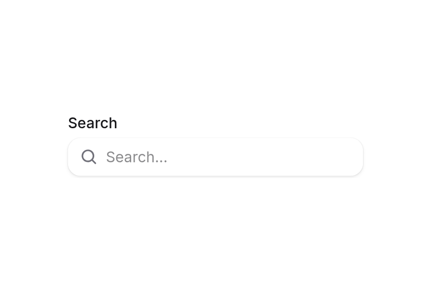
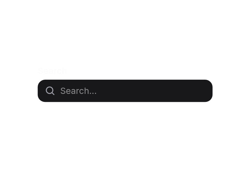
InputGroup
Group related input controls with prefix and suffix elements for enhanced form fields
Usage
<script setup lang="ts">
import { InputGroup } from '@hareui/vue'
</script><script setup lang="ts">import { Icon } from '@iconify/vue'import { InputGroup, TextField } from '@hareui/vue'</script><template> <TextField class="w-full max-w-[280px]" name="email" label="Email address"> <InputGroup :ui="{ input: 'w-full max-w-[280px]' }" placeholder="[email protected]"> <template #prefix> <Icon icon="gravity-ui:envelope" class="size-4 text-muted" /> </template> </InputGroup> </TextField></template>Anatomy
InputGroup wraps an input with optional prefix and suffix elements in one visually cohesive group. It's typically placed in the default slot of a TextField, replacing the field's own input, to add icons, text, buttons or other elements before or after the input. Set textarea for multiline input.
<template>
  <TextField label="…">
    <InputGroup prefix="…" suffix="…">
      <template #prefix />  <!-- content before the input; replaces `prefix` -->
      <template #suffix />  <!-- content after the input; replaces `suffix` -->
    </InputGroup>
  </TextField>
</template>
ui key | data-slot | Element |
|---|---|---|
base | input-group | <div role="group"> root |
prefix | input-group-prefix | <div> (iff prefix / #prefix) |
input | input-group-input | <input> |
input | input-group-textarea | <textarea> (instead of the input, iff textarea) |
suffix | input-group-suffix | <div> (iff suffix / #suffix) |
Inside a TextField, the group takes the field's id, name, type, value, variant, fullWidth and its disabled, invalid, required and read-only states. Its own props win when set. Clicking anywhere in the group outside the input focuses the input.
Examples
Variants
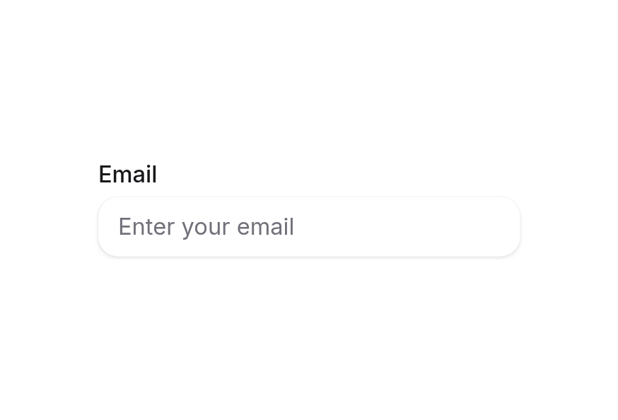
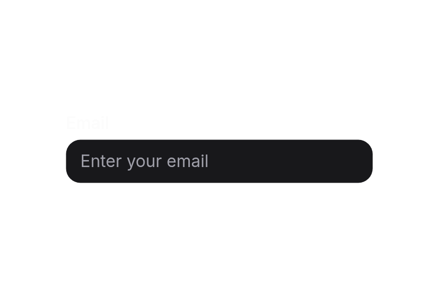
The InputGroup component supports two visual variants:
primary(default) - Standard styling with shadow, suitable for most use casessecondary- Lower emphasis variant without shadow, suitable for use in surfaces
<script setup lang="ts">import { Icon } from '@iconify/vue'import { InputGroup, TextField } from '@hareui/vue'</script><template> <div class="flex flex-col gap-4"> <TextField class="w-[280px]" name="primary" label="Primary variant"> <InputGroup variant="primary" placeholder="[email protected]"> <template #prefix> <Icon icon="gravity-ui:envelope" class="size-4 text-muted" /> </template> </InputGroup> </TextField> <TextField class="w-[280px]" name="secondary" label="Secondary variant"> <InputGroup variant="secondary" placeholder="[email protected]"> <template #prefix> <Icon icon="gravity-ui:envelope" class="size-4 text-muted" /> </template> </InputGroup> </TextField> </div></template>In Surface
When used inside a Surface component, use variant="secondary" to apply the lower emphasis variant suitable for surface backgrounds.
<script setup lang="ts">import { Icon } from '@iconify/vue'import { InputGroup, Surface, TextField } from '@hareui/vue'</script><template> <Surface class="rounded-2xl p-6"> <TextField class="w-full max-w-[280px]" name="email" label="Email address" description="We'll never share this with anyone else"> <InputGroup variant="secondary" :ui="{ input: 'w-full max-w-[280px]' }" placeholder="[email protected]"> <template #prefix> <Icon icon="gravity-ui:envelope" class="size-4 text-muted" /> </template> </InputGroup> </TextField> </Surface></template>Loading State
Show a loading spinner in the suffix to indicate processing.
<script setup lang="ts">import { InputGroup, Spinner, TextField } from '@hareui/vue'</script><template> <TextField class="w-full max-w-[280px]" default-value="Sending..." name="status"> <InputGroup :ui="{ input: 'w-full max-w-[280px]' }"> <template #suffix> <Spinner class="size-4" /> </template> </InputGroup> </TextField></template>Required Field
InputGroup respects the required state from its parent TextField.
<script setup lang="ts">import { Icon } from '@iconify/vue'import { InputGroup, TextField } from '@hareui/vue'</script><template> <div class="flex flex-col gap-4"> <TextField required class="w-full max-w-[280px]" name="email" label="Email address"> <InputGroup :ui="{ input: 'w-full max-w-[280px]' }" placeholder="[email protected]"> <template #prefix> <Icon icon="gravity-ui:envelope" class="size-4 text-muted" /> </template> </InputGroup> </TextField> <TextField required class="w-full max-w-[280px]" name="price" label="Set a price" description="What customers would pay"> <InputGroup :ui="{ input: 'w-full max-w-[200px]' }" placeholder="0" type="number" prefix="$" suffix="USD" /> </TextField> </div></template>Disabled State
InputGroup respects the disabled state from its parent TextField.
<script setup lang="ts">import { Icon } from '@iconify/vue'import { InputGroup, TextField } from '@hareui/vue'</script><template> <div class="flex flex-col gap-4"> <TextField disabled class="w-full max-w-[280px]" default-value="[email protected]" name="email" label="Email address"> <InputGroup :ui="{ input: 'w-full max-w-[280px]' }"> <template #prefix> <Icon icon="gravity-ui:envelope" class="size-4 text-muted" /> </template> </InputGroup> </TextField> <TextField disabled class="w-full max-w-[280px]" default-value="10" name="price" label="Set a price"> <InputGroup :ui="{ input: 'w-full max-w-[200px]' }" type="number" prefix="$" suffix="USD" /> </TextField> </div></template>Full Width
<script setup lang="ts">import { Icon } from '@iconify/vue'import { InputGroup, TextField } from '@hareui/vue'</script><template> <div class="w-[400px] space-y-4"> <TextField full-width name="email" label="Email address"> <InputGroup full-width placeholder="[email protected]"> <template #prefix> <Icon icon="gravity-ui:envelope" class="size-4 text-muted" /> </template> </InputGroup> </TextField> <TextField full-width name="password" label="Password"> <InputGroup full-width placeholder="Enter password" type="password"> <template #suffix> <Icon icon="gravity-ui:eye" class="size-4 text-muted" /> </template> </InputGroup> </TextField> </div></template>Text Prefix
Use text as a prefix, such as currency symbols or protocol prefixes.
<script setup lang="ts">import { InputGroup, TextField } from '@hareui/vue'</script><template> <TextField class="w-full max-w-[280px]" default-value="heroui.com" name="website" label="Website"> <InputGroup :ui="{ input: 'w-full max-w-[280px]' }" prefix="https://" /> </TextField></template>Text Suffix
Use text as a suffix, such as domain extensions or units.
<script setup lang="ts">import { InputGroup, TextField } from '@hareui/vue'</script><template> <TextField class="w-full max-w-[280px]" default-value="heroui" name="website" label="Website"> <InputGroup :ui="{ input: 'w-full max-w-[280px]' }" suffix=".com" /> </TextField></template>Icon Prefix and Text Suffix
Combine an icon prefix with a text suffix.
<script setup lang="ts">import { Icon } from '@iconify/vue'import { InputGroup, TextField } from '@hareui/vue'</script><template> <TextField class="w-full max-w-[280px]" default-value="heroui" name="website" label="Website"> <InputGroup :ui="{ input: 'w-full max-w-[280px]' }" suffix=".com"> <template #prefix> <Icon icon="gravity-ui:globe" class="size-4 text-muted" /> </template> </InputGroup> </TextField></template>Copy Button Suffix
Add an interactive button in the suffix, such as a copy button. :ui="{ suffix: 'pe-0' }" lets the button sit flush with the edge.
<script setup lang="ts">import { Icon } from '@iconify/vue'import { Button, InputGroup, TextField } from '@hareui/vue'</script><template> <TextField class="w-full max-w-[280px]" default-value="heroui.com" name="website" label="Website"> <InputGroup :ui="{ input: 'w-full max-w-[280px]', suffix: 'pe-0' }"> <template #suffix> <Button icon-only aria-label="Copy" size="sm" variant="ghost"> <Icon icon="gravity-ui:copy" class="size-4" /> </Button> </template> </InputGroup> </TextField></template>Icon Prefix and Copy Button
Combine an icon prefix with an interactive button suffix.
<script setup lang="ts">import { Icon } from '@iconify/vue'import { Button, InputGroup, TextField } from '@hareui/vue'</script><template> <TextField class="w-full max-w-[280px]" default-value="heroui.com" name="website" label="Website"> <InputGroup :ui="{ input: 'w-full max-w-[280px]', suffix: 'pe-0' }"> <template #prefix> <Icon icon="gravity-ui:globe" class="size-4 text-muted" /> </template> <template #suffix> <Button icon-only aria-label="Copy" size="sm" variant="ghost"> <Icon icon="gravity-ui:copy" class="size-4" /> </Button> </template> </InputGroup> </TextField></template>Password Toggle
Use a button in the suffix to toggle password visibility.
<script setup lang="ts">import { Icon } from '@iconify/vue'import { Button, InputGroup, TextField } from '@hareui/vue'import { ref } from 'vue'const isVisible = ref(false)</script><template> <TextField class="w-full max-w-[280px]" name="password" label="Password"> <InputGroup :ui="{ input: 'w-full max-w-[280px]', suffix: 'pe-0' }" :type="isVisible ? 'text' : 'password'" :model-value="isVisible ? '87$2h.3diua' : '••••••••'" > <template #suffix> <Button icon-only :aria-label="isVisible ? 'Hide password' : 'Show password'" size="sm" variant="ghost" @click="isVisible = !isVisible" > <Icon :icon="isVisible ? 'gravity-ui:eye' : 'gravity-ui:eye-slash'" class="size-4" /> </Button> </template> </InputGroup> </TextField></template>Keyboard Shortcut
Display keyboard shortcuts using the Kbd component.
<script setup lang="ts">import { InputGroup, Kbd, TextField } from '@hareui/vue'</script><template> <TextField aria-label="Command" class="w-full max-w-[280px]" name="command"> <InputGroup :ui="{ input: 'w-full max-w-[280px]', suffix: 'pe-2' }" placeholder="Command"> <template #suffix> <Kbd keys="command"> K </Kbd> </template> </InputGroup> </TextField></template>Badge Suffix
Add a badge or chip in the suffix to show status or labels.
<script setup lang="ts">import { Chip, InputGroup, TextField } from '@hareui/vue'</script><template> <TextField aria-label="Email address" class="w-full max-w-[280px]" name="email"> <InputGroup :ui="{ input: 'w-full max-w-[280px]', suffix: 'pe-2' }" placeholder="Email address"> <template #suffix> <Chip color="accent" size="md" variant="soft"> Pro </Chip> </template> </InputGroup> </TextField></template>Validation
InputGroup automatically reflects invalid state from its parent TextField.
<script setup lang="ts">import { Icon } from '@iconify/vue'import { InputGroup, TextField } from '@hareui/vue'</script><template> <div class="flex flex-col gap-4"> <TextField invalid required class="w-full max-w-[280px]" name="email" label="Email address" error-message="Please enter a valid email address"> <InputGroup :ui="{ input: 'w-full max-w-[280px]' }" placeholder="[email protected]"> <template #prefix> <Icon icon="gravity-ui:envelope" class="size-4 text-muted" /> </template> </InputGroup> </TextField> <TextField invalid required class="w-full max-w-[280px]" name="price" label="Set a price" error-message="Price must be greater than 0"> <InputGroup :ui="{ input: 'w-full max-w-[200px]' }" placeholder="0" type="number" prefix="$" suffix="USD" /> </TextField> </div></template>With Prefix Icon
Add an icon before the input field.
<script setup lang="ts">import { Icon } from '@iconify/vue'import { InputGroup, TextField } from '@hareui/vue'</script><template> <TextField class="w-full max-w-[280px]" name="email" label="Email address" description="We'll never share this with anyone else"> <InputGroup :ui="{ input: 'w-full max-w-[280px]' }" placeholder="[email protected]"> <template #prefix> <Icon icon="gravity-ui:envelope" class="size-4 text-muted" /> </template> </InputGroup> </TextField></template>With Suffix Icon
Add an icon after the input field.
<script setup lang="ts">import { Icon } from '@iconify/vue'import { InputGroup, TextField } from '@hareui/vue'</script><template> <TextField class="w-full max-w-[280px]" name="email" label="Email address" description="We don't send spam"> <InputGroup :ui="{ input: 'w-full max-w-[280px]' }" placeholder="[email protected]"> <template #suffix> <Icon icon="gravity-ui:envelope" class="size-4 text-muted" /> </template> </InputGroup> </TextField></template>With Prefix and Suffix
Combine both prefix and suffix elements.
<script setup lang="ts">import { InputGroup, TextField } from '@hareui/vue'</script><template> <TextField class="w-full max-w-[280px]" default-value="10" name="price" label="Set a price" description="What customers would pay"> <InputGroup :ui="{ input: 'w-full max-w-[200px]' }" type="number" prefix="$" suffix="USD" /> </TextField></template>With TextArea
Set textarea (with rows) for multiline text input with prefix and suffix elements. When a textarea is present, the container adjusts its height to the content and aligns the prefix and suffix to the top.
<script setup lang="ts">import { Icon } from '@iconify/vue'import { Button, InputGroup, Kbd, TextField, Tooltip } from '@hareui/vue'import { ref } from 'vue'const value = ref('')const isSubmitting = ref(false)function handleSubmit() { if (!value.value.trim()) return isSubmitting.value = true setTimeout(() => { isSubmitting.value = false value.value = '' }, 1000)}</script><template> <TextField v-model="value" full-width aria-label="Prompt input" class="flex w-sm flex-col sm:w-lg" name="prompt" > <InputGroup textarea full-width :rows="5" class="flex flex-col gap-2 rounded-3xl py-2" placeholder="Assign tasks or ask anything..." :ui="{ prefix: 'px-3 py-0', input: 'w-full resize-none px-3.5 py-0', suffix: 'flex w-full items-center gap-1.5 px-3 py-0', }" > <template #prefix> <Button aria-label="Add context" size="sm" variant="outline"> <Icon icon="gravity-ui:at" /> Add Context </Button> </template> <template #suffix> <Tooltip :delay="0"> <Button icon-only aria-label="Attach file" size="sm" variant="tertiary"> <Icon icon="gravity-ui:plus" /> </Button> <template #content> <p class="text-xs"> Add a files and more </p> </template> </Tooltip> <Tooltip :delay="0"> <Button icon-only aria-label="Connect Apps" size="sm" variant="tertiary"> <Icon icon="gravity-ui:plug-connection" /> </Button> <template #content> <p class="text-xs"> Connect apps </p> </template> </Tooltip> <div class="ms-auto flex items-center gap-1.5"> <Tooltip :delay="0"> <Button icon-only aria-label="Voice input" size="sm" variant="ghost"> <Icon icon="gravity-ui:microphone" /> </Button> <template #content> <p class="text-xs"> Voice input </p> </template> </Tooltip> <Tooltip :delay="0" class="flex items-center gap-1"> <Button icon-only aria-label="Send prompt" :disabled="!value.trim()" :pending="isSubmitting" @click="handleSubmit" > <template #default="{ pending }"> <Icon v-if="!pending" icon="gravity-ui:arrow-up" /> </template> </Button> <template #content> <p class="text-xs"> Send </p> <Kbd keys="enter" class="h-4 rounded-sm px-1" /> </template> </Tooltip> </div> </template> </InputGroup> </TextField></template>TextArea Usage Example
<script setup lang="ts">
import { Icon } from '@iconify/vue'
import { InputGroup, TextField } from '@hareui/vue'
import { ref } from 'vue'

const feedback = ref('')
</script>

<template>
  <TextField
    v-model="feedback"
    full-width
    name="feedback"
    label="Your Feedback"
    :invalid="feedback.length > 500"
    error-message="Feedback must be less than 500 characters"
  >
    <InputGroup
      textarea
      full-width
      :rows="5"
      :ui="{ input: 'resize-none' }"
      placeholder="Share your thoughts, suggestions, or issues..."
    >
      <template #prefix>
        <Icon icon="gravity-ui:envelope" class="size-4 text-muted" />
      </template>
    </InputGroup>
    <template #description>
      <span class="flex w-full items-center justify-between px-1">
        <span>Maximum 500 characters.</span>
        <span class="ml-auto">{{ feedback.length }}/500</span>
      </span>
    </template>
  </TextField>
</template>
Customization
Tailwind CSS
<script setup lang="ts">import { Icon } from '@iconify/vue'import { InputGroup, TextField } from '@hareui/vue'</script><template> <TextField class="w-full max-w-xs" name="email" label="Work email"> <InputGroup class="rounded-xl border border-border/80 bg-default shadow-sm" placeholder="[email protected]"> <template #prefix> <Icon icon="gravity-ui:envelope" class="size-4 text-muted" /> </template> </InputGroup> </TextField></template>Global Configuration
app.use(createHareUI({
  ui: { inputGroup: { slots: { prefix: 'px-2', suffix: 'px-2' } } },
}))
Styling Reference
Slots
base→[data-slot="input-group"]– root container with border, background and flex layout. Usesmin-h-9anditems-center, switching toitems-startwith auto height when a textarea is present.input→[data-slot="input-group-input"]/[data-slot="input-group-textarea"]– the input (or textarea) with a transparent background and no border. The textarea adds a minimum height and vertical resize.prefix→[data-slot="input-group-prefix"]– prefix container with the start-side radius. Aligns to the top with a textarea.suffix→[data-slot="input-group-suffix"]– suffix container with the end-side radius. Aligns to the top with a textarea.
Variants
variant: 'primary'– with shadow (default)variant: 'secondary'– without shadow,bg-default, for use in surfacesfullWidth: true–w-full
Interactive States
- Hover:
:hoverwhile the input isn't focused - Focus:
:has([data-slot="input-group-input"]:focus)– focus ring follows the input or textarea only, not a prefix/suffix button - Invalid:
[data-invalid="true"]– from theinvalidprop or the parent TextField - Disabled:
[data-disabled="true"]or[aria-disabled="true"]– from thedisabledprop or the parent TextField
API Reference
Props
| Prop | Type | Default | Description |
|---|---|---|---|
type | string | undefined | The native input type. |
id | string | - | The id of the input. Defaults to the id provided by a surrounding TextField. |
name | string | - | The name of the input, used when submitting a form. |
placeholder | string | - | Temporary text shown when the input is empty. |
defaultValue | string | number | - | The initial value when uncontrolled (no v-model). |
variant | "primary" | "secondary" | 'primary' | Visual variant of the group. Defaults to the surrounding TextField variant. |
fullWidth | boolean | undefined | Whether the input group takes the full width of its container. |
disabled | boolean | undefined | Whether the input is disabled. |
invalid | boolean | undefined | Whether the input is invalid. |
required | boolean | undefined | Whether the input is required. |
readonly | boolean | undefined | Whether the input can be selected but not changed. Defaults to the surrounding TextField. |
validate | ValidateFn<string | number> | - | Validates the value when used without a TextField (inside one, set validate on the TextField). |
validationBehavior | ValidationBehavior | 'native' | Validation behavior when used without a TextField. Defaults to the surrounding Form. |
prefix | string | - | Text content rendered before the input. Replaced by the #prefix slot. |
suffix | string | - | Text content rendered after the input. Replaced by the #suffix slot. |
textarea | boolean | false | Renders a multiline <textarea> (data-slot="input-group-textarea") instead of the input, like HeroUI's InputGroup.TextArea.
The group then grows with the content and aligns the prefix/suffix to the top. |
rows | number | - | Number of visible text lines when textarea is set. |
ui | ComponentSlots<{ slots: { base: string[]; input: string[]; prefix: string[]; suffix: string[]; }; variants: { variant: { primary: { base: string; }; secondary: { base: string[]; input: string; }; }; fullWidth: { false: { base: string; }; true: { base: string; }; }; }; defaultVariants: { fullWidth: boolean; variant: string; }; }> | - | Per-slot class overrides. |
modelValue | string | number | - | The input value. |
Slots
| Slot | Props | Description |
|---|---|---|
prefix | any | Content rendered before the input (icon, text or a button). Replaces the prefix prop. |
suffix | any | Content rendered after the input (icon, text or a button). Replaces the suffix prop. |
Emits
| Event | Payload | Description |
|---|---|---|
update:modelValue | [value: string | number | undefined] | - |