ColorPicker
A composable color picker that synchronizes color value between multiple color components
Usage
<script setup lang="ts">
import { ColorArea, ColorPicker, ColorSlider, ColorSwatch, Label } from '@hareui/vue'
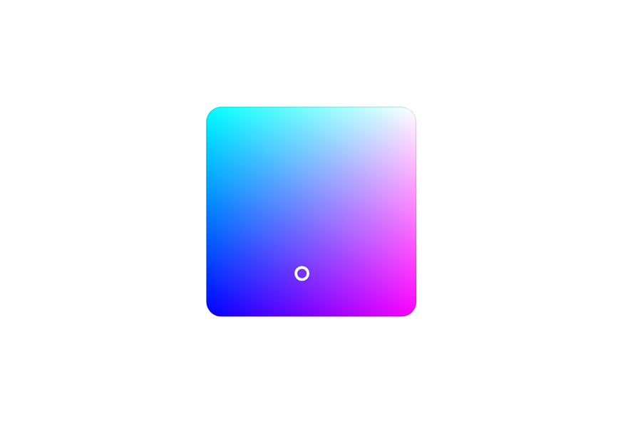
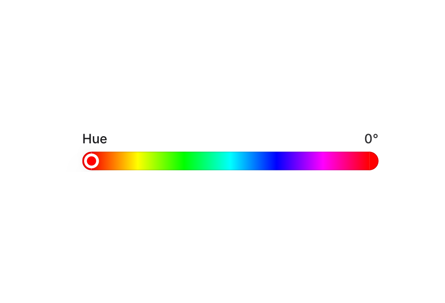
</script><script setup lang="ts">import { ColorArea, ColorPicker, ColorSlider, ColorSwatch, Label } from '@hareui/vue'</script><template> <ColorPicker default-value="#0485F7"> <template #trigger> <ColorSwatch size="lg" /> <Label>Pick a color</Label> </template> <ColorArea aria-label="Color area" class="max-w-full" color-space="hsb" x-channel="saturation" y-channel="brightness" /> <ColorSlider channel="hue" class="gap-1 px-1" color-space="hsb" label="Hue" :ui="{ output: 'text-muted' }" /> </ColorPicker></template>Anatomy
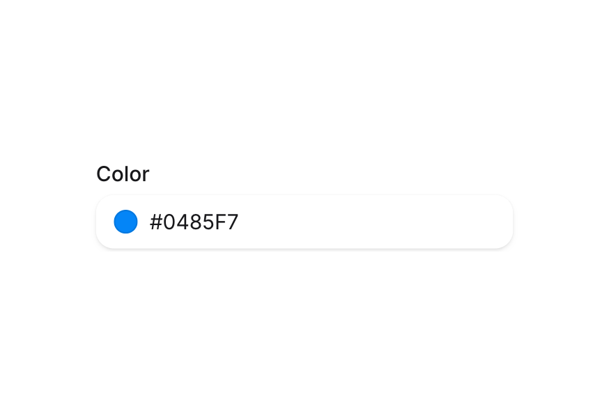
ColorPicker renders a trigger button and a popover. The trigger slot holds the button content, and the default slot holds the popover content. Color components placed in either slot without their own v-model read and write the picker's color.
<ColorPicker default-value="#0485F7">
  <template #trigger>
    <ColorSwatch />
    <Label>Pick a color</Label>
  </template>
  <ColorArea color-space="hsb" x-channel="saturation" y-channel="brightness" />
  <ColorSlider channel="hue" color-space="hsb" />
</ColorPicker>
Examples
Controlled
v-model accepts a hex string or a Color object and emits a Color. v-model:open controls the popover.
Selected: #325578
<script setup lang="ts">import type { ColorSwatchPickerItem } from '@hareui/vue'import { Button, ColorArea, ColorField, ColorPicker, ColorSlider, ColorSwatch, ColorSwatchPicker, Label, colorToString, parseColor } from '@hareui/vue'import { ref } from 'vue'const color = ref(parseColor('#325578'))const presets: ColorSwatchPickerItem[] = ['#ef4444', '#f97316', '#eab308', '#22c55e', '#06b6d4', '#3b82f6', '#8b5cf6', '#ec4899', '#f43f5e']function shuffleColor() { const h = Math.floor(Math.random() * 360) const s = 50 + Math.floor(Math.random() * 50) const l = 40 + Math.floor(Math.random() * 30) color.value = parseColor(`hsl(${h}, ${s}%, ${l}%)`)}</script><template> <div class="flex flex-col gap-4"> <ColorPicker v-model="color"> <template #trigger> <ColorSwatch size="lg" /> <Label>Pick a color</Label> </template> <ColorSwatchPicker :items="presets" class="justify-center pt-2" size="xs" /> <ColorArea aria-label="Color area" class="max-w-full" color-space="hsb" x-channel="saturation" y-channel="brightness" /> <div class="flex items-center gap-2 px-1"> <ColorSlider aria-label="Hue slider" channel="hue" class="flex-1" color-space="hsb" /> <Button icon-only aria-label="Shuffle color" size="sm" variant="tertiary" @click="shuffleColor"> <svg class="size-4" viewBox="0 0 16 16" fill="none" stroke="currentColor" stroke-width="1.5" aria-hidden="true"><path d="M2 4h2.5c3 0 4 8 7 8H14M2 12h2.5c1 0 1.8-1.4 2.5-2.6M14 4h-2.5c-1 0-1.8 1-2.5 2.2M12 2l2 2-2 2M12 10l2 2-2 2" /></svg> </Button> </div> <ColorField aria-label="Color field" variant="secondary"> <template #prefix> <ColorSwatch size="xs" /> </template> </ColorField> </ColorPicker> <p class="w-60 text-sm text-muted"> Selected: <span class="font-medium">{{ colorToString(color, 'hex') }}</span> </p> </div></template>With Swatches
<script setup lang="ts">import type { ColorSwatchPickerItem } from '@hareui/vue'import { ColorArea, ColorPicker, ColorSlider, ColorSwatch, ColorSwatchPicker, Label } from '@hareui/vue'const presets: ColorSwatchPickerItem[] = ['#ef4444', '#f97316', '#eab308', '#22c55e', '#06b6d4', '#3b82f6', '#8b5cf6', '#ec4899', '#f43f5e']</script><template> <ColorPicker default-value="#F43F5E"> <template #trigger> <ColorSwatch size="lg" /> <Label>Brand Color</Label> </template> <ColorArea aria-label="Color area" class="max-w-full" color-space="hsb" x-channel="saturation" y-channel="brightness" /> <ColorSlider aria-label="Hue slider" channel="hue" class="gap-1 px-1" color-space="hsb" label="Hue" :ui="{ output: 'text-muted' }" /> <ColorSwatchPicker :items="presets" class="justify-center px-1" size="xs" /> </ColorPicker></template>With Fields
Use ColorField to edit individual channels, with a Select to switch between color spaces.
<script setup lang="ts">import type { ListBoxItem } from '@hareui/vue'import type { ColorChannel, ColorSpace } from 'reka-ui'import { ColorArea, ColorField, ColorPicker, ColorSlider, ColorSwatch, Label, Select } from '@hareui/vue'import { ref } from 'vue'const colorSpace = ref<ColorSpace>('hsl')const channels: Record<ColorSpace, ColorChannel[]> = { hsb: ['hue', 'saturation', 'brightness'], hsl: ['hue', 'saturation', 'lightness'], rgb: ['red', 'green', 'blue'],}const spaces: ListBoxItem[] = Object.keys(channels).map(value => ({ value, label: value }))</script><template> <ColorPicker default-value="hsla(220, 90%, 50%, 0.8)" :ui="{ popover: 'max-w-62 gap-2' }"> <template #trigger> <ColorSwatch size="lg" /> <Label>Pick a color</Label> </template> <ColorArea class="max-w-full" color-space="hsb" x-channel="saturation" y-channel="brightness" /> <ColorSlider channel="hue" class="gap-1 px-1" color-space="hsb" label="Hue" :ui="{ output: 'text-muted' }" /> <Select v-model="colorSpace" aria-label="Color space" variant="secondary" class="uppercase" :items="spaces" /> <div class="grid w-full grid-cols-3 items-center gap-2"> <ColorField v-for="channel in channels[colorSpace]" :key="channel" :aria-label="channel" :channel="channel" :color-space="colorSpace" variant="secondary" /> </div> </ColorPicker></template>With Sliders
Use several ColorSlider components to adjust each channel.
<script setup lang="ts">import type { ListBoxItem } from '@hareui/vue'import type { ColorChannel, ColorSpace } from 'reka-ui'import { ColorPicker, ColorSlider, ColorSwatch, Label, Select } from '@hareui/vue'import { ref } from 'vue'const colorSpace = ref<ColorSpace>('hsl')const channels: Record<ColorSpace, ColorChannel[]> = { hsb: ['hue', 'saturation', 'brightness', 'alpha'], hsl: ['hue', 'saturation', 'lightness', 'alpha'], rgb: ['red', 'green', 'blue', 'alpha'],}const spaces: ListBoxItem[] = Object.keys(channels).map(value => ({ value, label: value }))const title = (s: string) => s[0].toUpperCase() + s.slice(1)</script><template> <ColorPicker default-value="hsl(219, 58%, 93%)" :ui="{ popover: 'max-w-62 gap-2 px-2 py-3' }"> <template #trigger> <ColorSwatch size="lg" /> <Label>Pick a color</Label> </template> <Select v-model="colorSpace" aria-label="Color space" variant="secondary" class="uppercase" :items="spaces" /> <div class="flex flex-col gap-2"> <ColorSlider v-for="channel in channels[colorSpace]" :key="channel" :aria-label="channel" :channel="channel" class="gap-1 px-1" :color-space="colorSpace" :label="title(channel)" :ui="{ output: 'text-muted' }" /> </div> </ColorPicker></template>Customization
Tailwind CSS
<script setup lang="ts">import { ColorArea, ColorPicker, ColorSlider, ColorSwatch, Label } from '@hareui/vue'</script><template> <ColorPicker default-value="#0485F7" :ui="{ trigger: 'rounded-xl bg-default-soft px-3 py-2', popover: 'bg-surface' }"> <template #trigger> <ColorSwatch size="lg" /> <Label class="font-medium text-foreground">Theme color</Label> </template> <ColorArea aria-label="Color area" class="max-w-full" color-space="hsb" x-channel="saturation" y-channel="brightness" /> <ColorSlider channel="hue" class="gap-1 px-1" color-space="hsb" label="Hue" :ui="{ output: 'text-muted' }" /> </ColorPicker></template>Global CSS
app.use(createHareUI({
  ui: {
    colorPicker: {
      slots: {
        trigger: 'gap-4 rounded-lg',
        popover: 'rounded-xl p-4',
      },
    },
  },
}))
Styling Reference
ui key | data-slot | Description |
|---|---|---|
base | color-picker | Wrapper (inline-flex) |
trigger | color-picker-trigger | Trigger button |
popover | color-picker-popover | Popover container (portalled to body) |
Interactive States
- Focus:
:focus-visibleordata-focus-visible="true" - Disabled:
:disabledordata-disabled="true"
API Reference
Props
| Prop | Type | Default | Description |
|---|---|---|---|
modelValue | string | Color | - | The current colour (controlled). Use with v-model. |
defaultValue | string | Color | - | The initial colour when uncontrolled. |
open | boolean | undefined | Whether the popover is open (controlled). Use with v-model:open. |
defaultOpen | boolean | - | Whether the popover is open initially when uncontrolled. |
side | "top" | "bottom" | "right" | "left" | "bottom" | Side of the trigger the popover opens on. |
align | "center" | "start" | "end" | "start" | Alignment of the popover against the trigger. HeroUI's default placement is bottom left, i.e. start in LTR. |
sideOffset | number | 8 | Distance in px between the trigger and the popover. |
portal | string | boolean | HTMLElement | true | Render the popover into body (or a given target) instead of in place. |
disabled | boolean | - | Whether the trigger is disabled. |
ui | ComponentSlots<{ slots: { base: string; trigger: string[]; popover: string[]; }; }> | - | Per-slot class overrides. |
Slots
| Slot | Props | Description |
|---|---|---|
trigger | { color: Color; open: boolean; } | Content of the trigger button, typically a ColorSwatch and a Label. Receives the current colour and open state. |
default | { color: Color; close: () => void; } | Popover content (ColorArea, ColorSlider, ColorField, ColorSwatchPicker, …). Colour components rendered here
follow the picker's colour unless they have their own v-model. |
Emits
| Event | Payload | Description |
|---|---|---|
update:modelValue | [value: Color] | - |
update:open | [value: boolean] | - |