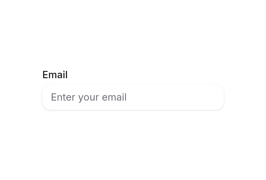
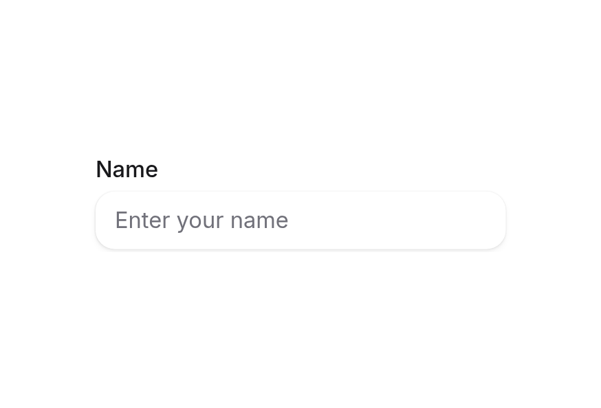
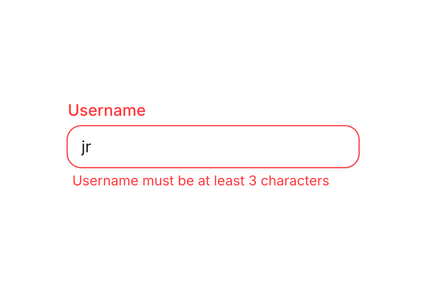
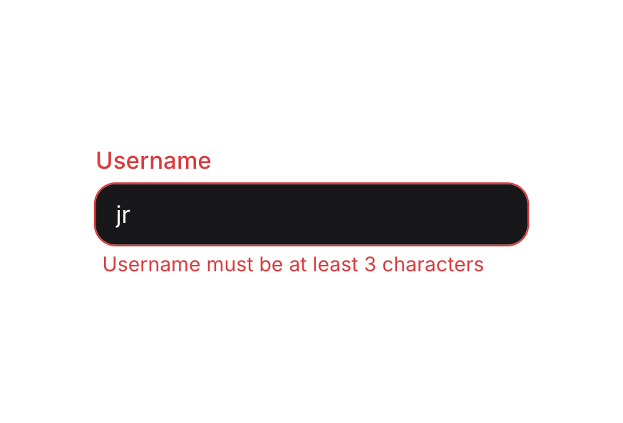
Description
Provides supplementary text for form fields and other components
Usage
<script setup lang="ts">
import { Description } from '@hareui/vue'
</script> We'll never share your email with anyone else.
<script setup lang="ts">import { Description, Input, Label } from '@hareui/vue'</script><template> <div class="flex flex-col gap-1"> <Label for="email">Email</Label> <Input id="email" aria-describedby="email-description" class="w-64" placeholder="[email protected]" type="email" /> <Description id="email-description"> We'll never share your email with anyone else. </Description> </div></template>Anatomy
ui key | data-slot | Element |
|---|---|---|
base | description | <span> |
Examples
With Form Fields
<div class="flex flex-col gap-1">
  <Label for="password">Password</Label>
  <Input id="password" type="password" aria-describedby="password-description" />
  <Description id="password-description">
    Must be at least 8 characters with one uppercase letter
  </Description>
</div>
Integration with TextField
<script setup lang="ts">
import { TextField } from '@hareui/vue'
</script>

<template>
  <TextField
    type="email"
    label="Email"
    placeholder="Enter your email"
    description="We'll never share your email"
  />
</template>
When using the TextField component, the description id and the input's aria-describedby are wired automatically.
Customization
Tailwind CSS
Lowercase letters and hyphens only. Used in app.heroui.com/acme
<script setup lang="ts">import { Description, Input, Label } from '@hareui/vue'</script><template> <div class="flex w-64 flex-col gap-1"> <Label for="workspace-slug">Workspace URL</Label> <Input id="workspace-slug" placeholder="acme" type="text" /> <Description id="workspace-slug-hint" class="leading-relaxed tracking-wide"> Lowercase letters and hyphens only. Used in app.heroui.com/acme </Description> </div></template>Global Configuration
app.use(createHareUI({
  ui: { description: { slots: { base: 'text-muted' } } },
}))
Styling Reference
Slots
base→[data-slot="description"]—text-xs text-muted, wraps long words
Inside a TextField with [data-invalid="true"], the description is hidden.
API Reference
Props
| Prop | Type | Default | Description |
|---|---|---|---|
id | string | - | The id of the element, referenced by aria-describedby of the described control. |
ui | ComponentSlots<{ slots: { base: string; }; }> | - | Per-slot class overrides. |
Slots
| Slot | Props | Description |
|---|---|---|
default | any | The description content. |
Accessibility
The Description component enhances accessibility by:
- Using semantic HTML that screen readers can identify
- Exposing an
idto reference from the control'saria-describedby(automatic inside TextField) - Supporting proper text contrast ratios