FieldError
Displays validation error messages for form fields
Usage
<script setup lang="ts">
import { FieldError } from '@hareui/vue'
</script>
Username must be at least 3 characters
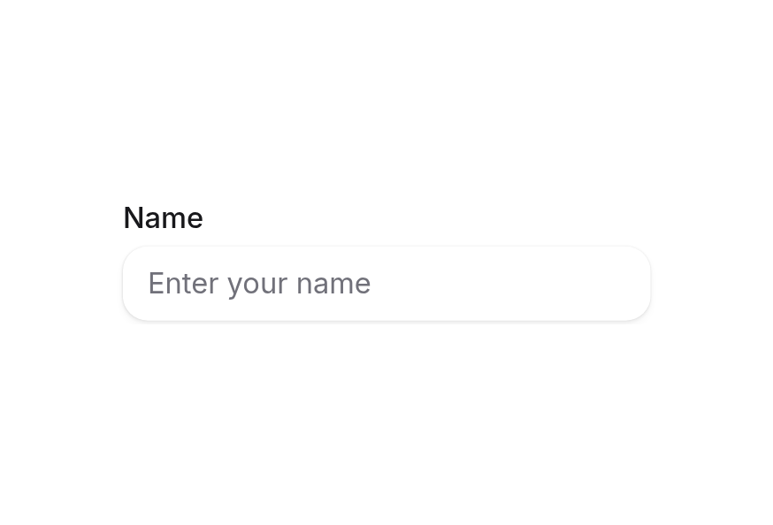
<script setup lang="ts">import { TextField } from '@hareui/vue'import { computed, ref } from 'vue'const value = ref('jr')const invalid = computed(() => value.value.length > 0 && value.value.length < 3)</script><template> <TextField id="username" v-model="value" class="w-64" label="Username" placeholder="Enter username" :invalid="invalid" error-message="Username must be at least 3 characters" /></template>The FieldError component displays validation error messages for form fields. Fields render it automatically while they are invalid: from the error-message prop or #error slot, or else from their validation errors (native constraints, validate, or a Form's validation-errors).
Anatomy
ui key | data-slot | Element |
|---|---|---|
base | field-error | <span role="alert"> |
Examples
Basic Validation
<script setup lang="ts">
import { TextField } from '@hareui/vue'
import { computed, ref } from 'vue'

const value = ref('')
const invalid = computed(() => value.value.length > 0 && value.value.length < 3)
</script>

<template>
  <TextField
    v-model="value"
    class="w-64"
    label="Username"
    placeholder="Enter username"
    :invalid="invalid"
    error-message="Username must be at least 3 characters"
  />
</template>
With Dynamic Messages
<TextField :invalid="errors.length > 0" label="Password" type="password">
  <template #error>
    {{ errors.join(', ') }}
  </template>
</TextField>
Custom Validation Logic
<script setup lang="ts">
import { TextField } from '@hareui/vue'
import { computed, ref } from 'vue'

const email = ref('')
const invalid = computed(() => email.value.length > 0 && !email.value.includes('@'))
</script>

<template>
  <TextField
    v-model="email"
    type="email"
    label="Email"
    :invalid="invalid"
    error-message="Email must include @ symbol"
  />
</template>
Multiple Error Messages
<TextField :invalid="hasErrors" label="Username">
  <template #error>
    <div v-for="error in errors" :key="error">
      {{ error }}
    </div>
  </template>
</TextField>
Customization
Tailwind CSS
Handle must be at least 3 characters
<script setup lang="ts">import { FieldError, Input, Label, TextField } from '@hareui/vue'import { computed, ref } from 'vue'const value = ref('jr')const invalid = computed(() => value.value.length > 0 && value.value.length < 3)</script><template> <TextField id="handle" class="w-64" :invalid="invalid"> <template #default="{ id }"> <Label :for="id">Handle</Label> <Input v-model="value" class="bg-field font-mono" placeholder="min. 3 characters" /> <FieldError v-if="invalid" :id="`${id}-error`" class="font-medium"> Handle must be at least 3 characters </FieldError> </template> </TextField></template>Global Configuration
app.use(createHareUI({
  ui: { fieldError: { slots: { base: 'font-medium text-danger' } } },
}))
Styling Reference
Slots
base→[data-slot="field-error"]— danger color, collapsed (h-0 opacity-0) unless[data-visible]is present (always set by HareUI)
Inside toggle fields ([data-slot="checkbox"], [data-slot="switch"], [data-slot="radio"]) the error is stacked like a description without the collapse transition.
API Reference
Props
| Prop | Type | Default | Description |
|---|---|---|---|
id | string | - | The id of the element, referenced by aria-describedby of the invalid control. |
ui | ComponentSlots<{ slots: { base: string[]; }; }> | - | Per-slot class overrides. |
Slots
| Slot | Props | Description |
|---|---|---|
default | any | The error message. |
Accessibility
The FieldError component ensures accessibility by:
- Using
role="alert"so the message is announced when it appears - Being referenced from the input's
aria-describedbyinside TextField - Providing visual and programmatic error indication (
aria-invalidon the input) - Automatically managing visibility based on validation state (rendered only while the field is invalid)