Popover
Displays rich content in a portal, anchored to a trigger element
Usage
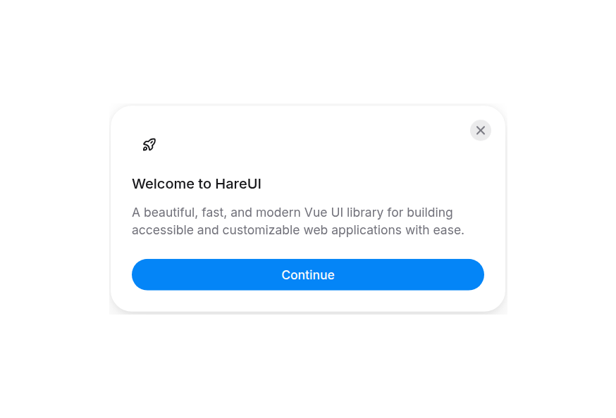
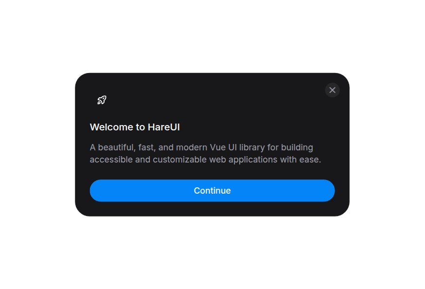
import { Popover } from '@hareui/vue'<script setup lang="ts">import { Button, Popover } from '@hareui/vue'</script><template> <div class="flex items-center gap-4"> <Popover title="Popover Title" class="max-w-64"> <Button>Click me</Button> <template #content> <p class="mt-2 text-sm text-muted"> This is the popover content. You can put any content here. </p> </template> </Popover> </div></template>Anatomy
The default slot's first child is the trigger (receives the current open state). The title slot (or title prop) renders an optional heading, and the content slot (receives a close callback) renders the body.
<Popover title="Title" arrow>
  <Button>Trigger</Button>
  <template #content="{ close }">
    Content
  </template>
</Popover>
ui keys: base, dialog, heading, arrow.
Examples
Placement
Click buttons
<script setup lang="ts">import { Button, Popover } from '@hareui/vue'</script><template> <div class="grid grid-cols-3 gap-4"> <div /> <Popover side="top" arrow> <Button class="w-full" variant="tertiary"> Top </Button> <template #content> <p class="text-sm">Top placement</p> </template> </Popover> <div /> <Popover side="left" arrow> <Button class="w-full" variant="tertiary"> Left </Button> <template #content> <p class="text-sm">Left placement</p> </template> </Popover> <div class="flex items-center justify-center"> <span class="text-sm text-muted">Click buttons</span> </div> <Popover side="right" arrow> <Button class="w-full" variant="tertiary"> Right </Button> <template #content> <p class="text-sm">Right placement</p> </template> </Popover> <div /> <Popover side="bottom" arrow> <Button class="w-full" variant="tertiary"> Bottom </Button> <template #content> <p class="text-sm">Bottom placement</p> </template> </Popover> <div /> </div></template>With Arrow
<script setup lang="ts">import { Icon } from '@iconify/vue'import { Button, Popover } from '@hareui/vue'</script><template> <div class="flex items-center gap-4"> <Popover title="Popover with Arrow" arrow class="max-w-64"> <Button variant="secondary">With Arrow</Button> <template #content> <p class="mt-2 text-sm text-muted"> The arrow shows which element triggered the popover. </p> </template> </Popover> <Popover title="Popover with Arrow" arrow class="max-w-64" :side-offset="10"> <Button icon-only aria-label="More options" variant="tertiary"> <Icon icon="gravity-ui:ellipsis" /> </Button> <template #content> <p class="mt-2 text-sm text-muted"> The arrow shows which element triggered the popover. </p> </template> </Popover> </div></template>Interactive Content
<script setup lang="ts">import { ref } from 'vue'import { Avatar, Button, Popover } from '@hareui/vue'const isFollowing = ref(false)</script><template> <div class="flex items-center gap-6"> <Popover class="w-[320px]"> <template #default="{ open }"> <button type="button" class="flex items-center gap-2" :aria-expanded="open" aria-label="User profile"> <Avatar size="sm" alt="Sarah Johnson" src="https://img.heroui.chat/image/avatar?w=400&h=400&u=1" fallback="SJ" /> <div class="flex flex-col items-start"> <p class="text-sm font-medium"> Sarah Johnson </p> <p class="text-xs text-muted"> @sarahj </p> </div> </button> </template> <template #title> <div class="flex items-center justify-between"> <div class="flex items-center gap-3"> <Avatar size="md" alt="Sarah Johnson" src="https://img.heroui.chat/image/avatar?w=400&h=400&u=1" fallback="SJ" /> <div> <p class="font-semibold"> Sarah Johnson </p> <p class="text-sm text-muted"> @sarahj </p> </div> </div> <Button class="rounded-full" size="sm" :variant="isFollowing ? 'tertiary' : 'primary'" @click="isFollowing = !isFollowing" > {{ isFollowing ? 'Following' : 'Follow' }} </Button> </div> </template> <template #content> <p class="mt-3 text-sm text-muted"> Product designer and creative director. Building beautiful experiences that matter. </p> <div class="mt-3 flex gap-4"> <div> <span class="font-semibold">892</span> <span class="ms-1 text-sm text-muted">Following</span> </div> <div> <span class="font-semibold">12.5K</span> <span class="ms-1 text-sm text-muted">Followers</span> </div> </div> </template> </Popover> </div></template>Customization
Tailwind CSS
<script setup lang="ts">import { Button, Popover } from '@hareui/vue'</script><template> <Popover :ui="{ base: 'max-w-56 overflow-hidden rounded-xl border border-border/80 bg-surface/90 p-0 shadow-xl ring-1 ring-black/5 backdrop-blur-xl dark:border-border/90 dark:bg-surface/85 dark:ring-white/10', dialog: 'relative p-4', }" > <Button variant="secondary">Details</Button> <template #content> <div aria-hidden="true" class="pointer-events-none absolute inset-x-0 top-0 h-12 bg-linear-to-b from-neutral-500/6 to-transparent dark:from-neutral-400/8" /> <h3 data-slot="popover-heading" class="relative font-medium text-neutral-800 dark:text-neutral-100"> Keyboard shortcuts </h3> <dl class="relative mt-3 space-y-2 text-sm"> <div class="flex justify-between gap-4"> <dt class="text-muted"> Save </dt> <dd class="font-mono text-neutral-700 dark:text-neutral-300"> ⌘ S </dd> </div> <div class="flex justify-between gap-4"> <dt class="text-muted"> Search </dt> <dd class="font-mono text-neutral-700 dark:text-neutral-300"> ⌘ K </dd> </div> </dl> </template> </Popover></template>Global theme override
app.use(createHareUI({
  ui: {
    popover: {
      slots: { base: 'rounded-xl' },
    },
  },
}))
Styling Reference
ui key | data-slot | Description |
|---|---|---|
base | popover | The floating surface |
dialog | popover-dialog | The dialog wrapper around the heading/content |
heading | popover-heading | The heading (shown when title prop or title slot is set) |
arrow | popover-overlay-arrow | The arrow <svg> (shown when arrow is true) |
Interactive states
- Open/closed:
data-state="open" | "closed"(drives the enter/exit animation) - Side:
data-side="top" | "right" | "bottom" | "left"
API Reference
Props
| Prop | Type | Default | Description |
|---|---|---|---|
open | boolean | undefined | The controlled open state of the popover. |
defaultOpen | boolean | false | The open state of the popover when it is initially rendered. Use when you do not need to control its open state. |
title | string | - | The title rendered inside the popover's heading. |
side | "top" | "bottom" | "right" | "left" | "bottom" | The preferred side of the trigger to render against when open. |
align | "center" | "start" | "end" | "center" | The preferred alignment against the trigger. |
sideOffset | number | 8 | The distance in pixels from the trigger. |
flip | boolean | true | Whether the popover can change orientation to fit in the viewport when it would otherwise overflow. |
arrow | boolean | false | Whether to render an arrow pointing at the trigger. |
dismissible | boolean | true | When false, the popover will not close when clicking outside or pressing Escape. |
portal | string | boolean | HTMLElement | true | Renders the popover content in a portal. true portals to document.body, a string is used as the teleport target, and false disables portalling. |
ui | ComponentSlots<{ slots: { base: string[]; dialog: string; heading: string; arrow: string; }; }> | - | Per-slot class overrides. |
Slots
| Slot | Props | Description |
|---|---|---|
default | { open: boolean; } | The trigger element. Receives the current open state. |
title | any | Replaces the heading text derived from title. |
content | { close: () => void; } | The popover's content. Receives a close callback. |