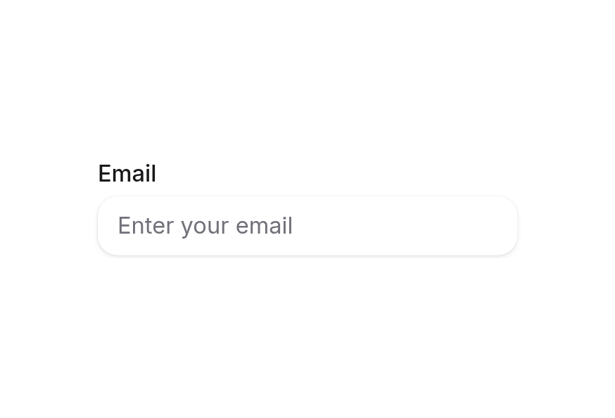
Form
Wrapper component for form validation and submission handling
Usage
<script setup lang="ts">
import { Form } from '@hareui/vue'
</script><script setup lang="ts">import { Icon } from '@iconify/vue'import { Button, Form, TextField } from '@hareui/vue'function onSubmit(e: Event) { e.preventDefault() const formData = new FormData(e.currentTarget as HTMLFormElement) const data: Record<string, string> = {} // Convert FormData to plain object formData.forEach((value, key) => { data[key] = value.toString() }) alert(`Form submitted with: ${JSON.stringify(data, null, 2)}`)}function validateEmail(value: string | number) { if (!/^[\w.%+-]+@[A-Z0-9.-]+\.[A-Z]{2,}$/i.test(String(value))) return 'Please enter a valid email address' return null}function validatePassword(value: string | number) { const password = String(value) if (password.length < 8) return 'Password must be at least 8 characters' if (!/[A-Z]/.test(password)) return 'Password must contain at least one uppercase letter' if (!/\d/.test(password)) return 'Password must contain at least one number' return null}</script><template> <Form class="flex w-96 flex-col gap-4" @submit="onSubmit"> <TextField required name="email" type="email" label="Email" placeholder="[email protected]" :validate="validateEmail" /> <TextField required minlength="8" name="password" type="password" label="Password" placeholder="Enter your password" description="Must be at least 8 characters with 1 uppercase and 1 number" :validate="validatePassword" /> <div class="flex gap-2"> <Button type="submit"> <Icon icon="gravity-ui:check" /> Submit </Button> <Button type="reset" variant="secondary"> Reset </Button> </div> </Form></template>Anatomy
<script setup lang="ts">
import { Button, Form } from '@hareui/vue'
</script>

<template>
  <Form>
    <!-- Form fields go here -->
    <Button type="submit" />
    <Button type="reset" />
  </Form>
</template>
Examples
Render Function
<script setup lang="ts">import { Icon } from '@iconify/vue'import { Button, Form, TextField } from '@hareui/vue'function onSubmit(e: Event) { e.preventDefault() const formData = new FormData(e.currentTarget as HTMLFormElement) const data: Record<string, string> = {} // Convert FormData to plain object formData.forEach((value, key) => { data[key] = value.toString() }) alert(`Form submitted with: ${JSON.stringify(data, null, 2)}`)}function validateEmail(value: string | number) { if (!/^[\w.%+-]+@[A-Z0-9.-]+\.[A-Z]{2,}$/i.test(String(value))) return 'Please enter a valid email address' return null}function validatePassword(value: string | number) { const password = String(value) if (password.length < 8) return 'Password must be at least 8 characters' if (!/[A-Z]/.test(password)) return 'Password must contain at least one uppercase letter' if (!/\d/.test(password)) return 'Password must contain at least one number' return null}</script><template> <!-- Attributes fall through to the native <form> element (HeroUI's `render` prop) --> <Form class="flex w-96 flex-col gap-4" data-custom="foo" @submit="onSubmit"> <TextField required name="email" type="email" label="Email" placeholder="[email protected]" :validate="validateEmail" /> <TextField required minlength="8" name="password" type="password" label="Password" placeholder="Enter your password" description="Must be at least 8 characters with 1 uppercase and 1 number" :validate="validatePassword" /> <div class="flex gap-2"> <Button type="submit"> <Icon icon="gravity-ui:check" /> Submit </Button> <Button type="reset" variant="secondary"> Reset </Button> </div> </Form></template>Attributes and listeners such as action, method, @submit, @reset and data-* fall through to the native <form> element.
Customization
Tailwind CSS
<script setup lang="ts">import { Button, Form, Input, TextField } from '@hareui/vue'</script><template> <Form class="flex w-80 flex-col gap-3 rounded-xl border border-border/80 bg-surface p-4 shadow-sm" @submit.prevent > <TextField required name="email" type="email" label="Work email"> <Input class="bg-field" placeholder="[email protected]" /> </TextField> <Button class="w-full" type="submit"> Continue </Button> </Form></template>Global CSS
Form renders a native <form> with no theme slots. Style it with class, or with a project-level class under @layer components.
@layer components {
  .form-layout {
    @apply flex flex-col gap-4 rounded-xl border border-border bg-surface p-4 shadow-sm;
  }
}<Form class="form-layout" @submit="onSubmit">
<!-- TextField, Input, Button, etc. -->
</Form>For individual controls, see Customization on TextField, Input, Label and FieldError.
Styling Reference
Form has no ui keys and no data-slot. Field appearance and validation states come from child components such as TextField, Input, Label, Description and FieldError.
API Reference
Props
| Prop | Type | Default | Description |
|---|---|---|---|
validationBehavior | ValidationBehavior | "native" | Validation behavior for the fields inside. native blocks submission and shows errors on change or submit;
aria shows errors in realtime and never blocks submission. A field's own validationBehavior wins. |
validationErrors | ValidationErrors | - | Server-side errors keyed by field name. Shown immediately; a field's error clears once the user changes it. |
Slots
| Slot | Props | Description |
|---|---|---|
default | any | Fields and buttons. |
Form Validation
Fields inside a Form support:
- Built-in HTML validation attributes (
required,minlength,pattern,min,max, …) - A custom
validatefunction on TextField, Input, NumberField, Checkbox, Switch and RadioGroup. It returns an error message (or an array of them) when the value is invalid, andtrue,nullorundefinedwhen it is valid. - Server-side errors through the
validation-errorsprop, keyed by fieldname. They show immediately and clear once the user changes that field. - Error display through each field's built-in FieldError. The
#errorslot receives{ isInvalid, validationErrors, validationDetails }.
A field's invalid prop, when set, overrides all of the above.
Validation Behavior
The validation-behavior prop controls how errors are displayed:
native(default): native constraint validation. Submission is blocked while a field is invalid, and errors show once the user commits a value (onchange, on blur, or on submit). The first invalid field is focused.aria: errors show in realtime as the user types, are exposed througharia-invalid, and never block submission. The<form>getsnovalidate.
Set it on the form, or override it on an individual field.
Form Submission
Forms can be submitted in several ways:
- Traditional submission: set the
actionattribute to submit to a URL - JavaScript handling: listen to
@submitand process the data - FormData API: read the values with
FormDatain the submit handler
function onSubmit(e: Event) {
  e.preventDefault()
  const formData = new FormData(e.currentTarget as HTMLFormElement)
  const data = Object.fromEntries(formData)
  console.log('Form data:', data)
}
A reset button (or form.reset()) restores every field's defaultValue and clears displayed errors.
Accessibility
- Native
<form>element semantics - Form landmark with
aria-labeloraria-labelledby - Focus moves to the first invalid field when submission is blocked
aria-invalidandaria-describedby(pointing to the error) on each invalid control