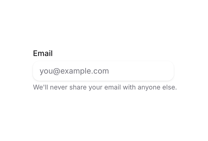
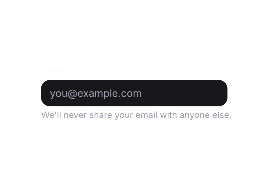
Label
Renders an accessible label associated with form controls
Usage
<script setup lang="ts">
import { Label } from '@hareui/vue'
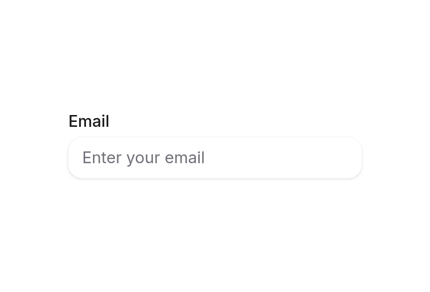
</script><script setup lang="ts">import { Input, Label } from '@hareui/vue'</script><template> <div class="flex flex-col gap-1"> <Label for="name">Name</Label> <Input id="name" class="w-64" placeholder="Enter your name" type="text" /> </div></template>Anatomy
Label renders a single <label> element (Reka UI Label).
ui key | data-slot | Element |
|---|---|---|
base | label | <label> |
Examples
With Required Indicator
<Label for="email" required>
  Email Address
</Label>
<Input id="email" type="email" />
With Disabled State
<Label for="username" disabled>
  Username
</Label>
<Input id="username" disabled />
With Invalid State
<Label for="password" invalid>
  Password
</Label>
<Input id="password" invalid />
Customization
Tailwind CSS
Pass utilities through class (root) or :ui="{ base: '…' }"; they are merged with tailwind-merge, so conflicting utilities replace the defaults.
<script setup lang="ts">import { Input, Label } from '@hareui/vue'</script><template> <div class="flex flex-col gap-1.5"> <Label class="text-xs font-semibold tracking-wide text-accent uppercase" for="repo"> Repository </Label> <Input id="repo" class="w-64 bg-field" placeholder="heroui/react" /> </div></template>Global Configuration
Override the theme for every Label with createHareUI:
import { createHareUI } from '@hareui/vue'

app.use(createHareUI({
  ui: {
    label: {
      slots: { base: 'font-semibold text-foreground' },
      variants: { required: { true: { base: 'after:text-accent' } } },
    },
  },
}))
Styling Reference
Slots
base→[data-slot="label"]— text styling (text-sm font-medium text-foreground)
State Variants
requiredprop, or a parent with[data-required="true"]— shows the required asterisk (::after)disabledprop, or an ancestor with[data-disabled="true"]— disabled stylinginvalidprop, or an ancestor with[data-invalid="true"]/[aria-invalid="true"]— danger text color
Note: The parent-driven asterisk excludes parents with role="group", role="radiogroup" or role="checkboxgroup", and items with data-slot="radio" or data-slot="checkbox", preventing duplicate asterisks in group components.
API Reference
Props
| Prop | Type | Default | Description |
|---|---|---|---|
for | string | - | The id of the form control the label is associated with. |
disabled | boolean | false | Whether the label is disabled. |
invalid | boolean | false | Whether the label is in an invalid state. |
required | boolean | false | Whether the label shows a required asterisk. |
ui | ComponentSlots<{ slots: { base: string[]; }; variants: { disabled: { true: { base: string; }; }; invalid: { true: { base: string; }; }; required: { true: { base: string; }; }; }; defaultVariants: { disabled: boolean; invalid: boolean; required: boolean; }; }> | - | Per-slot class overrides. |
Slots
| Slot | Props | Description |
|---|---|---|
default | any | The label content. |
Accessibility
The Label component is built on the native HTML <label> element (MDN Reference) and follows WAI-ARIA best practices:
- Associates with form controls using the
forattribute - Provides semantic HTML
<label>element - Supports keyboard navigation when associated with form controls
- Communicates required and invalid states to screen readers
- Clicking the label focuses/activates the associated form control