DisclosureGroup
Container that manages multiple Disclosure items with coordinated expanded states
Usage
<script setup lang="ts">
import { DisclosureGroup } from '@hareui/vue'
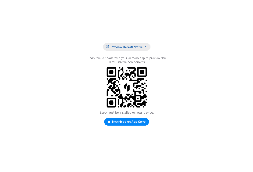
</script>Scan this QR code with your camera app to preview the HeroUI native components.

Expo must be installed on your device.
<script setup lang="ts">import type { ExpandedValue } from '@hareui/vue'import { Icon } from '@iconify/vue'import { Button, Disclosure, DisclosureGroup, Separator } from '@hareui/vue'import { ref } from 'vue'const expandedKeys = ref<ExpandedValue[]>(['preview'])</script><template> <div class="w-full max-w-md"> <div class="flex flex-col gap-4 bg-transparent p-4"> <DisclosureGroup v-model="expandedKeys"> <Disclosure aria-label="Preview HeroUI Native" value="preview" :ui="{ bodyInner: 'mx-2 flex flex-col items-center gap-2 p-4 text-center' }"> <template #trigger="{ indicator }"> <Button :class="['w-full border-none', { 'bg-transparent': !expandedKeys.includes('preview') }]" :variant="expandedKeys.includes('preview') ? 'secondary' : 'tertiary'" > <div class="flex w-full items-center justify-start gap-2"> <Icon height="16" icon="gravity-ui:qr-code" width="16" /> Preview HeroUI Native </div> <component :is="indicator" class="text-muted" /> </Button> </template> <p class="text-sm text-muted"> Scan this QR code with your camera app to preview the HeroUI native components. </p> <img alt="Expo Go QR Code" class="aspect-square w-full max-w-54 object-cover" src="https://heroui-assets.nyc3.cdn.digitaloceanspaces.com/images/qr-code-native.png" > <p class="text-sm text-muted"> Expo must be installed on your device. </p> <Button class="mt-4" variant="primary"> <Icon class="[&_path]:fill-accent-foreground" icon="logos:expo-icon" /> Preview on Expo Go </Button> </Disclosure> <Separator class="my-2" /> <Disclosure value="download" :ui="{ bodyInner: 'mx-2 flex flex-col items-center gap-2 p-4 text-center' }"> <template #trigger="{ indicator }"> <Button :class="['w-full border-none', { 'bg-transparent': !expandedKeys.includes('download') }]" :variant="expandedKeys.includes('download') ? 'secondary' : 'tertiary'" > <div class="flex w-full items-center justify-start gap-2"> <Icon icon="tabler:brand-apple-filled" /> Download App </div> <component :is="indicator" class="text-muted" /> </Button> </template> <p class="text-sm text-muted"> Download the HeroUI native app to explore our mobile components directly on your device. </p> <img alt="App Store QR Code" class="aspect-square w-full max-w-54 object-cover" src="https://heroui-assets.nyc3.cdn.digitaloceanspaces.com/images/qr-code-native.png" > <p class="text-sm text-muted"> Available on iOS and Android devices. </p> <Button class="mt-4" variant="primary"> <Icon icon="tabler:brand-apple-filled" /> Download on App Store </Button> </Disclosure> </DisclosureGroup> </div> </div></template>Anatomy
<template>
  <DisclosureGroup v-model="expanded">
    <Disclosure value="item1" title="…">
      <!-- optional: <template #trigger="{ open, indicator }" /> -->
      …
    </Disclosure>
  </DisclosureGroup>
</template>
Each Disclosure inside the group is identified by its value (HeroUI's id); the group's v-model holds the expanded values. Anything else can sit between the disclosures (e.g. a Separator).
ui key | data-slot | Element |
|---|---|---|
base | disclosure-group | root element |
Examples
Controlled
You can control which disclosures are expanded with external navigation controls using v-model and the useDisclosureGroupNavigation composable.
HeroUI Native
Scan this QR code with your camera app to preview the HeroUI native components.
Expo must be installed on your device.
<script setup lang="ts">import type { ExpandedValue } from '@hareui/vue'import { Icon } from '@iconify/vue'import { Button, Disclosure, DisclosureGroup, Separator, useDisclosureGroupNavigation } from '@hareui/vue'import { ref } from 'vue'const expandedKeys = ref<ExpandedValue[]>(['preview'])const itemIds = ['preview', 'download'] // Track our disclosure itemsconst { isNextDisabled, isPrevDisabled, onNext, onPrevious } = useDisclosureGroupNavigation({ expandedKeys, itemIds, onExpandedChange: (keys) => { expandedKeys.value = keys },})</script><template> <div class="w-full max-w-md"> <div class="flex flex-col gap-4 rounded-3xl p-4"> <div class="mb-2 flex items-center justify-between"> <h3 class="text-lg font-semibold"> HeroUI Native </h3> <div class="flex gap-2"> <Button aria-label="Previous disclosure" :disabled="isPrevDisabled" size="sm" variant="secondary" @click="onPrevious"> <Icon class="size-4" icon="gravity-ui:chevron-up" /> </Button> <Button aria-label="Next disclosure" :disabled="isNextDisabled" size="sm" variant="secondary" @click="onNext"> <Icon class="size-4" icon="gravity-ui:chevron-down" /> </Button> </div> </div> <DisclosureGroup v-model="expandedKeys"> <Disclosure aria-label="Preview HeroUI Native" value="preview" :ui="{ bodyInner: 'mx-2 flex flex-col items-center gap-2 p-4 text-center' }"> <template #trigger="{ indicator }"> <Button :class="['w-full border-none', { 'bg-transparent': !expandedKeys.includes('preview') }]" :variant="expandedKeys.includes('preview') ? 'secondary' : 'tertiary'" > <div class="flex w-full items-center justify-start gap-2"> <Icon height="16" icon="gravity-ui:qr-code" width="16" /> Preview HeroUI Native </div> <component :is="indicator" class="text-muted" /> </Button> </template> <p class="text-sm text-muted"> Scan this QR code with your camera app to preview the HeroUI native components. </p> <img alt="Expo Go QR Code" class="aspect-square w-full max-w-54 object-cover" src="https://heroui-assets.nyc3.cdn.digitaloceanspaces.com/images/qr-code-native.png" > <p class="text-sm text-muted"> Expo must be installed on your device. </p> <Button class="mt-4" variant="primary"> <Icon class="[&_path]:fill-accent-foreground" icon="logos:expo-icon" /> Preview on Expo Go </Button> </Disclosure> <Separator class="my-2" /> <Disclosure value="download" :ui="{ bodyInner: 'mx-2 flex flex-col items-center gap-2 p-4 text-center' }"> <template #trigger="{ indicator }"> <Button :class="['w-full border-none', { 'bg-transparent': !expandedKeys.includes('download') }]" :variant="expandedKeys.includes('download') ? 'secondary' : 'tertiary'" > <div class="flex w-full items-center justify-start gap-2"> <Icon icon="tabler:brand-apple-filled" /> Download HeroUI Native </div> <component :is="indicator" class="text-muted" /> </Button> </template> <p class="text-sm text-muted"> Scan this QR code with your camera app to preview the HeroUI native components. </p> <img alt="App Store QR Code" class="aspect-square w-full max-w-54 object-cover" src="https://heroui-assets.nyc3.cdn.digitaloceanspaces.com/images/qr-code-native.png" > <p class="text-sm text-muted"> Expo must be installed on your device. </p> <Button class="mt-4" variant="primary"> <Icon icon="tabler:brand-apple-filled" /> Download on App Store </Button> </Disclosure> </DisclosureGroup> </div> </div></template>Customization
Tailwind CSS
<script setup lang="ts">import { Button, Disclosure, DisclosureGroup, Separator } from '@hareui/vue'</script><template> <DisclosureGroup class="w-full max-w-sm rounded-xl bg-default-soft p-2"> <Disclosure value="billing" :ui="{ bodyInner: 'text-sm text-muted' }"> <template #trigger="{ indicator }"> <Button class="w-full justify-between" variant="ghost"> Billing <component :is="indicator" class="text-muted" /> </Button> </template> Invoices are issued on the first of each month. </Disclosure> <Separator class="my-1" /> <Disclosure value="support" :ui="{ bodyInner: 'text-sm text-muted' }"> <template #trigger="{ indicator }"> <Button class="w-full justify-between" variant="ghost"> Support <component :is="indicator" class="text-muted" /> </Button> </template> Reach us at [email protected]. Typical response time is under one business day. </Disclosure> </DisclosureGroup></template>Global Configuration
To customize the DisclosureGroup classes for the whole app, extend the disclosureGroup theme in createHareUI:
app.use(createHareUI({
  ui: {
    disclosureGroup: {
      slots: {
        base: 'w-full [contain:layout_style]',
      },
    },
  },
}))
Styling Reference
Slots
base→[data-slot="disclosure-group"]– base container styles with layout containment
Interactive States
The component supports both CSS pseudo-classes and data attributes for flexibility:
- Disabled:
[data-disabled="true"]on the group; every child Disclosure's trigger gets:disabled - Expanded Management: Automatically manages
[data-expanded]states on child Disclosure items
API Reference
Props
| Prop | Type | Default | Description |
|---|---|---|---|
as | AsTag | Component | "div" | The element or component to render the root as. |
modelValue | ExpandedValue[] | undefined | The expanded disclosures' values. Use v-model to control them. |
defaultValue | ExpandedValue[] | - | The disclosures expanded on first render (uncontrolled). |
multiple | boolean | false | Whether multiple disclosures can be expanded at once (HeroUI's allowsMultipleExpanded). |
disabled | boolean | false | Whether all disclosures in the group are disabled. |
ui | ComponentSlots<{ slots: { base: string; }; variants: {}; defaultVariants: {}; }> | - | Per-slot class overrides. |
Slots
| Slot | Props | Description |
|---|---|---|
default | { expanded: ExpandedValue[]; disabled: boolean; } | The Disclosure items (and anything between them, e.g. Separator). |
Emits
| Event | Payload | Description |
|---|---|---|
update:modelValue | [value: ExpandedValue[]] | - |
useDisclosureGroupNavigation
| Option | Type | Default | Description |
|---|---|---|---|
expandedKeys | MaybeRefOrGetter<ExpandedValue[]> | - | The current v-model value |
itemIds | MaybeRefOrGetter<ExpandedValue[]> | - | Every disclosure's value, in display order |
onExpandedChange | (keys: ExpandedValue[]) => void | - | Called with the new expanded values |
multiple | MaybeRefOrGetter<boolean> | false | Keep previously expanded disclosures open while navigating |
Returns currentIndex, isPrevDisabled, isNextDisabled (computed refs) and onPrevious, onNext.