SearchField
A text field for search queries, with a search icon and a clear button
Usage
<script setup lang="ts">
import { SearchField } from '@hareui/vue'
</script><script setup lang="ts">import { SearchField } from '@hareui/vue'</script><template> <SearchField class="w-[280px]" name="search" label="Search" placeholder="Search..." /></template>Anatomy
SearchField renders a Label, a group holding a search icon, a native type="search" input and a clear button, then a Description and a FieldError. The text parts come from props; each can be replaced with a slot, and the icons can be replaced too.
<template>
  <SearchField label="…" description="…" error-message="…" :invalid="…">
    <template #label />      <!-- Label content -->
    <template #icon />       <!-- search icon content (default: magnifier icon) -->
    <template #clearIcon />  <!-- clear button icon content (default: × icon) -->
    <template #description />  <!-- Description content -->
    <template #error="{ isInvalid, validationErrors, validationDetails }" /> <!-- FieldError content, rendered while invalid -->
  </SearchField>
</template>
ui key | data-slot | Element |
|---|---|---|
base | search-field | <div> root |
| — | label | Label (iff label / #label) |
group | search-field-group | <div> wrapping the icon, input and clear button |
searchIcon | search-field-search-icon | <span> (default icon or #icon) |
input | search-field-input | <input type="search"> |
clearButton | search-field-clear-button | CloseButton (default icon or #clearIcon), hidden via CSS while empty |
| — | description | Description (iff description / #description) |
| — | field-error | FieldError (while invalid, iff error-message / #error / validation errors) |
Examples
In Surface
When used inside a surface (HeroUI's Surface, here a bg-surface container), use variant="secondary" to apply the lower emphasis variant suitable for surface backgrounds.
<script setup lang="ts">import { SearchField, Surface } from '@hareui/vue'</script><template> <Surface class="flex w-full max-w-sm flex-col gap-4 rounded-3xl p-6"> <SearchField name="search" variant="secondary" label="Search" placeholder="Search..." description="Enter keywords to search" :ui="{ input: 'w-full' }" /> <SearchField name="search-2" variant="secondary" label="Advanced search" placeholder="Advanced search..." description="Use filters to refine your search" :ui="{ input: 'w-full' }" /> </Surface></template>With Description
<script setup lang="ts">import { SearchField } from '@hareui/vue'</script><template> <div class="flex flex-col gap-4"> <SearchField class="w-[280px]" name="search" label="Search products" placeholder="Search products..." description="Enter keywords to search for products" /> <SearchField class="w-[280px]" name="search-users" label="Search users" placeholder="Search users..." description="Search by name, email, or username" /> </div></template>Required Field
<script setup lang="ts">import { SearchField } from '@hareui/vue'</script><template> <div class="flex flex-col gap-4"> <SearchField required class="w-[280px]" name="search" label="Search" placeholder="Search..." /> <SearchField required class="w-[280px]" name="search-query" label="Search query" placeholder="Enter search query..." description="Minimum 3 characters required" /> </div></template>Disabled State
<script setup lang="ts">import { SearchField } from '@hareui/vue'</script><template> <div class="flex flex-col gap-4"> <SearchField disabled class="w-[280px]" name="search" model-value="Disabled search" label="Search" description="This search field is disabled" /> <SearchField disabled class="w-[280px]" name="search-empty" label="Search" description="This search field is disabled" /> </div></template>Full Width
<script setup lang="ts">import { SearchField } from '@hareui/vue'</script><template> <div class="w-[400px] space-y-4"> <SearchField full-width name="search" label="Search" placeholder="Search..." /> </div></template>Validation
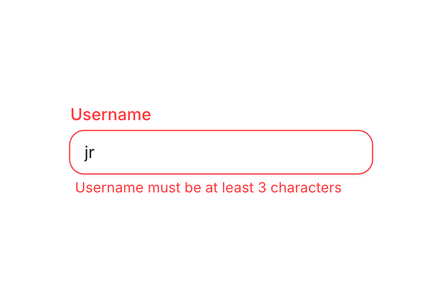
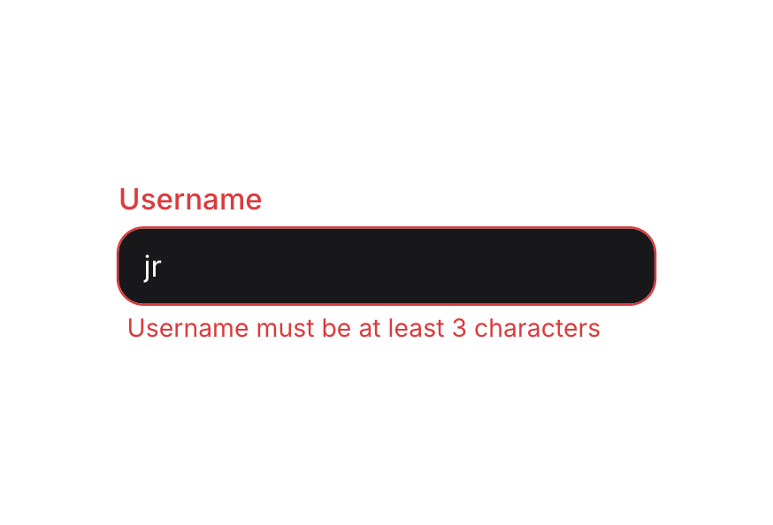
Use invalid together with error-message to control the state yourself, or let the field validate: native attributes (required, …) and a validate function, inside a Form or on their own. Without error-message, the field shows the validation errors.
<script setup lang="ts">import { SearchField } from '@hareui/vue'</script><template> <div class="flex flex-col gap-4"> <SearchField invalid required class="w-[280px]" name="search" model-value="ab" label="Search" error-message="Search query must be at least 3 characters" /> <SearchField invalid class="w-[280px]" name="search-invalid" model-value="invalid@query" label="Search" placeholder="Search..." error-message="Invalid characters in search query" /> </div></template>Controlled
Bind the value with v-model to synchronize counters, previews, or formatting. The clear button and Escape both empty it; pressing Enter emits submit with the current value.
<script setup lang="ts">import { Button, SearchField } from '@hareui/vue'import { ref } from 'vue'const value = ref('')</script><template> <div class="flex flex-col gap-4"> <SearchField v-model="value" class="w-[280px]" name="search" label="Search"> <template #description> Current value: {{ value || '(empty)' }} </template> </SearchField> <div class="flex gap-2"> <Button variant="tertiary" @click="value = ''"> Clear </Button> <Button variant="tertiary" @click="value = 'example query'"> Set example </Button> </div> </div></template>Form Example
<script setup lang="ts">import { Button, Form, SearchField, Spinner } from '@hareui/vue'import { computed, ref } from 'vue'const value = ref('')const isSubmitting = ref(false)const MIN_LENGTH = 3const isInvalid = computed(() => value.value.length > 0 && value.value.length < MIN_LENGTH)function handleSubmit(e: Event) { e.preventDefault() if (value.value.length < MIN_LENGTH) return isSubmitting.value = true // Simulate API call setTimeout(() => { console.log('Search submitted:', { query: value.value }) value.value = '' isSubmitting.value = false }, 1500)}</script><template> <Form class="flex w-[280px] flex-col gap-4" @submit="handleSubmit"> <SearchField v-model="value" required :invalid="isInvalid" full-width name="search" label="Search products" placeholder="Search products..." :error-message="`Search query must be at least ${MIN_LENGTH} characters`" :description="`Enter at least ${MIN_LENGTH} characters to search`" /> <Button class="w-full" :disabled="value.length < MIN_LENGTH" :pending="isSubmitting" type="submit" variant="primary"> <template v-if="isSubmitting"> <Spinner color="current" size="sm" /> Searching... </template> <template v-else> Search </template> </Button> </Form></template>With Validation
<script setup lang="ts">import { SearchField } from '@hareui/vue'import { computed, ref } from 'vue'const value = ref('')const isInvalid = computed(() => value.value.length > 0 && value.value.length < 3)</script><template> <div class="flex flex-col gap-4"> <SearchField v-model="value" required :invalid="isInvalid" class="w-[280px]" name="search" label="Search" placeholder="Search..." error-message="Search query must be at least 3 characters" description="Enter at least 3 characters to search" /> </div></template>Variants
<script setup lang="ts">import { SearchField } from '@hareui/vue'</script><template> <div class="flex flex-col gap-4"> <SearchField class="w-[280px]" name="primary-search" variant="primary" label="Primary variant" placeholder="Search..." /> <SearchField class="w-[280px]" name="secondary-search" variant="secondary" label="Secondary variant" placeholder="Search..." /> </div></template>With Keyboard Shortcut
Add keyboard shortcuts to quickly focus the search field.
<script setup lang="ts">import { Kbd, SearchField } from '@hareui/vue'import { onBeforeUnmount, onMounted, ref, useTemplateRef } from 'vue'const value = ref('')const field = useTemplateRef<{ $el: HTMLElement }>('field')const input = () => field.value?.$el.querySelector('input') ?? nullfunction handleKeyDown(e: KeyboardEvent) { // Check for Shift+S if (e.shiftKey && e.key === 'S' && !e.metaKey && !e.ctrlKey && !e.altKey) { e.preventDefault() input()?.focus() } // Check for ESC key to blur the input if (e.key === 'Escape' && document.activeElement === input()) input()?.blur()}onMounted(() => window.addEventListener('keydown', handleKeyDown))onBeforeUnmount(() => window.removeEventListener('keydown', handleKeyDown))</script><template> <div class="flex flex-col gap-4"> <div> <SearchField ref="field" v-model="value" name="search" label="Search" placeholder="Search..." description="Use keyboard shortcut to quickly focus this field" :ui="{ input: 'w-[280px]' }" /> </div> <div class="text-default-500 flex items-center gap-2 text-sm"> <span>Press</span> <Kbd keys="shift"> S </Kbd> <span>to focus the search field</span> </div> </div></template>Render Function
HeroUI's render prop replaces the root element. In Vue, attributes you pass to SearchField (other than aria-label / aria-labelledby, which go to the input) fall through to the root div.
<script setup lang="ts">import { SearchField } from '@hareui/vue'</script><template> <!-- Attributes other than aria-label/aria-labelledby fall through to the root element (HeroUI's `render` prop) --> <SearchField class="w-[280px]" data-custom="foo" name="search" label="Search" placeholder="Search..." /></template>Customization
Tailwind CSS
Use the icon and clearIcon slots to render custom icons, and :ui or class for styling.
<script setup lang="ts">import { SearchField } from '@hareui/vue'</script><template> <div class="flex flex-col gap-4"> <SearchField name="search-custom" label="Search (Custom Icons)" description="Custom icon children"> <template #icon> <svg height="16" viewBox="0 0 16 16" width="16" xmlns="http://www.w3.org/2000/svg"> <path clip-rule="evenodd" d="M12.5 4c0 .174-.071.513-.885.888S9.538 5.5 8 5.5s-2.799-.237-3.615-.612C3.57 4.513 3.5 4.174 3.5 4s.071-.513.885-.888S6.462 2.5 8 2.5s2.799.237 3.615.612c.814.375.885.714.885.888m-1.448 2.66C10.158 6.888 9.115 7 8 7s-2.158-.113-3.052-.34l1.98 2.905c.21.308.322.672.322 1.044v3.37q.088.02.25.021c.422 0 .749-.14.95-.316c.185-.162.3-.38.3-.684v-2.39c0-.373.112-.737.322-1.045zM8 1c3.314 0 6 1 6 3a3.24 3.24 0 0 1-.563 1.826l-3.125 4.584a.35.35 0 0 0-.062.2V13c0 1.5-1.25 2.5-2.75 2.5s-1.75-1-1.75-1v-3.89a.35.35 0 0 0-.061-.2L2.563 5.826A3.24 3.24 0 0 1 2 4c0-2 2.686-3 6-3m-.88 12.936q-.015-.008-.013-.01z" fill="currentColor" fill-rule="evenodd" /> </svg> </template> <template #clearIcon> <svg height="16" viewBox="0 0 16 16" width="16" xmlns="http://www.w3.org/2000/svg"> <path clip-rule="evenodd" d="M8 15A7 7 0 1 0 8 1a7 7 0 0 0 0 14M6.53 5.47a.75.75 0 0 0-1.06 1.06L6.94 8L5.47 9.47a.75.75 0 1 0 1.06 1.06L8 9.06l1.47 1.47a.75.75 0 1 0 1.06-1.06L9.06 8l1.47-1.47a.75.75 0 1 0-1.06-1.06L8 6.94z" fill="currentColor" fill-rule="evenodd" /> </svg> </template> </SearchField> </div></template><script setup lang="ts">import { SearchField } from '@hareui/vue'</script><template> <SearchField class="w-full max-w-64" name="docs" variant="secondary" label="Search docs" placeholder="Components, guides..." :ui="{ group: 'rounded-xl bg-default', searchIcon: 'text-muted', input: 'placeholder:text-muted', clearButton: 'text-muted' }" /></template>Global Configuration
app.use(createHareUI({
  ui: { searchField: { slots: { base: 'gap-2' } } },
}))
Styling Reference
Slots
base→[data-slot="search-field"]– root container (flex flex-col gap-1)group→[data-slot="search-field-group"]– bordered field shell (inline-flex h-9 items-center rounded-field border)searchIcon→[data-slot="search-field-search-icon"]– icon wrapper (size-4 text-field-placeholder)input→[data-slot="search-field-input"]– the native inputclearButton→[data-slot="search-field-clear-button"]– CloseButton (size-5)
Note: The child components (Label, Description, FieldError) have their own themes. See their respective pages for customization options.
Interactive States
SearchField sets these data attributes:
- Invalid:
[data-invalid="true"]on the root and the group - automatically hides the description when invalid - Disabled:
[data-disabled="true"]on the root and the group - Required:
[data-required="true"]on the root - shows the label's required asterisk - Read Only:
[data-readonly="true"]on the root - Empty:
[data-empty="true"]on the root - hides the clear button (pointer-events-none opacity-0) while there's no value - Focus Within:
[data-focus-within="true"]on the group - applied when the input is focused - Focus Visible:
[data-focus-visible="true"]on the group - applied when focus is visible (keyboard navigation)
API Reference
Props
| Prop | Type | Default | Description |
|---|---|---|---|
label | string | - | Label text rendered above the field. |
description | string | - | Helper text rendered below the field. Hidden while the field is invalid. |
errorMessage | string | - | Error message rendered below the field while invalid. Defaults to the validation errors. |
id | string | useId() | The id of the input; label, description and error ids derive from it. |
name | string | - | The name of the input, used when submitting a form. |
placeholder | string | - | Temporary text shown when the input is empty. |
defaultValue | string | - | The initial value when uncontrolled (no v-model). |
variant | "primary" | "secondary" | 'primary' | Visual variant of the field. |
fullWidth | boolean | false | Whether the field takes the full width of its container. |
disabled | boolean | false | Whether the field is disabled. |
invalid | boolean | undefined | Whether the field is invalid. Overrides validation when set. |
required | boolean | false | Whether the field is required. |
readonly | boolean | false | Whether the input can be selected but not changed. |
validate | ValidateFn<string> | - | Validates the value. Return an error message (or several) when invalid, true/null/undefined when valid. |
validationBehavior | ValidationBehavior | 'native' | native blocks form submission and shows errors on change or submit; aria shows errors in realtime.
Defaults to the surrounding Form. |
ui | ComponentSlots<{ slots: { base: string[]; group: string[]; input: string[]; searchIcon: string; clearButton: string; }; variants: { variant: { primary: { base: string; }; secondary: { group: string[]; }; }; fullWidth: { false: { base: string; group: string; }; true: { base: string; group: string; }; }; }; defaultVariants: { fullWidth: boolean; variant: string; }; }> | - | Per-slot class overrides. |
modelValue | string | - | The search query. |
Slots
| Slot | Props | Description |
|---|---|---|
label | any | Label content. Replaces the label prop. |
icon | any | Replaces the default search icon. |
clearIcon | any | Replaces the default clear (×) icon inside the clear button. |
description | any | Description content. Replaces the description prop. |
error | ValidationResult | Error content, rendered while invalid. Replaces the errorMessage prop. |
Emits
| Event | Payload | Description |
|---|---|---|
update:modelValue | unknown[] | - |
clear | [] | - |
submit | [value: string] | - |
Accessibility
- The label's
forpoints to the input id (auto-generated withuseId()unlessidis set) - The input's
aria-describedbylists the ids of the rendered description (<id>-description) and error (<id>-error) invalidsetsaria-invalid="true"on the input; the error is announced viarole="alert"requiredanddisabledset the native attributes on the input- The clear button is excluded from the tab order (
tabindex="-1") and labeled"Clear search"; clicking it refocuses the input instead of moving focus away - Escape clears the field (and does nothing when it's already empty); Enter emits
submitwith the current value