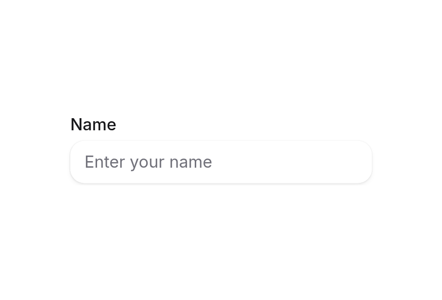
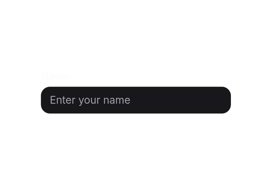
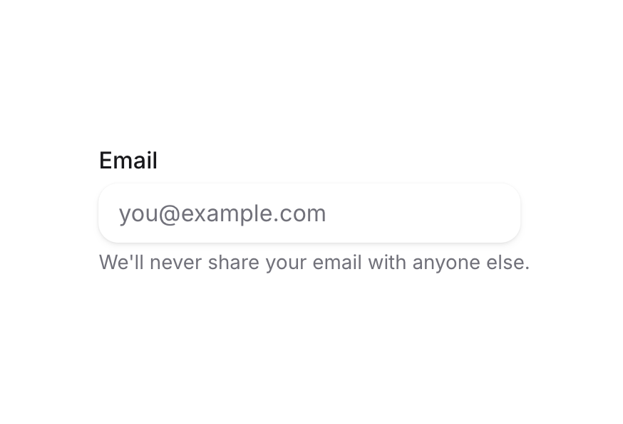
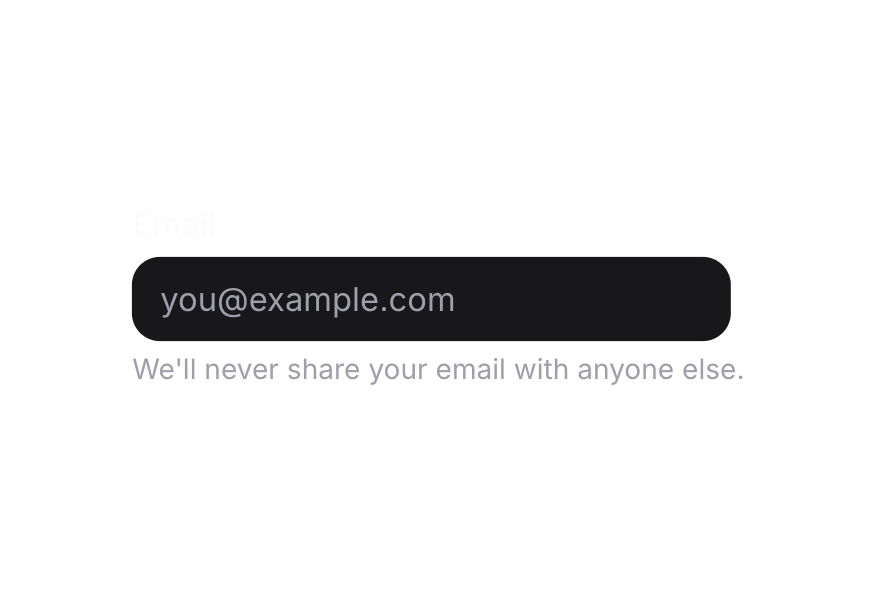
ColorField
Color input field with labels, descriptions, and validation
Usage
<script setup lang="ts">
import { ColorField, parseColor } from '@hareui/vue'
</script><script setup lang="ts">import { ColorField, ColorSwatch, parseColor } from '@hareui/vue'import { ref } from 'vue'const color = ref(parseColor('#0485F7'))</script><template> <ColorField v-model="color" class="w-[280px]" name="color" label="Color"> <template #prefix> <ColorSwatch :color="color" size="xs" /> </template> </ColorField></template>Anatomy
ColorField renders a Label, a group holding an optional prefix (e.g. a ColorSwatch), the input and an optional suffix, then a Description and a FieldError. The text parts come from props; each can be replaced with a slot.
<template>
  <ColorField label="…" description="…" error-message="…" :invalid="…">
    <template #label />        <!-- Label content -->
    <template #prefix />       <!-- content rendered before the input, e.g. a ColorSwatch -->
    <template #suffix />       <!-- content rendered after the input -->
    <template #description />  <!-- Description content -->
    <template #error />        <!-- FieldError content, rendered when invalid -->
  </ColorField>
</template>
ui key | data-slot | Element |
|---|---|---|
base | color-field | <div> root |
| — | label | Label (iff label / #label) |
group | color-input-group | <div role="group"> holding the prefix, input and suffix |
prefix | color-input-group-prefix | <span> (iff #prefix) |
input | color-input-group-input | <input> |
suffix | color-input-group-suffix | <span> (iff #suffix) |
| — | description | Description (iff description / #description) |
| — | field-error | FieldError (while invalid, iff error-message / #error / validation errors) |
ColorField combines a label, color input, description, and error into a single accessible component. It accepts a hex string or a
Colorobject (fromparseColor) and always commits aColorobject.
Examples
Variants
The ColorField component supports two visual variants:
primary(default) - Standard styling with shadow, suitable for most use casessecondary- Lower emphasis variant without shadow, suitable for use in surfaces
<script setup lang="ts">import { ColorField } from '@hareui/vue'</script><template> <div class="flex flex-col gap-4"> <ColorField class="w-[280px]" default-value="#0485F7" name="primary-color" label="Primary variant" variant="primary" /> <ColorField class="w-[280px]" default-value="#F43F5E" name="secondary-color" label="Secondary variant" variant="secondary" /> </div></template>On Surface
When used inside a Surface component, use variant="secondary" to apply the lower emphasis variant suitable for surface backgrounds.
<script setup lang="ts">import { ColorField, Surface } from '@hareui/vue'</script><template> <Surface class="w-[320px] p-4"> <ColorField default-value="#3B82F6" name="color" label="Theme Color" description="Select your theme color" variant="secondary" /> </Surface></template>With Description
<script setup lang="ts">import { ColorField } from '@hareui/vue'</script><template> <div class="flex flex-col gap-4"> <ColorField class="w-[280px]" default-value="#3B82F6" name="color" label="Primary Color" description="Enter your brand's primary color" /> <ColorField class="w-[280px]" default-value="#F59E0B" name="accent-color" label="Accent Color" description="Used for highlights and CTAs" /> </div></template>Required Field
<script setup lang="ts">import { ColorField } from '@hareui/vue'</script><template> <div class="flex flex-col gap-4"> <ColorField required class="w-[280px]" name="color" label="Brand Color" placeholder="#000000" /> <ColorField required class="w-[280px]" name="theme-color" label="Theme Color" placeholder="#000000" description="Required field" /> </div></template>Empty value and forms
Without v-model/default-value, or with a null model, the input is empty and shows its placeholder, as in HeroUI. Reka's ColorField always holds a colour internally, so an empty field still submits #000000 as its form value, and required can't block submitting an empty field. Validate with validate or check for a null model if you need to tell them apart.
Disabled State
<script setup lang="ts">import { ColorField } from '@hareui/vue'</script><template> <div class="flex flex-col gap-4"> <ColorField disabled class="w-[280px]" default-value="#0485F7" name="color" label="Color" description="This color field is disabled" /> <ColorField disabled class="w-[280px]" name="color-empty" label="Color" placeholder="#000000" description="This color field is disabled" /> </div></template>Full Width
<script setup lang="ts">import { ColorField } from '@hareui/vue'</script><template> <div class="w-[400px] space-y-4"> <ColorField full-width default-value="#10B981" name="color" label="Brand Color" /> <ColorField full-width default-value="#8B5CF6" name="color-with-suffix" label="Theme Color" /> </div></template>Validation
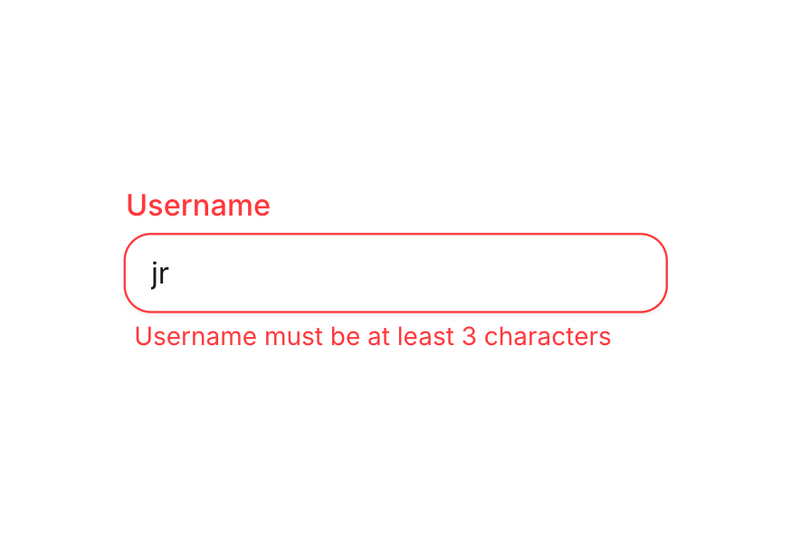
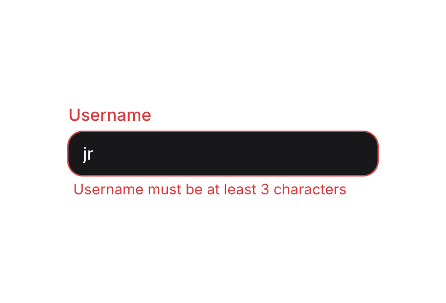
Set invalid with error-message to control the state yourself, or validate with required, a validate function, or a surrounding Form.
<script setup lang="ts">import { ColorField } from '@hareui/vue'</script><template> <div class="flex flex-col gap-4"> <ColorField invalid required class="w-[280px]" name="color" label="Color" placeholder="#000000" error-message="Please enter a valid hex color" /> <ColorField invalid class="w-[280px]" default-value="#000000" name="invalid-color" label="Background Color" error-message="Invalid color format. Use hex (e.g., #FF5733)" /> </div></template>Channel Editing
ColorField supports editing individual color channels (hue, saturation, lightness, red, green, blue, alpha) by setting the colorSpace and channel props.
Edit individual HSL channels:
<script setup lang="ts">import { ColorField, ColorSwatch, colorToString, parseColor } from '@hareui/vue'import { ref } from 'vue'const color = ref(parseColor('#7F007F'))</script><template> <div class="flex flex-col gap-4"> <p class="text-sm text-muted"> Edit individual HSL channels: </p> <div class="flex gap-4"> <ColorField v-model="color" channel="hue" color-space="hsl" class="w-[100px]" name="hue" label="Hue" /> <ColorField v-model="color" channel="saturation" color-space="hsl" class="w-[100px]" name="saturation" label="Saturation"> <template #suffix> <span class="text-sm text-muted">%</span> </template> </ColorField> <ColorField v-model="color" channel="lightness" color-space="hsl" class="w-[100px]" name="lightness" label="Lightness"> <template #suffix> <span class="text-sm text-muted">%</span> </template> </ColorField> </div> <div class="flex items-center gap-2"> <ColorSwatch :color="color" size="md" /> <span class="text-sm">Current: {{ colorToString(color, 'hex') }}</span> </div> </div></template>Controlled
Bind the value with v-model to synchronize with other components or state management. The committed value is a Color object, or null when the input is cleared (set the model to null to clear it). Use colorToString(color, 'hex') to read it as a string.
<script setup lang="ts">import type { Color } from '@hareui/vue'import { Button, ColorField, ColorSwatch, colorToString, parseColor } from '@hareui/vue'import { ref } from 'vue'const value = ref<Color | null>(parseColor('#0485F7'))</script><template> <div class="flex flex-col gap-4"> <ColorField v-model="value" class="w-[280px]" name="color" label="Color" :description="`Current value: ${value ? colorToString(value, 'hex') : '(empty)'}`" > <template #prefix> <ColorSwatch :color="value ?? undefined" size="xs" /> </template> </ColorField> <div class="flex gap-2"> <Button variant="tertiary" @click="value = parseColor('#EF4444')"> Set Red </Button> <Button variant="tertiary" @click="value = parseColor('#10B981')"> Set Green </Button> <Button variant="tertiary" @click="value = null"> Clear </Button> </div> </div></template>Form Example
Complete form example with validation and submission handling.
<script setup lang="ts">import type { Color } from '@hareui/vue'import { Button, ColorField, ColorSwatch, Form, colorToString } from '@hareui/vue'import { ref } from 'vue'const value = ref<Color>()const isSubmitting = ref(false)function handleSubmit(e: Event) { e.preventDefault() if (!value.value) return isSubmitting.value = true // Simulate API call setTimeout(() => { console.log('Color submitted:', { color: colorToString(value.value!, 'hex') }) value.value = undefined isSubmitting.value = false }, 1500)}</script><template> <Form class="flex w-[280px] flex-col gap-4" @submit="handleSubmit"> <ColorField v-model="value" full-width required class="w-full" name="brand-color" label="Brand Color" placeholder="#000000" description="Choose your brand's primary color" > <template #prefix> <ColorSwatch :color="value" size="xs" /> </template> </ColorField> <Button class="w-full" :disabled="!value" :pending="isSubmitting" type="submit" variant="primary" > {{ isSubmitting ? 'Saving...' : 'Save Color' }} </Button> </Form></template>Render Function
HeroUI's render prop replaces the root element. In Vue, attributes you pass to ColorField (other than aria-label / aria-labelledby, which go to the input) fall through to the root div.
<script setup lang="ts">import { ColorField, ColorSwatch, parseColor } from '@hareui/vue'import { ref } from 'vue'const color = ref(parseColor('#0485F7'))</script><template> <!-- Attributes other than aria-label/aria-labelledby fall through to the root element (HeroUI's `render` prop) --> <ColorField v-model="color" class="w-[280px]" data-custom="foo" name="color" label="Color" > <template #prefix> <ColorSwatch :color="color" size="xs" /> </template> </ColorField></template>Customization
Tailwind CSS
<script setup lang="ts">import { ColorField, ColorSwatch, parseColor } from '@hareui/vue'import { ref } from 'vue'const color = ref(parseColor('#6366F1'))</script><template> <ColorField v-model="color" class="w-full max-w-xs gap-1.5" name="accent-color" label="Accent color" description="Applied to buttons, links, and focus rings." :ui="{ base: '[&_[data-slot=label]]:font-medium [&_[data-slot=label]]:text-foreground', group: 'rounded-xl bg-default shadow-none focus-within:ring-2 focus-within:ring-accent/15', input: 'font-mono text-sm text-foreground placeholder:text-muted', }" variant="secondary" > <template #prefix> <ColorSwatch class="rounded-md" :color="color" size="xs" /> </template> </ColorField></template>Global Configuration
app.use(createHareUI({
  ui: { colorField: { slots: { group: 'rounded-xl', input: 'font-mono' } } },
}))
Styling Reference
Slots
base→[data-slot="color-field"]– root container (flex flex-col gap-1)group→[data-slot="color-input-group"]– container for the prefix, input and suffix, with border and background stylingprefix→[data-slot="color-input-group-prefix"]– content before the input, e.g. aColorSwatchinput→[data-slot="color-input-group-input"]– the text inputsuffix→[data-slot="color-input-group-suffix"]– content after the input
Note: The child components (Label, Description, FieldError) have their own themes. See their respective pages for customization options.
Interactive States
ColorField sets these data attributes:
- Invalid:
[data-invalid="true"]on the root and the group - Automatically hides the description when invalid - Disabled:
[data-disabled="true"]on the root,[data-disabled]on the group and input - Required:
[data-required="true"]on the root - Shows the label's required asterisk - Read Only:
[data-readonly="true"]on the root,[data-readonly]on the group and input - Focus Within:
[data-focus-within="true"]on the group - Applied when the input is focused - Focus Visible:
[data-focus-visible="true"]on the group - Applied when focus is visible (keyboard navigation)
API Reference
Props
| Prop | Type | Default | Description |
|---|---|---|---|
label | string | - | Label text rendered above the field. |
description | string | - | Helper text rendered below the field. Hidden while the field is invalid. |
errorMessage | string | - | Error message rendered below the field while invalid. Defaults to the validation errors. |
id | string | useId() | The id of the input; label, description and error ids derive from it. |
name | string | - | The name of the field, used when submitting a form. |
placeholder | string | - | Temporary text shown when the input is empty. |
modelValue | string | Color | null | - | The committed color (controlled). A hex string or a Reka Color object; null shows an empty
input. Falls back to the enclosing ColorPicker's color when neither this nor v-model is set. |
defaultValue | string | Color | - | The initial value when uncontrolled (no v-model) and outside a ColorPicker. When omitted the
input starts empty (the submitted form value is still #000000). |
colorSpace | ColorSpace | - | The color space to operate in when channel is set. |
channel | ColorChannel | - | The color channel to edit (e.g. 'hue', 'red', 'alpha'). If unset, edits the hex value. |
locale | string | - | Locale used to format and parse channel numbers. Defaults to the ConfigProvider locale. |
step | number | - | Custom step for increment/decrement. Defaults to the channel's natural step, or 1 for hex. |
disableWheelChange | boolean | false | Whether changing the value with the mouse wheel is disabled. |
variant | "primary" | "secondary" | 'primary' | Visual variant of the group. |
fullWidth | boolean | false | Whether the field takes the full width of its container. |
disabled | boolean | false | Whether the field is disabled. |
invalid | boolean | undefined | Whether the field is invalid. Overrides validation when set. |
required | boolean | false | Whether the field is required. |
readonly | boolean | false | Whether the value can be selected but not changed. |
validate | ValidateFn<Color> | - | Validates the committed color. Return an error message (or several) when invalid. |
validationBehavior | ValidationBehavior | 'native' | native blocks form submission and shows errors on commit or submit; aria shows errors in realtime.
Defaults to the surrounding Form. |
ui | ComponentSlots<{ slots: { base: string; group: string[]; input: string[]; prefix: string; suffix: string; }; variants: { variant: { primary: { base: string; }; secondary: { group: string[]; input: string; }; }; fullWidth: { false: { base: string; group: string; }; true: { base: string; group: string; }; }; }; defaultVariants: { fullWidth: boolean; variant: string; }; }> | - | Per-slot class overrides. |
Slots
| Slot | Props | Description |
|---|---|---|
label | any | Label content. Replaces the label prop. |
prefix | any | Content rendered before the input, e.g. a ColorSwatch. |
suffix | any | Content rendered after the input, e.g. a unit label. |
description | any | Description content. Replaces the description prop. |
error | ValidationResult | Error content, rendered while invalid. Replaces the errorMessage prop. |
Emits
| Event | Payload | Description |
|---|---|---|
update:modelValue | [value: string | Color | null] | - |
Accessibility
- The label's
forpoints to the input id (auto-generated withuseId()unlessidis set) - The input's
aria-describedbylists the ids of the rendered description (<id>-description) and error (<id>-error) invalidsetsaria-invalid="true"on the input; the error is announced viarole="alert"- Keyboard: ↑/↓ step the hex value or the active channel, Enter commits typed text, mouse wheel steps the value unless
disableWheelChangeis set