Separator
Visually divide content sections
Usage
import { Separator } from '@hareui/vue'HeroUI v3 Components
Beautiful, fast and modern React UI library.
Blog
Docs
Source
<script setup lang="ts">import { Separator } from '@hareui/vue'</script><template> <div class="max-w-md"> <div class="space-y-1"> <h4 class="text-medium font-medium">HeroUI v3 Components</h4> <p class="text-small text-default-400">Beautiful, fast and modern React UI library.</p> </div> <Separator class="my-4" /> <div class="text-small flex h-5 items-center space-x-4"> <div>Blog</div> <Separator orientation="vertical" /> <div>Docs</div> <Separator orientation="vertical" /> <div>Source</div> </div> </div></template>Examples
Variants
Default Variant
Secondary Variant
Tertiary Variant
<script setup lang="ts">import { Separator } from '@hareui/vue'</script><template> <div class="flex max-w-md flex-col items-center gap-3"> <div>Default Variant</div> <Separator variant="default" /> <div>Secondary Variant</div> <Separator variant="secondary" /> <div>Tertiary Variant</div> <Separator variant="tertiary" /> </div></template>With Surface
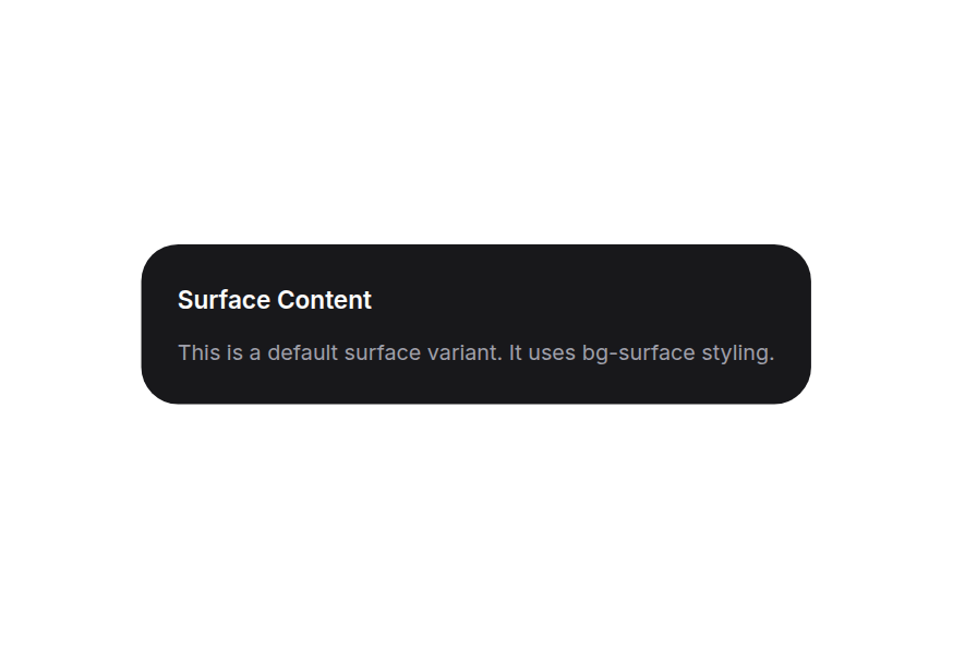
The Separator component adapts to different surface backgrounds for better visibility.
Default Surface
Surface Content
Secondary Surface
Surface Content
Tertiary Surface
Surface Content
Transparent Surface
Surface Content
<script setup lang="ts">import { Separator, Surface } from '@hareui/vue'</script><template> <div class="flex flex-col gap-8"> <div class="flex flex-col gap-2"> <Surface class="flex min-w-[320px] flex-col gap-3 rounded-3xl p-6" variant="default"> <h3 class="text-base font-semibold text-foreground">Default Surface</h3> <Separator /> <p class="text-sm text-muted">Surface Content</p> </Surface> </div> <div class="flex flex-col gap-2"> <Surface class="flex min-w-[320px] flex-col gap-3 rounded-3xl p-6" variant="secondary"> <h3 class="text-base font-semibold text-foreground">Secondary Surface</h3> <Separator variant="secondary" /> <p class="text-sm text-muted">Surface Content</p> </Surface> </div> <div class="flex flex-col gap-2"> <Surface class="flex min-w-[320px] flex-col gap-3 rounded-3xl p-6" variant="tertiary"> <h3 class="text-base font-semibold text-foreground">Tertiary Surface</h3> <Separator variant="tertiary" /> <p class="text-sm text-muted">Surface Content</p> </Surface> </div> <div class="flex flex-col gap-2"> <Surface class="flex min-w-[320px] flex-col gap-3 rounded-3xl border p-6" variant="transparent"> <h3 class="text-base font-semibold text-foreground">Transparent Surface</h3> <Separator /> <p class="text-sm text-muted">Surface Content</p> </Surface> </div> </div></template>Vertical
Blog
Docs
Source
<script setup lang="ts">import { Separator } from '@hareui/vue'</script><template> <div class="text-small flex h-5 items-center space-x-4"> <div>Blog</div> <Separator orientation="vertical" /> <div>Docs</div> <Separator orientation="vertical" /> <div>Source</div> </div></template>With Content

Set Up Notifications
Receive account activity updates

Set up Browser Extension
Connect your browser to your account

Mint Collectible
Create your first collectible
<script setup lang="ts">import { Separator } from '@hareui/vue'const items = [ { iconUrl: 'https://heroui-assets.nyc3.cdn.digitaloceanspaces.com/docs/3dicons/bell-small.png', subtitle: 'Receive account activity updates', title: 'Set Up Notifications', }, { iconUrl: 'https://heroui-assets.nyc3.cdn.digitaloceanspaces.com/docs/3dicons/compass-small.png', subtitle: 'Connect your browser to your account', title: 'Set up Browser Extension', }, { iconUrl: 'https://heroui-assets.nyc3.cdn.digitaloceanspaces.com/docs/3dicons/mint-collective-small.png', subtitle: 'Create your first collectible', title: 'Mint Collectible', },]</script><template> <div class="max-w-md space-y-4"> <div v-for="(item, index) in items" :key="item.title"> <div class="flex items-center gap-3"> <img :alt="item.title" class="size-12" :src="item.iconUrl"> <div class="flex-1 space-y-0"> <h4 class="text-small font-medium">{{ item.title }}</h4> <p class="text-sm text-muted">{{ item.subtitle }}</p> </div> </div> <Separator v-if="index < items.length - 1" class="my-4" /> </div> </div></template>Render Function
HeroUI v3 Components
Beautiful, fast and modern React UI library.
Blog
Docs
Source
<script setup lang="ts">import { Separator } from '@hareui/vue'import { defineComponent, h } from 'vue'const CustomDiv = defineComponent((_, { attrs, slots }) => () => h('div', { ...attrs, 'data-custom': 'foo' }, slots.default?.()))</script><template> <div class="max-w-md"> <div class="space-y-1"> <h4 class="text-medium font-medium"> HeroUI v3 Components </h4> <p class="text-small text-default-400"> Beautiful, fast and modern React UI library. </p> </div> <Separator class="my-4" :as="CustomDiv" /> <div class="text-small flex h-5 items-center space-x-4"> <div>Blog</div> <Separator orientation="vertical" :as="CustomDiv" /> <div>Docs</div> <Separator orientation="vertical" :as="CustomDiv" /> <div>Source</div> </div> </div></template>Customization
Tailwind CSS
Account settings
ProfileBillingSecurity
<script setup lang="ts">import { Separator } from '@hareui/vue'</script><template> <div class="max-w-xs space-y-4"> <p class="text-sm font-medium text-foreground">Account settings</p> <Separator class="bg-separator-secondary" /> <div class="flex items-center gap-3 text-sm text-muted"> <span>Profile</span> <Separator class="h-4 bg-separator" orientation="vertical" /> <span>Billing</span> <Separator class="h-4 bg-separator" orientation="vertical" /> <span>Security</span> </div> </div></template>Global theme override
Override the separator theme app-wide with createHareUI:
app.use(createHareUI({
  ui: {
    separator: {
      slots: { base: 'bg-accent h-[2px]' },
      variants: {
        orientation: { vertical: { base: 'bg-accent w-[2px]' } },
      },
    },
  },
}))
Styling Reference
Each rendered element carries the same data-slot string as HeroUI, so selectors translate 1:1.
ui key | data-slot | Description |
|---|---|---|
base | separator | The separator element |
HeroUI's modifier classes correspond to these props (HareUI renders utilities, not BEM classes, so style through class, ui or createHareUI):
orientation:horizontal(default, full width / 1px height),vertical(full height / 1px width)variant:default(standard contrast),secondary(medium contrast),tertiary(subtle contrast)
API Reference
Props
| Prop | Type | Default | Description |
|---|---|---|---|
as | AsTag | Component | 'div' | The element or component to render as. |
orientation | "horizontal" | "vertical" | 'horizontal' | The orientation of the separator. Inside a Toolbar it defaults to the one perpendicular to the toolbar. |
variant | "default" | "secondary" | "tertiary" | 'default' | The visual variant of the separator. |
ui | ComponentSlots<{ slots: { base: string; }; variants: { orientation: { horizontal: { base: string; }; vertical: { base: string; }; }; variant: { default: { base: string; }; secondary: { base: string; }; tertiary: { base: string; }; }; }; defaultVariants: { orientation: string; variant: string; }; }> | - | Per-slot class overrides. |
Slots
| Slot | Props | Description |
|---|---|---|
default | any | Content rendered inside the separator (uncommon; HeroUI's separator is normally empty). |