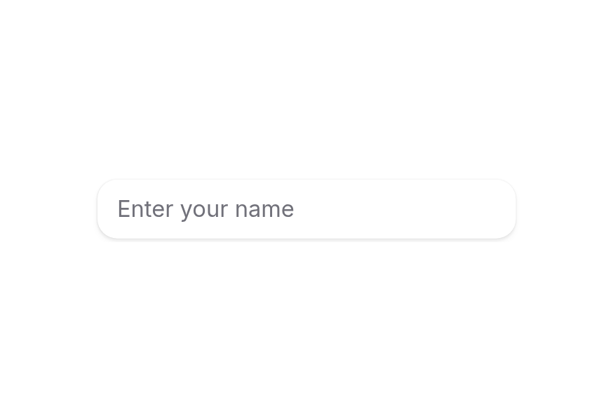
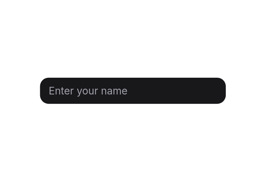
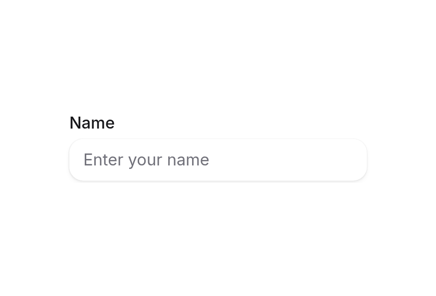
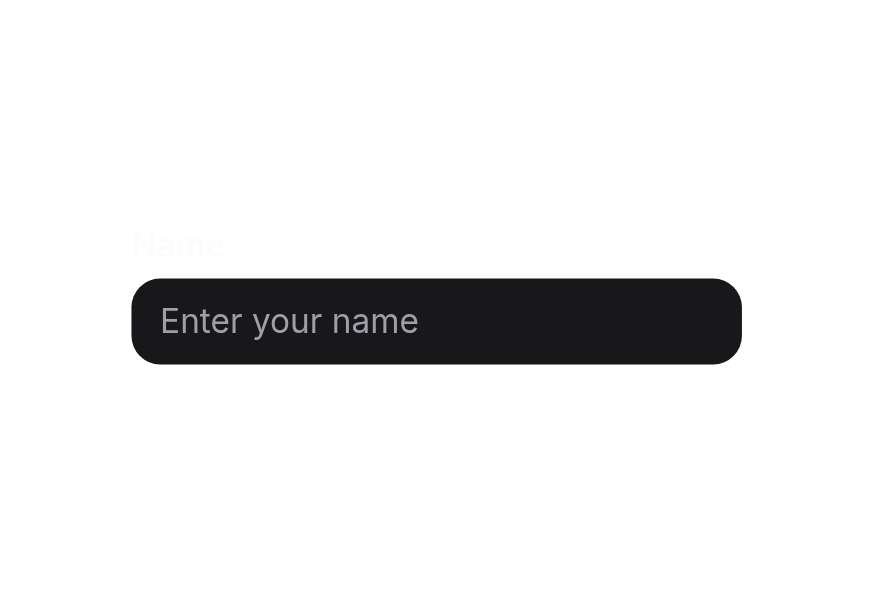
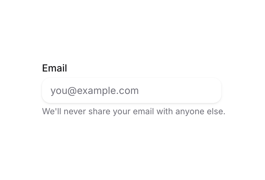
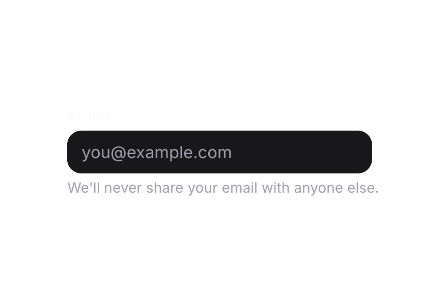
TextField
Composition-friendly text fields with labels, descriptions, and inline validation
Usage
<script setup lang="ts">
import { TextField } from '@hareui/vue'
</script><script setup lang="ts">import { TextField } from '@hareui/vue'</script><template> <TextField class="w-full max-w-64" label="Email" name="email" placeholder="Enter your email" type="email" /></template>Anatomy
TextField renders a Label, an Input, a Description and a FieldError from props; each part can be replaced with a slot.
<template>
  <TextField label="…" description="…" error-message="…" :invalid="…">
    <template #label />        <!-- Label content -->
    <template #default="{ id, describedBy, invalid, disabled, required, readonly, focusWithin, focusVisible }" /> <!-- replaces the Input -->
    <template #description />  <!-- Description content -->
    <template #error="{ isInvalid, validationErrors, validationDetails }" /> <!-- FieldError content, rendered while invalid -->
  </TextField>
</template>
ui key | data-slot | Element |
|---|---|---|
base | textfield | <div> root |
| — | label | Label (iff label / #label) |
| — | input | Input (default slot) |
| — | description | Description (iff description / #description) |
| — | field-error | FieldError (while invalid, iff error-message / #error / validation errors) |
TextField combines label, input, description, and error into a single accessible component. For standalone inputs, use Input.
Examples
In Surface
When used inside a surface (HeroUI's Surface, here a bg-surface container), use variant="secondary" on the TextField or its Input to apply the lower emphasis variant suitable for surface backgrounds.
<script setup lang="ts">import { Input, Surface, TextArea, TextField } from '@hareui/vue'</script><template> <Surface class="flex w-full min-w-[340px] flex-col gap-4 rounded-3xl p-6"> <TextField name="name" variant="secondary" label="Your name" description="We'll never share this with anyone else"> <Input class="w-full" placeholder="John" /> </TextField> <TextField name="email" type="email" variant="secondary" label="Email"> <Input class="w-full" placeholder="[email protected]" /> </TextField> <TextField name="bio" variant="secondary" label="Bio" description="Minimum 4 rows"> <TextArea class="w-full" placeholder="Tell us about yourself..." :rows="4" /> </TextField> </Surface></template>With Description
<script setup lang="ts">import { TextField } from '@hareui/vue'</script><template> <TextField class="w-full max-w-64" label="Username" name="username" placeholder="Enter username" description="Choose a unique username for your account" /></template>Required Field
<script setup lang="ts">import { TextField } from '@hareui/vue'</script><template> <TextField required class="w-full max-w-64" label="Full Name" name="fullName" placeholder="John Doe" description="This field is required" /></template>Disabled State
<script setup lang="ts">import { TextField } from '@hareui/vue'</script><template> <TextField disabled class="w-full max-w-64" name="accountId" model-value="USR-12345" label="Account ID" placeholder="Auto-generated" description="This field cannot be edited" /></template>Full Width
<script setup lang="ts">import { TextField } from '@hareui/vue'</script><template> <div class="w-[400px] space-y-4"> <TextField full-width label="Your name" name="name" placeholder="John" /> <TextField full-width invalid required label="Password" name="password" type="password" error-message="Password must be longer than 8 characters" /> </div></template>Validation
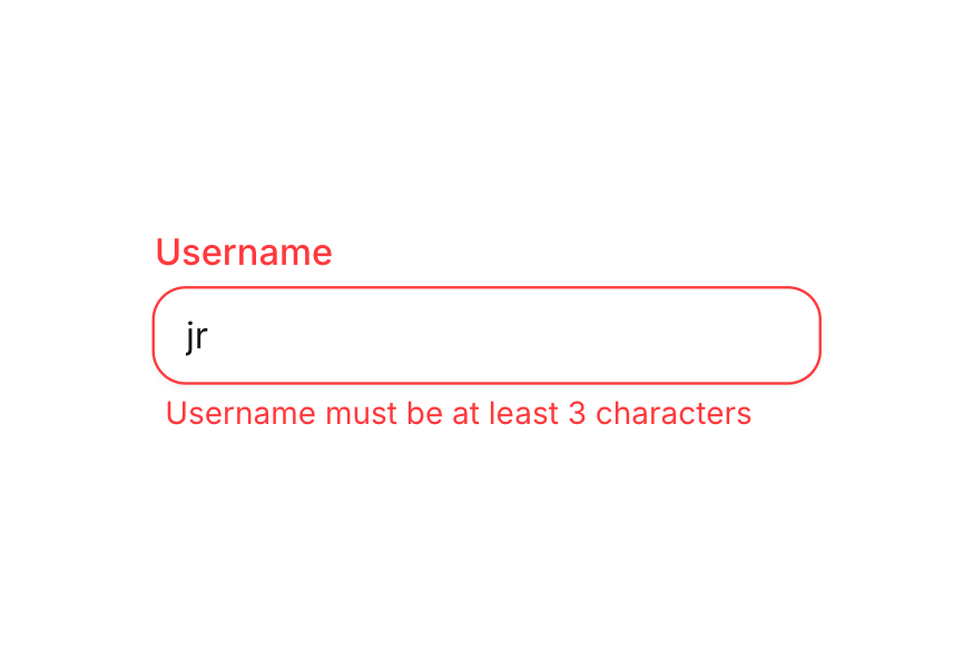
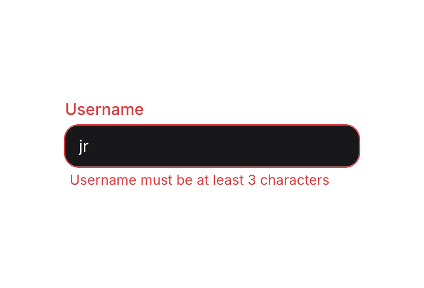
Use invalid together with error-message to control the state yourself, or let the field validate: native attributes (required, minlength, pattern, …) and a validate function, inside a Form or on their own. Without error-message, the field shows the validation errors.
<script setup lang="ts">import { TextArea, TextField } from '@hareui/vue'import { computed, ref } from 'vue'const username = ref('')const bio = ref('')const usernameInvalid = computed(() => username.value.length > 0 && username.value.length < 3)const bioInvalid = computed(() => bio.value.length > 0 && bio.value.length < 20)</script><template> <div class="flex w-full max-w-64 flex-col gap-4"> <TextField v-model="username" required :invalid="usernameInvalid" label="Username" name="username" placeholder="jane_doe" :description="usernameInvalid ? undefined : 'Choose a unique username for your profile.'" error-message="Username must be at least 3 characters." /> <TextField v-model="bio" required :invalid="bioInvalid" label="Bio" name="bio" :description="bioInvalid ? undefined : `Minimum 20 characters (${bio.length}/20).`" error-message="Bio must contain at least 20 characters." > <TextArea placeholder="Tell us about yourself..." /> </TextField> </div></template>Controlled
Bind the value with v-model to synchronize counters, previews, or formatting.
<script setup lang="ts">import { TextArea, TextField } from '@hareui/vue'import { ref } from 'vue'const name = ref('')const bio = ref('')</script><template> <div class="flex w-full max-w-64 flex-col gap-4"> <TextField v-model="name" label="Display name" name="name" placeholder="Jane" :description="`Characters: ${name.length}`" /> <TextField v-model="bio" label="Bio" name="bio" :description="`Characters: ${bio.length} / 200`" > <TextArea placeholder="Tell us about yourself..." /> </TextField> </div></template>Error Message
<script setup lang="ts">import { TextField } from '@hareui/vue'</script><template> <TextField invalid class="w-full max-w-64" label="Email" name="email" placeholder="[email protected]" type="email" error-message="Please enter a valid email address" /></template>TextArea
Use TextArea instead of Input for multiline content.
<script setup lang="ts">import { TextArea, TextField } from '@hareui/vue'</script><template> <TextField class="w-full max-w-64" name="message" label="Message" description="Maximum 500 characters"> <TextArea placeholder="Write your message here..." :rows="4" /> </TextField></template>Input Types
<script setup lang="ts">import { Input, TextField } from '@hareui/vue'</script><template> <div class="flex w-full max-w-64 flex-col gap-4"> <TextField label="Password" name="password" placeholder="••••••••" type="password" /> <TextField label="Age" name="age"> <Input max="150" min="0" name="age" placeholder="21" type="number" /> </TextField> <TextField label="Email" name="email" placeholder="[email protected]" type="email" /> <TextField label="Website" name="website" placeholder="https://example.com" type="url" /> <TextField label="Phone" name="phone" placeholder="+1 (555) 000-0000" type="tel" /> </div></template>Render Function
HeroUI's render prop replaces the root element. In Vue, attributes you pass to TextField (other than aria-label / aria-labelledby, which go to the input) fall through to the root div; render your own markup through the default slot.
<script setup lang="ts">import { TextField } from '@hareui/vue'</script><template> <!-- Attributes other than aria-label/aria-labelledby fall through to the root element (HeroUI's `render` prop) --> <TextField class="w-full max-w-64" data-custom="foo" label="Email" name="email" placeholder="Enter your email" type="email" /></template>Customization
Tailwind CSS
Use the default slot to render your own Label and Input with custom classes; Inputs inside the slot still read the field's id and state.
<script setup lang="ts">import { Input, Label, TextField } from '@hareui/vue'const fieldClass = 'rounded-xl border border-border/80 bg-surface shadow-sm ring-1 ring-black/5 transition-[box-shadow,border-color] focus-visible:ring-2 focus-visible:ring-neutral-400/25 dark:ring-white/10 dark:focus-visible:ring-neutral-500/30'</script><template> <TextField class="w-full max-w-64 gap-1.5" name="email"> <template #default="{ id }"> <Label :for="id" class="font-medium text-neutral-800 dark:text-neutral-100"> Email </Label> <Input type="email" name="email" :class="['text-sm text-neutral-800 placeholder:text-neutral-400 dark:text-neutral-100 dark:placeholder:text-neutral-500', fieldClass]" placeholder="[email protected]" /> </template> </TextField></template>Global Configuration
app.use(createHareUI({
  ui: { textField: { slots: { base: 'gap-2' } } },
}))
Styling Reference
Slots
base→[data-slot="textfield"]– root container (flex flex-col gap-1)
Note: The child components (Label, Input, Description, FieldError) have their own themes. See their respective pages for customization options.
Interactive States
TextField sets these data attributes on its root:
- Invalid:
[data-invalid="true"]- Automatically hides the description when invalid - Disabled:
[data-disabled="true"] - Required:
[data-required="true"]- Shows the label's required asterisk - Read Only:
[data-readonly="true"]- Applied whenreadonlyis true - Focus Within:
[data-focus-within="true"]- Applied when any child input is focused - Focus Visible:
[data-focus-visible="true"]- Applied when focus is visible (keyboard navigation)
API Reference
Props
| Prop | Type | Default | Description |
|---|---|---|---|
label | string | - | Label text rendered above the input. |
description | string | - | Helper text rendered below the input. Hidden while the field is invalid. |
errorMessage | string | - | Error message rendered below the input while invalid. Defaults to the validation errors. |
id | string | useId() | The id of the input; label, description and error ids derive from it. |
name | string | - | The name of the input, used when submitting a form. |
type | string | "text" | The native input type. |
placeholder | string | - | Temporary text shown when the input is empty. |
defaultValue | string | number | - | The initial value when uncontrolled (no v-model). |
variant | "primary" | "secondary" | 'primary' | Visual variant of the input. |
fullWidth | boolean | false | Whether the field takes the full width of its container. |
disabled | boolean | false | Whether the field is disabled. |
invalid | boolean | undefined | Whether the field is invalid. Overrides validation when set. |
required | boolean | false | Whether the field is required. |
readonly | boolean | false | Whether the input can be selected but not changed. |
validate | ValidateFn<string | number> | - | Validates the value. Return an error message (or several) when invalid, true/null/undefined when valid. |
validationBehavior | ValidationBehavior | 'native' | native blocks form submission and shows errors on change or submit; aria shows errors in realtime.
Defaults to the surrounding Form. |
ui | ComponentSlots<{ slots: { base: string; }; variants: { fullWidth: { false: { base: string; }; true: { base: string; }; }; }; defaultVariants: { fullWidth: boolean; }; }> | - | Per-slot class overrides. |
modelValue | string | number | - | The input value. |
Slots
| Slot | Props | Description |
|---|---|---|
label | any | Label content. Replaces the label prop. |
default | TextFieldSlotProps | Control slot. Replaces the default Input (e.g. an Input with custom props); Inputs inside read the field context. |
description | any | Description content. Replaces the description prop. |
error | ValidationResult | Error content, rendered while invalid. Replaces the errorMessage prop. |
Emits
| Event | Payload | Description |
|---|---|---|
update:modelValue | [value: string | number | undefined] | - |
Render Props
The default slot receives the field state, the Vue equivalent of HeroUI's render props:
| Prop | Type | Description |
|---|---|---|
id | string | Id of the field's input. |
describedBy | string | undefined | Ids of the rendered description and error. |
disabled | boolean | Whether the field is disabled. |
invalid | boolean | Whether the field is currently invalid. |
readonly | boolean | Whether the field is read-only. |
required | boolean | Whether the field is required. |
focusWithin | boolean | Whether any child element is focused. |
focusVisible | boolean | Whether focus is visible (keyboard navigation). |
Accessibility
- The label's
forpoints to the input id (auto-generated withuseId()unlessidis set) - The input's
aria-describedbylists the ids of the rendered description (<id>-description) and error (<id>-error) invalidsetsaria-invalid="true"on the input; the error is announced viarole="alert"requiredanddisabledset the native attributes on the input