Card
Flexible container component for grouping related content and actions
Usage
import { Card } from '@hareui/vue'Become an Acme Creator!
Visit the Acme Creator Hub to sign up today and start earning credits from your fans and followers.
<script setup lang="ts">import { Card, Link } from '@hareui/vue'import { Icon } from '@iconify/vue'</script><template> <Card class="w-[400px]" description="Visit the Acme Creator Hub to sign up today and start earning credits from your fans and followers." title="Become an Acme Creator!" > <template #leading> <Icon aria-label="Dollar sign icon" class="size-6" icon="gravity-ui:circle-dollar" role="img" /> </template> <template #footer> <Link aria-label="Go to Acme Creator Hub (opens in new tab)" href="https://heroui.com" rel="noopener noreferrer" target="_blank" icon > Creator Hub </Link> </template> </Card></template>Anatomy
HeroUI's compound parts (Card.Header, Card.Title, Card.Description, Card.Content, Card.Footer) become props and named slots, rendered in a fixed order: #leading, header, content (default slot), then #footer.
<Card title="…" description="…">
  <template #leading /> <!-- unwrapped children before the header (icon, image, background) -->
  <template #header /> <!-- or: replaces title + description -->
  <template #title /> <!-- or: replaces the title text -->
  <template #description /> <!-- or: replaces the description text -->
  <!-- default slot = Card.Content -->
  <template #footer />
</Card>- The header renders only when the
title/descriptionprops or the#header/#title/#descriptionslots are provided. - The content wrapper renders only when the default slot is used; the footer only when
#footeris used. #leadingrenders its children directly inside the root, without a wrapper, so they become flex items of the card (like the plain children HeroUI places beforeCard.Header).
ui keys: base, header, title, description, content, footer.
Examples
Variants
Cards come in semantic variants that describe their prominence level rather than specific visual styles. This allows themes to interpret them differently:
Transparent
Minimal prominence with transparent background
Use for less important content or nested cards
Default
Standard card appearance (bg-surface)
The default card variant for most use cases
Secondary
Medium prominence (bg-surface-secondary)
Use to draw moderate attention
Tertiary
Higher prominence (bg-surface-tertiary)
Use for primary or featured content
<script setup lang="ts">import { Card } from '@hareui/vue'</script><template> <div class="flex flex-col gap-4"> <Card class="w-[320px]" description="Minimal prominence with transparent background" title="Transparent" variant="transparent"> <p>Use for less important content or nested cards</p> </Card> <Card class="w-[320px]" description="Standard card appearance (bg-surface)" title="Default" variant="default"> <p>The default card variant for most use cases</p> </Card> <Card class="w-[320px]" description="Medium prominence (bg-surface-secondary)" title="Secondary" variant="secondary"> <p>Use to draw moderate attention</p> </Card> <Card class="w-[320px]" description="Higher prominence (bg-surface-tertiary)" title="Tertiary" variant="tertiary"> <p>Use for primary or featured content</p> </Card> </div></template>transparent- Minimal prominence, transparent background (great for nested cards)default- Standard card for most use cases (bg-surface)secondary- Medium prominence to draw moderate attention (bg-surface-secondary)tertiary- Higher prominence for important content (bg-surface-tertiary)
Horizontal Layout
Put the media in #leading and the rest in the default slot: the root gets two flex items, so md:flex-row lays them out side by side. :ui="{ content: 'gap-3' }" turns the content wrapper into the right-hand column.
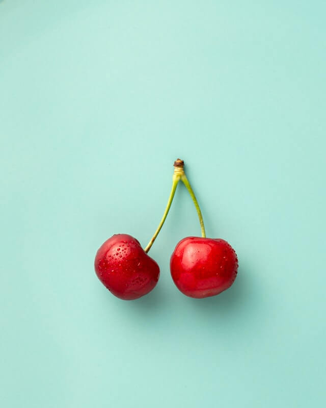
Become an ACME Creator!
Lorem ipsum dolor sit amet consectetur. Sed arcu donec id aliquam dolor sed amet faucibus etiam.
<script setup lang="ts">import { Button, Card, CloseButton } from '@hareui/vue'</script><template> <!-- #leading and the content wrapper become the two columns of the md:flex-row root --> <Card class="w-full items-stretch md:flex-row" :ui="{ content: 'gap-3' }"> <template #leading> <div class="relative h-[140px] w-full shrink-0 overflow-hidden rounded-2xl sm:h-[120px] sm:w-[120px]"> <img alt="Cherries" class="pointer-events-none absolute inset-0 h-full w-full scale-125 object-cover select-none" loading="lazy" src="https://heroui-assets.nyc3.cdn.digitaloceanspaces.com/docs/cherries.jpeg" /> </div> </template> <div class="flex flex-col gap-1"> <h3 class="pe-8 text-sm leading-6 font-medium text-foreground">Become an ACME Creator!</h3> <p class="text-sm leading-5 text-muted"> Lorem ipsum dolor sit amet consectetur. Sed arcu donec id aliquam dolor sed amet faucibus etiam. </p> <CloseButton aria-label="Close banner" class="absolute end-3 top-3" /> </div> <div class="mt-auto flex w-full flex-col items-start gap-3 sm:flex-row sm:items-center sm:justify-between"> <div class="flex flex-col"> <span class="text-sm font-medium text-foreground">Only 10 spots</span> <span class="text-xs text-muted">Submission ends Oct 10.</span> </div> <Button class="w-full sm:w-auto">Apply Now</Button> </div> </Card></template>With Avatar

Indie Hackers
148 members

AI Builders
362 members

<script setup lang="ts">import { Avatar, Card } from '@hareui/vue'</script><template> <div class="flex flex-wrap gap-4"> <Card class="w-[200px] gap-2" description="148 members" title="Indie Hackers" :ui="{ footer: 'flex gap-2' }"> <template #leading> <img alt="Indie Hackers community" class="pointer-events-none aspect-square w-14 rounded-2xl object-cover select-none" loading="lazy" src="https://heroui-assets.nyc3.cdn.digitaloceanspaces.com/docs/demo1.jpg" /> </template> <template #footer> <Avatar alt="Martha's avatar" aria-label="Martha's profile picture" class="size-5" fallback="IH" src="https://heroui-assets.nyc3.cdn.digitaloceanspaces.com/avatars/red.jpg" :ui="{ fallback: 'text-xs' }" /> <span class="text-xs">By Martha</span> </template> </Card> <Card class="w-[200px] gap-2" description="362 members" title="AI Builders" :ui="{ footer: 'flex gap-2' }"> <template #leading> <img alt="AI Builders community" class="pointer-events-none aspect-square w-14 rounded-2xl object-cover select-none" loading="lazy" src="https://heroui-assets.nyc3.cdn.digitaloceanspaces.com/docs/demo2.jpg" /> </template> <template #footer> <Avatar alt="John's avatar - blue themed" aria-label="John's profile picture" class="size-5" fallback="B" src="https://heroui-assets.nyc3.cdn.digitaloceanspaces.com/avatars/blue.jpg" :ui="{ fallback: 'text-xs' }" /> <span class="text-xs">By John</span> </template> </Card> </div></template>With Images
Become an ACME Creator!
Lorem ipsum dolor sit amet consectetur. Sed arcu donec id aliquam dolor sed amet faucibus etiam.
You can now withdraw on crypto
Add your wallet in settings to withdraw
Indie Hackers
148 members
By John
AI Builders
362 members
By Martha
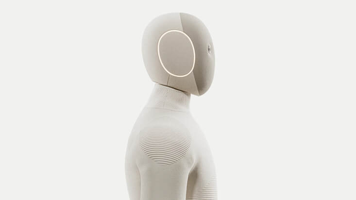
NEO
Home Robot
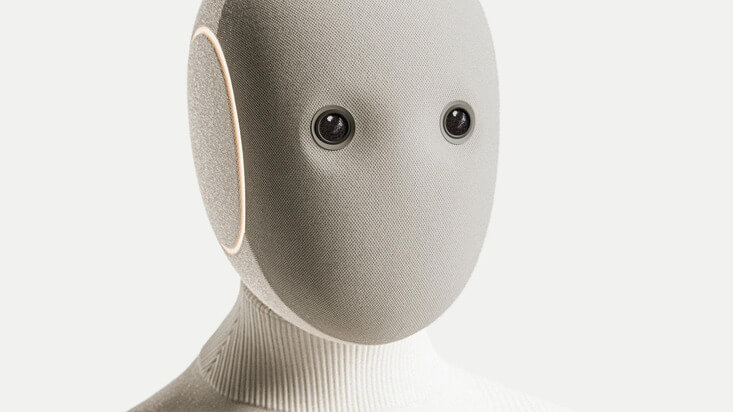

Bridging the Future
Today, 6:30 PM
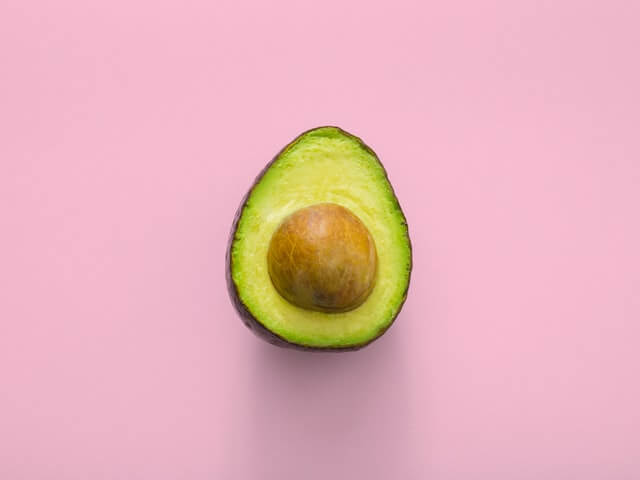
Avocado Hackathon
Wed, 4:30 PM

Sound Electro | Beyond art
Fri, 8:00 PM
<script setup lang="ts">import { Avatar, Button, Card, CloseButton, Link } from '@hareui/vue'import { Icon } from '@iconify/vue'const events = [ { alt: 'Futuristic Robot', src: 'https://heroui-assets.nyc3.cdn.digitaloceanspaces.com/docs/robot1.jpeg', title: 'Bridging the Future', description: 'Today, 6:30 PM' }, { alt: 'Avocado', src: 'https://heroui-assets.nyc3.cdn.digitaloceanspaces.com/docs/avocado.jpeg', title: 'Avocado Hackathon', description: 'Wed, 4:30 PM' }, { alt: 'Sound Electro event', src: 'https://heroui-assets.nyc3.cdn.digitaloceanspaces.com/docs/oranges.jpeg', title: 'Sound Electro | Beyond art', description: 'Fri, 8:00 PM' },]</script><template> <div class="flex w-full items-center justify-center"> <div class="grid w-full max-w-2xl grid-cols-12 gap-4 p-4"> <!-- Row 1: Large Product Card - Available Soon --> <Card class="col-span-12 flex h-auto min-h-[152px] flex-col sm:flex-row" :ui="{ content: 'gap-3' }"> <template #leading> <div class="relative h-[140px] w-full shrink-0 overflow-hidden rounded-2xl sm:h-[120px] sm:w-[120px]"> <img alt="Cherries" class="pointer-events-none absolute inset-0 h-full w-full scale-125 object-cover select-none" loading="lazy" src="https://heroui-assets.nyc3.cdn.digitaloceanspaces.com/docs/cherries.jpeg" /> </div> </template> <div class="flex flex-col gap-1"> <h3 class="pe-8 text-sm leading-6 font-medium text-foreground">Become an ACME Creator!</h3> <p class="text-sm leading-5 text-muted"> Lorem ipsum dolor sit amet consectetur. Sed arcu donec id aliquam dolor sed amet faucibus etiam. </p> <CloseButton aria-label="Close banner" class="absolute end-3 top-3" /> </div> <div class="mt-auto flex w-full flex-col items-start gap-3 sm:flex-row sm:items-center sm:justify-between"> <div class="flex flex-col"> <span class="text-sm font-medium text-foreground">Only 10 spots</span> <span class="text-xs text-muted">Submission ends Oct 10.</span> </div> <Button class="w-full sm:w-auto">Apply Now</Button> </div> </Card> <!-- Row 2 --> <div class="col-span-12 grid grid-cols-12 gap-4"> <!-- Left Column --> <div class="col-span-12 grid grid-cols-12 gap-4 lg:col-span-6"> <!-- Top Card --> <Card class="col-span-12" :ui="{ header: 'gap-3' }"> <template #leading> <div class="absolute end-3 top-3 z-10"> <CloseButton aria-label="Close notification" /> </div> </template> <template #header> <Icon aria-label="Dollar sign icon" class="size-8 shrink-0" icon="gravity-ui:circle-dollar" role="img" /> <div class="flex flex-col gap-1"> <span class="text-xs font-medium text-muted uppercase">PAYMENT</span> <h3 class="pe-8 text-sm leading-6 font-medium text-foreground sm:text-base">You can now withdraw on crypto</h3> <p class="text-xs leading-5 text-muted sm:text-sm">Add your wallet in settings to withdraw</p> </div> </template> <template #footer> <Link aria-label="Go to settings" href="#" rel="noopener noreferrer" icon> Go to settings </Link> </template> </Card> <!-- Bottom cards --> <div class="col-span-12 grid grid-cols-12 gap-4"> <Card class="col-span-12 gap-2 sm:col-span-6" :ui="{ content: 'mt-1', footer: 'flex items-center gap-2' }"> <template #header> <Avatar alt="Demo 1" class="size-[56px] rounded-xl" fallback="JK" src="https://heroui-assets.nyc3.cdn.digitaloceanspaces.com/docs/demo1.jpg" /> </template> <p class="text-sm leading-4 font-medium">Indie Hackers</p> <p class="text-xs text-muted">148 members</p> <template #footer> <Avatar alt="John" class="size-4" fallback="JK" src="https://heroui-assets.nyc3.cdn.digitaloceanspaces.com/avatars/red.jpg" /> <p class="text-xs text-muted">By John</p> </template> </Card> <Card class="col-span-12 gap-2 sm:col-span-6" :ui="{ content: 'mt-1', footer: 'flex items-center gap-2' }"> <template #header> <Avatar alt="Demo 2" class="size-[56px] rounded-xl" fallback="AB" src="https://heroui-assets.nyc3.cdn.digitaloceanspaces.com/docs/demo2.jpg" /> </template> <p class="text-sm leading-4 font-medium">AI Builders</p> <p class="text-xs text-muted">362 members</p> <template #footer> <Avatar alt="John" class="size-4" fallback="M" src="https://heroui-assets.nyc3.cdn.digitaloceanspaces.com/avatars/blue.jpg" /> <p class="text-xs text-muted">By Martha</p> </template> </Card> </div> </div> <!-- Right Column --> <Card class="col-span-12 min-h-[200px] overflow-hidden rounded-3xl lg:col-span-6" description="Home Robot" title="NEO" :ui="{ header: 'z-10 text-white', title: 'text-xs font-semibold tracking-wide text-black/70', description: 'text-sm leading-5 font-medium text-black/50', footer: 'z-10 mt-auto flex items-center justify-between', }" > <!-- Background image --> <template #leading> <img alt="NEO Home Robot" aria-hidden="true" class="absolute inset-0 h-full w-full object-cover" src="https://heroui-assets.nyc3.cdn.digitaloceanspaces.com/docs/neo2.jpeg" /> </template> <template #footer> <div> <div class="text-sm font-medium text-black">Available soon</div> <div class="text-xs text-black/60">Get notified</div> </div> <Button class="bg-white text-black" size="sm" variant="tertiary">Notify me</Button> </template> </Card> </div> <!-- Row 3 --> <div class="col-span-12 grid grid-cols-12 gap-4"> <!-- Left Column: Card --> <Card class="relative col-span-12 h-[250px] sm:h-[300px] md:col-span-8 md:h-[350px]" :ui="{ footer: 'z-10 mt-auto flex items-end justify-between' }"> <template #leading> <img alt="NEO Home Robot" aria-hidden="true" class="absolute inset-0 h-full w-full object-cover" src="https://heroui-assets.nyc3.cdn.digitaloceanspaces.com/docs/neo1.jpeg" /> </template> <template #footer> <div> <div class="text-base font-medium text-black sm:text-lg">NEO</div> <div class="text-xs font-medium text-black/50 sm:text-sm">$499/m</div> </div> <Button class="bg-white text-black" size="sm" variant="tertiary">Get now</Button> </template> </Card> <!-- Right Column: Cards Stack --> <div class="col-span-12 flex flex-col gap-2 md:col-span-4 md:justify-between md:gap-0 md:py-2"> <Card v-for="event in events" :key="event.title" class="flex flex-row gap-3 p-1" :description="event.description" :title="event.title" :ui="{ header: 'flex-1 justify-center gap-1', title: 'text-sm', description: 'text-xs' }" variant="transparent" > <template #leading> <img :alt="event.alt" class="aspect-square h-16 w-16 shrink-0 rounded-xl object-cover select-none sm:h-20 sm:w-20" loading="lazy" :src="event.src" /> </template> </Card> </div> </div> </div> </div></template>With Form
Login
Enter your credentials to access your account
<script setup lang="ts">import { Button, Card, Input, Label, Link, TextField } from '@hareui/vue'function onSubmit(e: Event) { e.preventDefault() alert('Form submitted successfully!')}</script><template> <Card class="w-full max-w-md" description="Enter your credentials to access your account" title="Login"> <form @submit="onSubmit"> <div class="flex flex-col gap-4"> <TextField name="email" type="email"> <Label>Email</Label> <Input placeholder="[email protected]" variant="secondary" /> </TextField> <TextField name="password" type="password"> <Label>Password</Label> <Input placeholder="••••••••" variant="secondary" /> </TextField> </div> <div class="mt-4 flex flex-col items-center gap-2"> <Button class="w-full" type="submit">Sign In</Button> <Link class="text-center text-sm" href="#"> Forgot password? </Link> </div> </form> </Card></template>Customization
Tailwind CSS
Use the class prop for the root and the ui prop for the inner elements (tailwind-merge resolves conflicts):
Upgrade to Pro
Unlock team workflows and insights built for growing products.
- Unlimited projects and collaborators
- Priority support with 24h response
- Advanced analytics and exports
<script setup lang="ts">import { Button, Card } from '@hareui/vue'import { Icon } from '@iconify/vue'const PRO_FEATURES = [ 'Unlimited projects and collaborators', 'Priority support with 24h response', 'Advanced analytics and exports',]</script><template> <Card class="relative w-full max-w-md overflow-hidden border border-accent/20 bg-linear-to-br from-accent/12 via-surface to-surface-secondary shadow-lg shadow-accent/10 dark:border-accent/30 dark:from-accent/20 dark:via-surface dark:to-accent/8 dark:shadow-accent/5" :ui="{ header: 'relative gap-3', content: 'relative', footer: 'relative flex-col gap-2 sm:flex-row' }" > <template #leading> <div aria-hidden="true" class="pointer-events-none absolute -top-12 -right-12 size-40 rounded-full bg-accent/20 blur-3xl dark:bg-accent/30" /> <div aria-hidden="true" class="pointer-events-none absolute -bottom-8 -left-8 size-28 rounded-full bg-accent/10 blur-2xl dark:bg-accent/20" /> </template> <template #header> <span class="w-fit rounded-full bg-accent/15 px-2.5 py-0.5 text-xs font-medium tracking-wide text-accent dark:bg-accent/25 dark:text-accent-soft-foreground"> Recommended </span> <div class="flex items-start gap-3"> <div class="flex size-10 shrink-0 items-center justify-center rounded-xl bg-accent/15 text-accent dark:bg-accent/20 dark:text-accent-soft-foreground"> <Icon aria-hidden="true" class="size-5" icon="gravity-ui:star" /> </div> <div class="flex flex-col gap-1"> <h3 class="text-sm leading-6 font-medium text-foreground">Upgrade to Pro</h3> <p class="text-sm leading-5 text-muted">Unlock team workflows and insights built for growing products.</p> </div> </div> </template> <ul class="flex flex-col gap-2"> <li v-for="feature in PRO_FEATURES" :key="feature" class="flex items-center gap-2 text-sm text-muted"> <Icon aria-hidden="true" class="size-4 shrink-0 text-accent" icon="gravity-ui:check" /> {{ feature }} </li> </ul> <template #footer> <Button class="w-full shadow-md shadow-accent/20">Upgrade now</Button> <Button class="w-full" variant="secondary">Compare plans</Button> </template> </Card></template>Global theme override
Override the card theme app-wide with createHareUI:
app.use(createHareUI({
  ui: {
    card: {
      variants: {
        variant: { secondary: { base: 'bg-linear-to-br from-blue-50 to-purple-50' } },
      },
      slots: { title: 'text-xl font-bold' },
    },
  },
}))
Title and description in custom wrappers
When a layout puts the title or description inside your own markup (like the horizontal layout above), resolve the Card theme with tv to reuse its slot classes, the equivalent of HeroUI's cardVariants():
<script setup lang="ts">
import { Card, themes, tv } from '@hareui/vue'

const card = tv(themes.card)()
</script>

<template>
  <Card class="md:flex-row" :ui="{ content: 'gap-3' }">
    <template #leading>
      <img class="size-[120px] rounded-2xl object-cover" src="…" alt="…" />
    </template>
    <div class="flex flex-col gap-1">
      <h3 data-slot="card-title" :class="card.title({ class: 'pe-8' })">Become an ACME Creator!</h3>
      <p data-slot="card-description" :class="card.description()">Lorem ipsum dolor sit amet.</p>
    </div>
  </Card>
</template>
tv(themes.card) uses the default theme; app-wide createHareUI({ ui: { card } }) overrides don't apply to these classes.
Styling Reference
Each rendered element carries the same data-slot string as HeroUI, so selectors translate 1:1.
ui key | data-slot | Description |
|---|---|---|
base | card | Base container with padding and border radius |
header | card-header | Header section container |
title | card-title | Title with base font size and weight (renders as h3) |
description | card-description | Muted description text (renders as p) |
content | card-content | Flexible content container (default slot) |
footer | card-footer | Footer with row layout |
HeroUI's modifier classes correspond to the variant prop (HareUI renders utilities, not BEM classes, so style through class, ui or createHareUI): .card--transparent, .card--default, .card--secondary, .card--tertiary.
API Reference
Props
| Prop | Type | Default | Description |
|---|---|---|---|
as | AsTag | Component | "div" | The element or component to render as. |
variant | "default" | "transparent" | "secondary" | "tertiary" | 'default' | Visual style of the card surface. |
title | string | - | Title rendered in the header. |
description | string | - | Description rendered under the title. |
ui | ComponentSlots<{ slots: { base: string; header: string; title: string; description: string; content: string; footer: string; }; variants: { variant: { default: { base: string; }; secondary: { base: string; }; tertiary: { base: string; }; transparent: { base: string; }; }; }; defaultVariants: { variant: string; }; }> | - | Per-slot class overrides. |
Slots
| Slot | Props | Description |
|---|---|---|
leading | any | Content rendered directly inside the root, before the header, without a wrapper (e.g. an icon, an image, or a full-bleed background). |
header | any | Replaces the whole header (title and description). |
title | any | Replaces the title text. |
description | any | Replaces the description text. |
default | any | Card content. |
footer | any | Card footer. |
Accessibility
<script setup lang="ts">
import { Card, themes, tv } from '@hareui/vue'

const card = tv(themes.card)()
</script>

<template>
  <!-- Semantic markup -->
  <Card as="article" aria-labelledby="card-title">
    <template #title>
      <span id="card-title">Article Title</span>
    </template>
  </Card>

  <!-- Interactive cards -->
  <a :class="card.base()" href="/details" aria-label="View product details">
    <h3 :class="card.title()">Product Name</h3>
  </a>
</template>