TextArea
Primitive multiline text input component that accepts standard HTML attributes
Usage
import { TextArea } from '@hareui/vue'<script setup lang="ts">import { TextArea } from '@hareui/vue'</script><template> <TextArea aria-label="Quick project update" class="h-32 w-96" placeholder="Share a quick project update..." /></template>For validation, labels, and error messages, see TextField.
Examples
Variants
The TextArea component supports two visual variants:
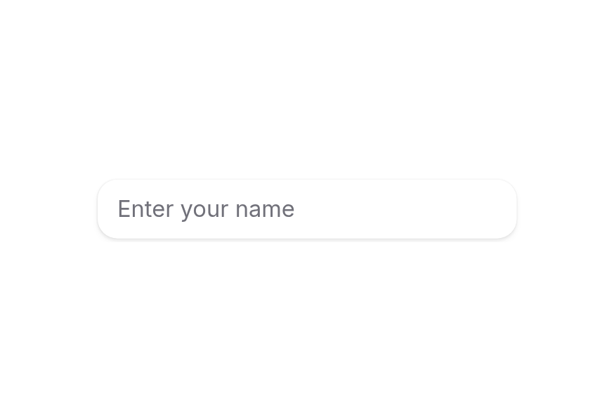
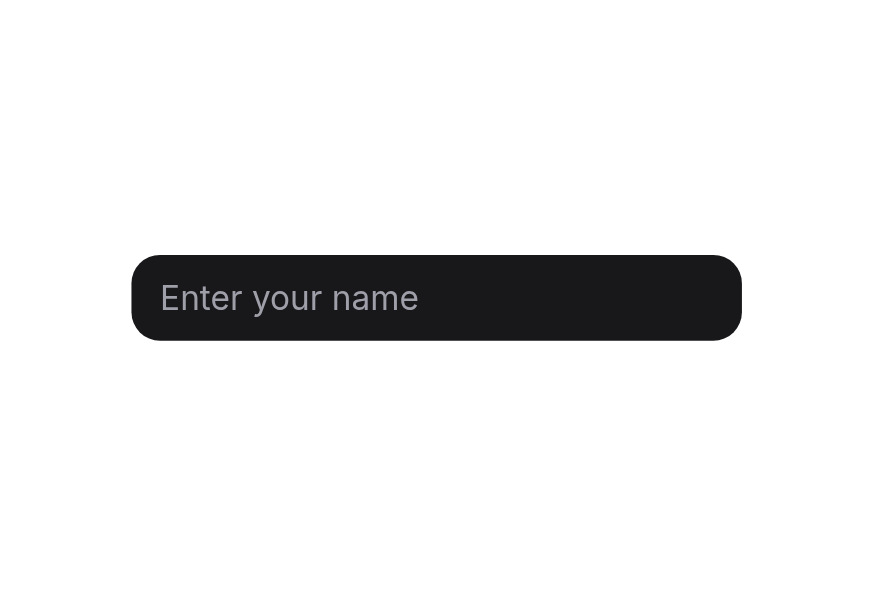
primary(default) - Standard styling with shadow, suitable for most use casessecondary- Lower emphasis variant without shadow, suitable for use in Surface components
<script setup lang="ts">import { TextArea } from '@hareui/vue'</script><template> <div class="flex w-[280px] flex-col gap-2"> <TextArea full-width placeholder="Primary textarea" variant="primary" /> <TextArea full-width placeholder="Secondary textarea" variant="secondary" /> </div></template>In Surface
When used inside a Surface component, use variant="secondary" to apply the lower emphasis variant suitable for surface backgrounds.
<script setup lang="ts">import { Surface, TextArea } from '@hareui/vue'</script><template> <Surface class="w-full rounded-3xl p-6"> <TextArea class="w-full min-w-[280px]" placeholder="Describe your product" variant="secondary" /> </Surface></template>Full Width
<script setup lang="ts">import { TextArea } from '@hareui/vue'</script><template> <div class="w-[400px] space-y-3"> <TextArea full-width placeholder="Full width textarea" /> </div></template>Controlled
Characters: 0 / 280
<script setup lang="ts">import { Description, TextArea } from '@hareui/vue'import { ref } from 'vue'const value = ref('')</script><template> <div class="flex w-96 flex-col gap-2"> <TextArea v-model="value" aria-describedby="textarea-controlled-description" aria-label="Announcement" placeholder="Compose an announcement..." /> <Description id="textarea-controlled-description"> Characters: {{ value.length }} / 280 </Description> </div></template>Rows and Resizing
<script setup lang="ts">import { Label, TextArea } from '@hareui/vue'</script><template> <div class="flex w-96 flex-col gap-4"> <div class="flex flex-col gap-2"> <Label for="textarea-rows-3"> Short feedback </Label> <TextArea id="textarea-rows-3" aria-label="Short feedback" placeholder="This week's highlights..." :rows="3" /> </div> <div class="flex flex-col gap-2"> <Label for="textarea-rows-6"> Detailed notes </Label> <TextArea id="textarea-rows-6" aria-label="Detailed notes" placeholder="Write out the full meeting notes..." :rows="6" :style="{ resize: 'vertical' }" /> </div> </div></template>Customization
Tailwind CSS
<script setup lang="ts">import { TextArea } from '@hareui/vue'const fieldClass = 'rounded-xl border border-border/80 bg-surface shadow-sm ring-1 ring-black/5 transition-[box-shadow,border-color] focus-visible:ring-2 focus-visible:ring-neutral-400/25 dark:ring-white/10 dark:focus-visible:ring-neutral-500/30'</script><template> <TextArea aria-label="Notes" :class="`h-28 w-full max-w-xs text-sm text-neutral-800 placeholder:text-neutral-400 dark:text-neutral-100 dark:placeholder:text-neutral-500 ${fieldClass}`" placeholder="Add a note..." /></template>Global Configuration
app.use(createHareUI({
  ui: {
    textArea: {
      slots: { base: 'rounded-xl px-4 py-3 leading-6' },
      defaultVariants: { variant: 'secondary' },
    },
  },
}))
Styling Reference
Slots
base→[data-slot="textarea"]– Underlying<textarea>element styling
Interactive States
- Hover:
:hover(when not focused) - Focus Visible:
:focus - Invalid:
[data-invalid="true"] - Disabled:
:disabled,[data-disabled="true"]or[aria-disabled="true"]
API Reference
TextArea accepts all standard HTML <textarea> attributes (rows, cols, maxlength, minlength, wrap, autocomplete, …) plus the following:
Props
| Prop | Type | Default | Description |
|---|---|---|---|
id | string | - | The id of the textarea. Defaults to the id provided by a surrounding TextField. |
name | string | - | The name of the textarea, used when submitting a form. |
placeholder | string | - | Temporary text shown when the textarea is empty. |
defaultValue | string | number | - | The initial value when uncontrolled (no v-model). |
variant | "primary" | "secondary" | 'primary' | Visual variant of the textarea. Defaults to the surrounding TextField variant. |
fullWidth | boolean | undefined | Whether the textarea takes the full width of its container. |
disabled | boolean | undefined | Whether the textarea is disabled. |
invalid | boolean | undefined | Whether the textarea is invalid. |
required | boolean | undefined | Whether the textarea is required. |
readonly | boolean | undefined | Whether the textarea can be selected but not changed. Defaults to the surrounding TextField. |
validate | ValidateFn<string | number> | - | Validates the value when used without a TextField (inside one, set validate on the TextField). |
validationBehavior | ValidationBehavior | 'native' | Validation behavior when used without a TextField. Defaults to the surrounding Form. |
ui | ComponentSlots<{ slots: { base: string[]; }; variants: { variant: { primary: { base: string; }; secondary: { base: string[]; }; }; fullWidth: { false: { base: string; }; true: { base: string; }; }; }; defaultVariants: { fullWidth: boolean; variant: string; }; }> | - | Per-slot class overrides. |
modelValue | string | number | - | The textarea value. |
Emits
| Event | Payload | Description |
|---|---|---|
update:modelValue | [value: string | number | undefined] | - |
For validation props like
invalid,required, and error handling, use TextField with TextArea in its default slot.