Drawer
Slide-out panel for supplementary content and actions
Usage
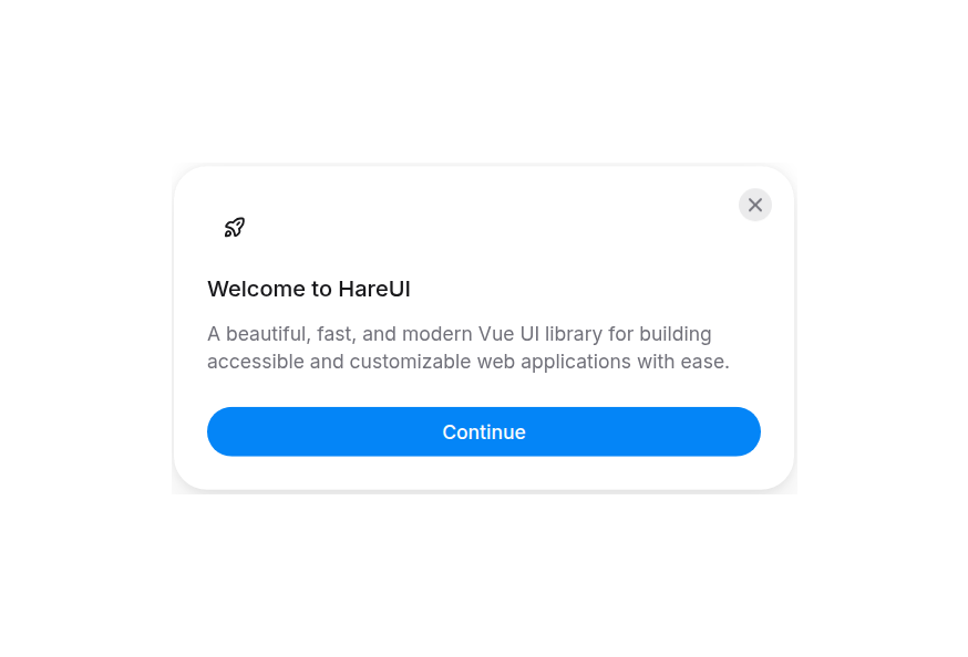
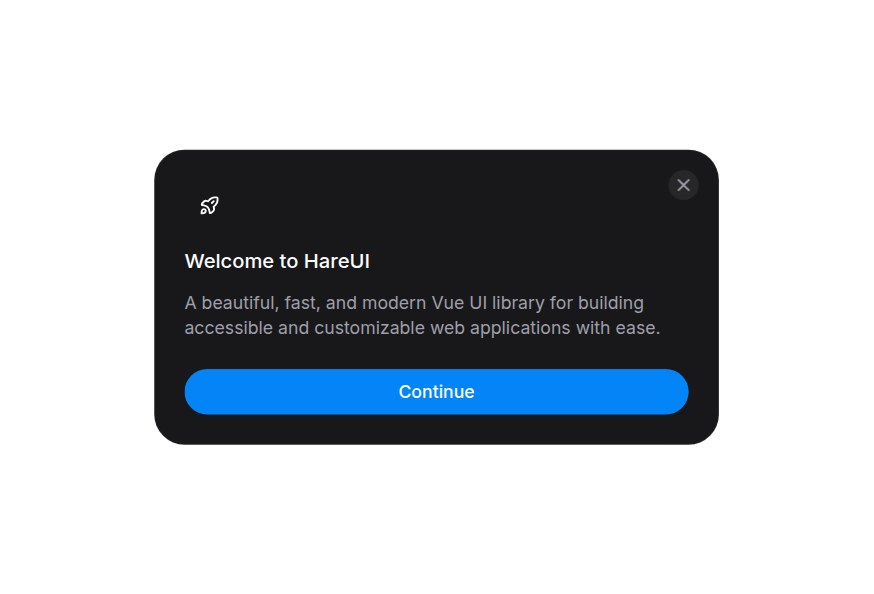
import { Drawer } from '@hareui/vue'<script setup lang="ts">import { Button, Drawer } from '@hareui/vue'</script><template> <Drawer :close-button="false" placement="right" title="Drawer Title"> <Button variant="secondary"> Open Drawer </Button> <template #body> <p> This is a bottom drawer built with Reka UI's Dialog component. It slides up from the bottom of the screen with a smooth CSS transition. </p> </template> <template #footer="{ close }"> <Button variant="secondary" @click="close"> Cancel </Button> <Button @click="close"> Confirm </Button> </template> </Drawer></template>Anatomy
A single Drawer component owns the whole structure. The first child is the trigger (as-child, merged directly onto its own root element); everything else is supplied through props and named slots.
<Drawer handle placement="bottom" title="Heading">
  <Button>Open Drawer</Button>
  <template #body>Body content</template>
  <template #footer="{ close }">
    <Button variant="secondary" @click="close">Cancel</Button>
    <Button @click="close">Confirm</Button>
  </template>
</Drawer>
handle adds the optional drag handle, closeButton (on by default) the close button. ui keys: backdrop, content, dialog, handle, header, heading, body, footer, closeTrigger.
Examples
Placement
<script setup lang="ts">import { Button, Drawer } from '@hareui/vue'const placements = ['bottom', 'top', 'left', 'right'] as constconst capitalize = (s: string) => s.charAt(0).toUpperCase() + s.slice(1)</script><template> <div class="flex flex-wrap gap-4"> <Drawer v-for="placement in placements" :key="placement" :handle="placement === 'bottom' || placement === 'top'" :placement="placement" :title="`${capitalize(placement)} Drawer`" > <Button variant="secondary"> {{ capitalize(placement) }} </Button> <template #body> <p> This drawer slides in from the <strong>{{ placement }}</strong> edge of the screen. </p> </template> <template #footer="{ close }"> <Button variant="secondary" @click="close"> Cancel </Button> <Button @click="close"> Done </Button> </template> </Drawer> </div></template>Non-Dismissable
Set :dismissible="false" to prevent closing by clicking outside or dragging. The user must interact with the drawer's action buttons.
<script setup lang="ts">import { Button, Drawer } from '@hareui/vue'</script><template> <Drawer :close-button="false" :dismissible="false" title="Confirm Action"> <Button variant="secondary"> Important Action </Button> <template #body> <p> This drawer cannot be dismissed by clicking outside or dragging. You must use one of the buttons below. </p> </template> <template #footer="{ close }"> <Button variant="secondary" @click="close"> Cancel </Button> <Button @click="close"> Confirm </Button> </template> </Drawer></template>Scrollable Content
The #body area automatically handles overflow with native scrolling. Drag-to-dismiss is excluded from the body area to avoid scroll conflicts.
<script setup lang="ts">import { Button, Drawer } from '@hareui/vue'</script><template> <Drawer handle title="Terms & Conditions"> <Button variant="secondary"> Terms & Conditions </Button> <template #body> <p v-for="i in 20" :key="i" class="mb-3"> Paragraph {{ i }}: Lorem ipsum dolor sit amet, consectetur adipiscing elit. Nullam pulvinar risus non risus hendrerit venenatis. Pellentesque sit amet hendrerit risus, sed porttitor quam. </p> </template> <template #footer="{ close }"> <Button variant="secondary" @click="close"> Decline </Button> <Button @click="close"> Accept </Button> </template> </Drawer></template>Controlled State
With v-model:open
Control the drawer using Vue's ref and v-model:open for simple state management.
Status: closed
With useOverlayState()
Use the useOverlayState composable for a cleaner API with methods like open(), close(), and toggle().
Status: closed
<script setup lang="ts">import { Button, Drawer } from '@hareui/vue'import { reactive, ref } from 'vue'const isOpen = ref(false)// Vue counterpart of HeroUI's `useOverlayState` hook: a ref plus named open/close/toggle helpers.function useOverlayState(defaultOpen = false) { const isOpen = ref(defaultOpen) return reactive({ isOpen, open: () => { isOpen.value = true }, close: () => { isOpen.value = false }, toggle: () => { isOpen.value = !isOpen.value }, setOpen: (value: boolean) => { isOpen.value = value }, })}const state = useOverlayState()</script><template> <div class="flex max-w-md flex-col gap-8"> <div class="flex flex-col gap-3"> <h3 class="text-lg font-semibold text-foreground"> With v-model:open </h3> <p class="text-sm leading-relaxed text-pretty text-muted"> Control the drawer using Vue's <code class="text-foreground">ref</code> and <code class="text-foreground">v-model:open</code> for simple state management. </p> <div class="flex flex-col items-start gap-3 rounded-2xl bg-surface p-4 shadow-sm"> <div class="flex w-full items-center justify-between"> <p class="text-xs text-muted"> Status: <span class="font-mono font-medium text-foreground">{{ isOpen ? 'open' : 'closed' }}</span> </p> </div> <div class="flex gap-2"> <Button size="sm" variant="secondary" @click="isOpen = true"> Open Drawer </Button> <Button size="sm" variant="tertiary" @click="isOpen = !isOpen"> Toggle </Button> </div> </div> <Drawer v-model:open="isOpen" placement="right" title="Controlled with v-model:open"> <template #body> <p> This drawer is controlled by Vue's <code>ref</code>. Bind <code>v-model:open</code> to manage the drawer state externally. </p> </template> <template #footer="{ close }"> <Button variant="secondary" @click="close"> Close </Button> </template> </Drawer> </div> <div class="flex flex-col gap-3"> <h3 class="text-lg font-semibold text-foreground"> With useOverlayState() </h3> <p class="text-sm leading-relaxed text-pretty text-muted"> Use the <code class="text-foreground">useOverlayState</code> composable for a cleaner API with methods like <code>open()</code>, <code>close()</code>, and <code>toggle()</code>. </p> <div class="flex flex-col items-start gap-3 rounded-2xl bg-surface p-4 shadow-sm"> <div class="flex w-full items-center justify-between"> <p class="text-xs text-muted"> Status: <span class="font-mono font-medium text-foreground">{{ state.isOpen ? 'open' : 'closed' }}</span> </p> </div> <div class="flex gap-2"> <Button size="sm" variant="secondary" @click="state.open"> Open Drawer </Button> <Button size="sm" variant="tertiary" @click="state.toggle"> Toggle </Button> </div> </div> <Drawer :open="state.isOpen" @update:open="state.setOpen" placement="right" title="Controlled with useOverlayState()"> <template #body> <p> The <code>useOverlayState</code> composable provides dedicated methods for common operations. No need to manually create callbacks—just use <code>state.open()</code>, <code>state.close()</code>, or <code>state.toggle()</code>. </p> </template> <template #footer="{ close }"> <Button variant="secondary" @click="close"> Close </Button> </template> </Drawer> </div> </div></template>With Form
<script setup lang="ts">import { Button, Drawer, TextField } from '@hareui/vue'</script><template> <Drawer placement="right" title="Edit Profile"> <Button variant="secondary"> Edit Profile </Button> <template #body> <form class="flex flex-col gap-4"> <TextField class="w-full" label="Name" name="name" placeholder="Enter your name" type="text" variant="secondary" /> <TextField class="w-full" label="Email" name="email" placeholder="Enter your email" type="email" variant="secondary" /> <TextField class="w-full" label="Bio" name="bio" placeholder="Tell us about yourself" variant="secondary" /> </form> </template> <template #footer="{ close }"> <Button variant="secondary" @click="close"> Cancel </Button> <Button @click="close"> Save Changes </Button> </template> </Drawer></template>Navigation Drawer
<script setup lang="ts">import { Button, Drawer } from '@hareui/vue'import { Icon } from '@iconify/vue'const navItems = [ { icon: 'gravity-ui:house', label: 'Home' }, { icon: 'gravity-ui:magnifier', label: 'Search' }, { icon: 'gravity-ui:bell', label: 'Notifications' }, { icon: 'gravity-ui:envelope', label: 'Messages' }, { icon: 'gravity-ui:person', label: 'Profile' }, { icon: 'gravity-ui:gear', label: 'Settings' },]</script><template> <Drawer placement="left" title="Navigation"> <Button variant="secondary"> <Icon height="16" icon="gravity-ui:bars" width="16" /> Menu </Button> <template #body> <nav class="flex flex-col gap-1"> <button v-for="item in navItems" :key="item.label" class="flex items-center gap-3 rounded-xl px-3 py-2.5 text-sm text-foreground transition-colors hover:bg-default" type="button" > <Icon class="size-5 text-muted" :icon="item.icon" /> {{ item.label }} </button> </nav> </template> </Drawer></template>Backdrop Variants
<script setup lang="ts">import { Button, Drawer } from '@hareui/vue'const variants = ['opaque', 'blur', 'transparent'] as constconst capitalize = (s: string) => s.charAt(0).toUpperCase() + s.slice(1)</script><template> <div class="flex flex-wrap gap-4"> <Drawer v-for="variant in variants" :key="variant" handle :title="`Backdrop: ${capitalize(variant)}`" :variant="variant" > <Button variant="secondary"> {{ capitalize(variant) }} </Button> <template #body> <p> This drawer uses the <code>{{ variant }}</code> backdrop variant. </p> </template> <template #footer="{ close }"> <Button class="w-full" @click="close"> Close </Button> </template> </Drawer> </div></template>Customization
Tailwind CSS
<script setup lang="ts">import { Button, Drawer } from '@hareui/vue'</script><template> <Drawer class="border-l border-border/80 bg-surface" :close-button="false" placement="right" title="Filters" :ui="{ heading: 'text-foreground' }" variant="blur" > <Button variant="secondary"> Open filters </Button> <template #body> <p class="text-sm text-muted"> Narrow results by status, owner, or date. </p> </template> <template #footer="{ close }"> <Button variant="secondary" @click="close"> Cancel </Button> <Button @click="close"> Apply </Button> </template> </Drawer></template>Global Configuration
To customize the Drawer classes for the whole app, extend the drawer theme in createHareUI:
app.use(createHareUI({
  ui: {
    drawer: {
      slots: {
        backdrop: 'bg-gradient-to-br from-black/50 to-black/70',
        dialog: 'rounded-2xl border border-white/10 shadow-2xl',
        header: 'text-center',
        closeTrigger: 'rounded-full bg-white/10 hover:bg-white/20',
      },
    },
  },
}))
Styling Reference
ui key | data-slot | Element |
|---|---|---|
backdrop | drawer-backdrop | Overlay backdrop behind the drawer (Reka DialogOverlay) |
content | drawer-content | Positioning wrapper for the drawer panel |
dialog | drawer-dialog | The drawer panel itself (Reka DialogContent); class merges here |
header | drawer-header | Header section for titles |
heading | drawer-heading | Main title text (Reka DialogTitle) |
body | drawer-body | Main scrollable content area, rendered when #body is present |
footer | drawer-footer | Footer section for actions, rendered when #footer is present |
handle | drawer-handle | Visual drag handle indicator (bar: data-slot="drawer-handle-bar"), rendered when handle is true |
closeTrigger | drawer-close-trigger | Close button, rendered when closeButton is true |
Backdrop Variants
variant="opaque"- Opaque colored backdrop (default)variant="blur"- Blurred backdrop with glass effectvariant="transparent"- Transparent backdrop (no overlay)
Placement Variants
placement="bottom"- Slides up from the bottom edge (default)placement="top"- Slides down from the top edge (the handle renders below the footer)placement="left"- Slides in from the left edgeplacement="right"- Slides in from the right edge
Interactive States
- Focus:
:focus-visible- applied to the trigger and close button - Hover:
:hover- applied to the close button on hover - Active:
:active- applied to the trigger and close button when pressed - Entering / Exiting:
data-[state=open]/data-[state=closed]onbackdrop,contentanddialog, mapped from HeroUI's[data-entering]/[data-exiting]. The panel slide is a CSS animation (Reka waits for animations, not transitions, before unmounting) with HeroUI's distance, durations (250ms in, 200ms out) and easing - Placement:
data-placement="top|bottom|left|right"oncontentanddialog
API Reference
Props
| Prop | Type | Default | Description |
|---|---|---|---|
open | boolean | undefined | The controlled open state of the drawer. Use with v-model:open. |
defaultOpen | boolean | - | The open state of the drawer when it is initially rendered. Use when you do not need to control its open state. |
title | string | - | Title rendered in the header. |
placement | "top" | "bottom" | "right" | "left" | "bottom" | Edge of the screen the drawer slides in from. |
variant | "opaque" | "blur" | "transparent" | 'opaque' | Visual style of the backdrop. |
dismissible | boolean | true | Whether clicking the backdrop or dragging the drawer towards its edge closes it. |
keyboardDismissible | boolean | true | Whether pressing Escape closes the drawer. |
handle | boolean | false | Whether the drag handle bar is rendered (at the top, or at the bottom for placement="top"). |
closeButton | boolean | true | Whether the default close button is rendered. |
portal | string | boolean | HTMLElement | true | Where the drawer is teleported. true teleports to body, false renders in place,
a string or element teleports to that target. |
ui | ComponentSlots<{ slots: { backdrop: string[]; content: string[]; dialog: string[]; header: string; heading: string; body: string[]; footer: string[]; handle: string[]; closeTrigger: string; }; variants: { placement: { bottom: { content: string; dialog: string[]; }; top: { content: string; dialog: string[]; handle: string; }; left: { content: string; dialog: string[]; }; right: { content: string; dialog: string[]; }; }; variant: { opaque: { backdrop: string; }; blur: { backdrop: string; }; transparent: { backdrop: string; }; }; }; defaultVariants: { placement: string; variant: string; }; }> | - | Per-slot class overrides. |
Slots
| Slot | Props | Description |
|---|---|---|
default | { open: boolean; } | The trigger element. Omit to control the drawer purely via v-model:open. |
header | any | Replaces the whole header (title). |
title | any | Replaces the title text. |
body | { close: () => void; } | The drawer body (scrollable; drag-to-dismiss is excluded from it). |
footer | { close: () => void; } | The drawer footer (actions). |
close | { close: () => void; } | Replaces the default close button. |
content | { close: () => void; } | Replaces the entire drawer content (handle, header, body, footer, close trigger). |
Emits
| Event | Payload | Description |
|---|---|---|
update:open | [value: boolean] | - |
Accessibility
Implements the WAI-ARIA Dialog pattern via Reka UI's Dialog primitive:
- Focus trap: focus is locked within the drawer while open
- Keyboard:
Escapecloses it (unlesskeyboardDismissibleisfalse),Tabcycles elements - Screen readers: the dialog always has an accessible name, either the rendered title or a visually hidden one
- Scroll lock: body scroll is disabled while open
- Drag to dismiss: pointer drags towards the drawer's edge on the handle, header and footer areas close it (when
dismissible); controls and the body are excluded