ComboBox
A combo box combines a text input with a listbox, allowing users to filter a list of options to items matching a query
Usage
<script setup lang="ts">
import { ComboBox } from '@hareui/vue'
</script><script setup lang="ts">import type { ListBoxItem } from '@hareui/vue'import { ComboBox } from '@hareui/vue'const animals: ListBoxItem[] = [ { value: 'aardvark', label: 'Aardvark' }, { value: 'cat', label: 'Cat' }, { value: 'dog', label: 'Dog' }, { value: 'kangaroo', label: 'Kangaroo' }, { value: 'panda', label: 'Panda' }, { value: 'snake', label: 'Snake' },]</script><template> <ComboBox class="w-[256px]" label="Favorite Animal" placeholder="Search animals..." :items="animals" /></template>Anatomy
ComboBox renders a Label, an input group (an Input and a trigger button), a popover holding a ListBox-styled option list, and an optional Description / FieldError. Options use ListBox's items format, including sections and separators.
<template>
  <ComboBox label="Animal" :items="items">
    <template #label />                                  <!-- Label content -->
    <template #indicator="{ open }" />                   <!-- trigger button content (default: chevron) -->
    <!-- Displays the selected values, primarily used for multiple selection -->
    <template #value="{ selectedItems, isPlaceholder, text }" />
    <template #description />                            <!-- Description content -->
    <template #error="validation" />                     <!-- FieldError content -->
    <template #item-leading="{ item, selected }" />      <!-- ListBox item slots -->
    <template #item-indicator="{ selected }" />          <!-- option checkmark -->
    <template #section-label="{ section }" />            <!-- section header -->
    <template #empty />                                  <!-- with `allows-empty-collection` -->
    <template #loading />                                <!-- with `loading`: after the last option -->
  </ComboBox>
</template>
ui key | data-slot | Element |
|---|---|---|
base | combo-box | root <div> |
label | label | Label |
inputGroup | combo-box-input-group | <div role="group"> around the input and trigger |
input | input | <input role="combobox"> (Input styles) |
trigger | combo-box-trigger | <button> opening the popover |
value | combo-box-value | selected values (multiple mode or #value) |
popover | combo-box-popover | popover holding the list |
Typing items
items takes the exported ListBoxItem type (ListBoxEntry when it mixes in sections and separators). Extra fields are kept: extend the type, and the slots receive your type, so no casts are needed.
import type { ListBoxItem } from '@hareui/vue'

interface MyItem extends ListBoxItem {
  icon: string
}

const items: MyItem[] = [/* ... */]
// <template #item-leading="{ item }"> — item.icon is a string
Examples
Full Width
<script setup lang="ts">import type { ListBoxItem } from '@hareui/vue'import { ComboBox } from '@hareui/vue'const animals: ListBoxItem[] = [ { value: 'aardvark', label: 'Aardvark' }, { value: 'cat', label: 'Cat' }, { value: 'dog', label: 'Dog' },]</script><template> <div class="w-[400px] space-y-4"> <ComboBox full-width label="Favorite Animal" placeholder="Search animals..." :items="animals" /> </div></template>With Description
<script setup lang="ts">import type { ListBoxItem } from '@hareui/vue'import { ComboBox } from '@hareui/vue'const animals: ListBoxItem[] = [ { value: 'aardvark', label: 'Aardvark' }, { value: 'cat', label: 'Cat' }, { value: 'dog', label: 'Dog' }, { value: 'kangaroo', label: 'Kangaroo' }, { value: 'panda', label: 'Panda' }, { value: 'snake', label: 'Snake' },]</script><template> <ComboBox class="w-[256px]" label="Favorite Animal" placeholder="Search animals..." description="Search and select your favorite animal" :items="animals" /></template>Required
<script setup lang="ts">import type { ListBoxItem } from '@hareui/vue'import { Button, ComboBox, Form } from '@hareui/vue'const animals: ListBoxItem[] = [ { value: 'aardvark', label: 'Aardvark' }, { value: 'cat', label: 'Cat' }, { value: 'dog', label: 'Dog' }, { value: 'kangaroo', label: 'Kangaroo' }, { value: 'panda', label: 'Panda' }, { value: 'snake', label: 'Snake' },]function onSubmit(event: SubmitEvent) { const data = Object.fromEntries(new FormData(event.currentTarget as HTMLFormElement)) console.log('Form submitted:', data) alert('Form submitted successfully!')}</script><template> <Form class="flex w-[256px] flex-col gap-4" @submit.prevent="onSubmit"> <ComboBox required class="w-full" name="animal" label="Favorite Animal" placeholder="Search animals..." :items="animals" /> <Button type="submit"> Submit </Button> </Form></template>Disabled
<script setup lang="ts">import type { ListBoxItem } from '@hareui/vue'import { ComboBox } from '@hareui/vue'const animals: ListBoxItem[] = [ { value: 'aardvark', label: 'Aardvark' }, { value: 'cat', label: 'Cat' }, { value: 'dog', label: 'Dog' }, { value: 'kangaroo', label: 'Kangaroo' }, { value: 'panda', label: 'Panda' }, { value: 'snake', label: 'Snake' },]</script><template> <ComboBox disabled class="w-[256px]" label="Favorite Animal" placeholder="Search animals..." default-value="cat" :items="animals" /></template>With Disabled Options
<script setup lang="ts">import type { ListBoxItem } from '@hareui/vue'import { ComboBox } from '@hareui/vue'const animals: ListBoxItem[] = [ { value: 'dog', label: 'Dog' }, { value: 'cat', label: 'Cat', disabled: true }, { value: 'bird', label: 'Bird' }, { value: 'kangaroo', label: 'Kangaroo', disabled: true }, { value: 'elephant', label: 'Elephant' }, { value: 'tiger', label: 'Tiger' },]</script><template> <ComboBox class="w-[256px]" label="Animal" placeholder="Search animals..." :items="animals" /></template>With Sections
<script setup lang="ts">import type { ListBoxEntry } from '@hareui/vue'import { ComboBox } from '@hareui/vue'const countries: ListBoxEntry[] = [ { type: 'section', label: 'North America', items: [ { value: 'usa', label: 'United States' }, { value: 'canada', label: 'Canada' }, { value: 'mexico', label: 'Mexico' }, ], }, { type: 'separator' }, { type: 'section', label: 'Europe', items: [ { value: 'uk', label: 'United Kingdom' }, { value: 'france', label: 'France' }, { value: 'germany', label: 'Germany' }, { value: 'spain', label: 'Spain' }, { value: 'italy', label: 'Italy' }, ], }, { type: 'separator' }, { type: 'section', label: 'Asia', items: [ { value: 'japan', label: 'Japan' }, { value: 'china', label: 'China' }, { value: 'india', label: 'India' }, { value: 'south-korea', label: 'South Korea' }, ], },]</script><template> <ComboBox class="w-[256px]" label="Country" placeholder="Search countries..." :items="countries" /></template>Controlled
Selected: Cat
<script setup lang="ts">import type { ListBoxItem } from '@hareui/vue'import { ComboBox } from '@hareui/vue'import { computed, ref } from 'vue'const animals: ListBoxItem[] = [ { value: 'cat', label: 'Cat' }, { value: 'dog', label: 'Dog' }, { value: 'bird', label: 'Bird' }, { value: 'fish', label: 'Fish' }, { value: 'hamster', label: 'Hamster' },]const selectedKey = ref<string | null>('cat')const selectedAnimal = computed(() => animals.find(a => a.value === selectedKey.value))</script><template> <div class="space-y-2"> <ComboBox v-model="selectedKey" class="w-[256px]" label="Animal (controlled)" placeholder="Search animals..." :items="animals" /> <p class="text-sm text-muted"> Selected: {{ selectedAnimal?.label || 'None' }} </p> </div></template>Controlled Input Value
Bind v-model:input-value to read or set the text in the input.
Input value: (empty)
<script setup lang="ts">import type { ListBoxItem } from '@hareui/vue'import { ComboBox } from '@hareui/vue'import { ref } from 'vue'const animals: ListBoxItem[] = [ { value: 'aardvark', label: 'Aardvark' }, { value: 'cat', label: 'Cat' }, { value: 'dog', label: 'Dog' }, { value: 'kangaroo', label: 'Kangaroo' }, { value: 'panda', label: 'Panda' }, { value: 'snake', label: 'Snake' },]const inputValue = ref('')</script><template> <div class="space-y-2"> <ComboBox v-model:input-value="inputValue" class="w-[256px]" label="Search (controlled input)" placeholder="Type to search..." :items="animals" /> <p class="text-sm text-muted"> Input value: {{ inputValue || '(empty)' }} </p> </div></template>Asynchronous Loading
Bind v-model:input-value to refetch as the user types and set :filter="false" so the fetched items are shown as they are. Bind loading and listen to load-more: it fires whenever the end of the list scrolls into view while loading is false. The #loading slot shows after the last option while loading.
<script setup lang="ts">import { ComboBox, EmptyState, Spinner } from '@hareui/vue'import { onMounted, ref, watch } from 'vue'interface Character { name: string}// HeroUI's `useAsyncList` equivalent: refetch on every input change, follow the `next` cursor on `load-more`const filterText = ref('')const characters = ref<Character[]>([])const loading = ref(false)let cursor: string | null = nulllet controller: AbortController | undefinedasync function load(url: string, append: boolean) { controller?.abort() controller = new AbortController() loading.value = true try { const json = await (await fetch(url.replace(/^http:\/\//i, 'https://'), { signal: controller.signal })).json() cursor = json.next characters.value = append ? [...characters.value, ...json.results] : json.results loading.value = false } catch (error) { if ((error as Error).name !== 'AbortError') loading.value = false }}function loadMore() { if (cursor && !loading.value) load(cursor, true)}watch(filterText, text => load(`https://swapi.py4e.com/api/people/?search=${text}`, false))// Client only: VitePress SSR-renders demosonMounted(() => load('https://swapi.py4e.com/api/people/?search=', false))</script><template> <ComboBox v-model:input-value="filterText" allows-empty-collection class="w-[256px]" label="Pick a Character" placeholder="Star Wars characters..." :filter="false" :items="characters.map(c => ({ value: c.name, label: c.name }))" :loading="loading" @load-more="loadMore" > <template #empty> <EmptyState /> </template> <template #loading> <div class="flex items-center justify-center gap-2 py-2"> <Spinner size="sm" /> <span class="muted text-sm">Loading more...</span> </div> </template> </ComboBox></template>Default Selected Key
<script setup lang="ts">import type { ListBoxItem } from '@hareui/vue'import { ComboBox } from '@hareui/vue'const animals: ListBoxItem[] = [ { value: 'aardvark', label: 'Aardvark' }, { value: 'cat', label: 'Cat' }, { value: 'dog', label: 'Dog' }, { value: 'kangaroo', label: 'Kangaroo' }, { value: 'panda', label: 'Panda' }, { value: 'snake', label: 'Snake' },]</script><template> <ComboBox class="w-[256px]" label="Favorite Animal" placeholder="Search animals..." default-value="cat" :items="animals" /></template>Allows Custom Value
<script setup lang="ts">import type { ListBoxItem } from '@hareui/vue'import { ComboBox } from '@hareui/vue'const animals: ListBoxItem[] = [ { value: 'aardvark', label: 'Aardvark' }, { value: 'cat', label: 'Cat' }, { value: 'dog', label: 'Dog' }, { value: 'kangaroo', label: 'Kangaroo' }, { value: 'panda', label: 'Panda' }, { value: 'snake', label: 'Snake' },]</script><template> <ComboBox allows-custom-value class="w-[256px]" label="Favorite Animal" placeholder="Search or type an animal..." description="You can type any animal name, even if it's not in the list" :items="animals" /></template>Custom Indicator
<script setup lang="ts">import { Icon } from '@iconify/vue'import type { ListBoxItem } from '@hareui/vue'import { ComboBox } from '@hareui/vue'const animals: ListBoxItem[] = [ { value: 'aardvark', label: 'Aardvark' }, { value: 'cat', label: 'Cat' }, { value: 'dog', label: 'Dog' }, { value: 'kangaroo', label: 'Kangaroo' }, { value: 'panda', label: 'Panda' }, { value: 'snake', label: 'Snake' },]</script><template> <ComboBox class="w-[256px]" label="Favorite Animal" placeholder="Search animals..." :items="animals"> <template #indicator> <Icon class="size-3" icon="gravity-ui:chevrons-expand-vertical" /> </template> </ComboBox></template>Custom Value
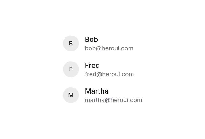
<script setup lang="ts">import type { ListBoxItem } from '@hareui/vue'import { Avatar, ComboBox } from '@hareui/vue'interface User extends ListBoxItem { avatarUrl: string fallback: string}const users: User[] = [ { value: '1', label: 'Bob', description: '[email protected]', avatarUrl: 'https://heroui-assets.nyc3.cdn.digitaloceanspaces.com/avatars/blue.jpg', fallback: 'B' }, { value: '2', label: 'Fred', description: '[email protected]', avatarUrl: 'https://heroui-assets.nyc3.cdn.digitaloceanspaces.com/avatars/green.jpg', fallback: 'F' }, { value: '3', label: 'Martha', description: '[email protected]', avatarUrl: 'https://heroui-assets.nyc3.cdn.digitaloceanspaces.com/avatars/purple.jpg', fallback: 'M' }, { value: '4', label: 'John', description: '[email protected]', avatarUrl: 'https://heroui-assets.nyc3.cdn.digitaloceanspaces.com/avatars/red.jpg', fallback: 'J' }, { value: '5', label: 'Jane', description: '[email protected]', avatarUrl: 'https://heroui-assets.nyc3.cdn.digitaloceanspaces.com/avatars/orange.jpg', fallback: 'J' },]</script><template> <ComboBox class="w-[256px]" label="User" placeholder="Search users..." :items="users"> <template #item-leading="{ item }"> <Avatar size="sm" :src="item.avatarUrl" :fallback="item.fallback" /> </template> </ComboBox></template>Custom Filtering
Pass filter to replace the default case- and accent-insensitive "contains" match.
<script setup lang="ts">import type { ListBoxItem } from '@hareui/vue'import { ComboBox } from '@hareui/vue'const animals: ListBoxItem[] = [ { value: 'cat', label: 'Cat' }, { value: 'dog', label: 'Dog' }, { value: 'bird', label: 'Bird' }, { value: 'fish', label: 'Fish' }, { value: 'hamster', label: 'Hamster' },]// Plain case-insensitive substring match (the default also ignores accents)function filter(text: string, inputValue: string) { if (!inputValue) return true return text.toLowerCase().includes(inputValue.toLowerCase())}</script><template> <ComboBox class="w-[256px]" label="Animal (custom filter)" placeholder="Search animals..." :filter="filter" :items="animals" /></template>Render Function
HeroUI's render prop has no HareUI equivalent; attributes such as data-custom fall through to the root.
<script setup lang="ts">import type { ListBoxItem } from '@hareui/vue'import { ComboBox } from '@hareui/vue'const animals: ListBoxItem[] = [ { value: 'aardvark', label: 'Aardvark' }, { value: 'cat', label: 'Cat' }, { value: 'dog', label: 'Dog' }, { value: 'kangaroo', label: 'Kangaroo' }, { value: 'panda', label: 'Panda' }, { value: 'snake', label: 'Snake' },]</script><template> <!-- HeroUI's `render` prop has no Vue equivalent (plan drop: render functions); attributes fall through to the root instead. --> <ComboBox class="w-[256px]" data-custom="foo" label="Favorite Animal" placeholder="Search animals..." :items="animals" /></template>Menu Trigger
Use the menu-trigger prop to control when the popover opens:
focus(default): popover opens when the user focuses the inputinput: popover opens when the user edits the input textmanual: popover only opens when the user presses the trigger button or uses the arrow keys
Focus (default)
Input
Manual
<script setup lang="ts">import type { ListBoxItem } from '@hareui/vue'import { ComboBox } from '@hareui/vue'const animals: ListBoxItem[] = [ { value: 'aardvark', label: 'Aardvark' }, { value: 'cat', label: 'Cat' }, { value: 'dog', label: 'Dog' }, { value: 'kangaroo', label: 'Kangaroo' }, { value: 'panda', label: 'Panda' }, { value: 'snake', label: 'Snake' },]</script><template> <div class="flex flex-col gap-8"> <div class="flex flex-col gap-2"> <p class="text-sm font-medium text-muted"> Focus (default) </p> <ComboBox class="w-[256px]" menu-trigger="focus" label="Favorite Animal" placeholder="Search animals..." description="Popover opens when the input is focused" :items="animals" /> </div> <div class="flex flex-col gap-2"> <p class="text-sm font-medium text-muted"> Input </p> <ComboBox class="w-[256px]" menu-trigger="input" label="Favorite Animal" placeholder="Search animals..." description="Popover opens when the user edits the input text" :items="animals" /> </div> <div class="flex flex-col gap-2"> <p class="text-sm font-medium text-muted"> Manual </p> <ComboBox class="w-[256px]" menu-trigger="manual" label="Favorite Animal" placeholder="Search animals..." description="Popover only opens when the trigger button is pressed or arrow keys are used" :items="animals" /> </div> </div></template>Form Value
Use the form-value prop to control whether the selected item's value or text is submitted in forms. key is the default. When allows-custom-value is set, the text is always submitted.
<script setup lang="ts">import type { ListBoxItem } from '@hareui/vue'import { Button, ComboBox, Form } from '@hareui/vue'import { ref } from 'vue'const animals: ListBoxItem[] = [ { value: 'aardvark', label: 'Aardvark' }, { value: 'cat', label: 'Cat' }, { value: 'dog', label: 'Dog' }, { value: 'kangaroo', label: 'Kangaroo' }, { value: 'panda', label: 'Panda' }, { value: 'snake', label: 'Snake' },]const message = ref<string | null>(null)function onSubmit(event: SubmitEvent) { const formData = new FormData(event.currentTarget as HTMLFormElement) message.value = `Key: ${formData.get('animal')}. Text: ${formData.get('animal-text')}.`}</script><template> <Form class="flex w-[256px] flex-col gap-4" @submit.prevent="onSubmit"> <ComboBox required class="w-full" form-value="key" name="animal" label="Animal" placeholder="Select an animal..." description="Submits the selected key" :items="animals" /> <ComboBox required class="w-full" form-value="text" name="animal-text" label="Animal (text)" placeholder="Select an animal..." description="Submits the selected text" :items="animals" /> <Button class="w-fit" type="submit"> Submit </Button> <p v-if="message" class="text-sm text-muted"> {{ message }} </p> </Form></template>Validation Behavior
Use the validation-behavior prop to control how validation is displayed:
native(default): blocks form submission when the value is missing or invalidaria: shows errors in realtime and does not block submission
<script setup lang="ts">import type { ListBoxItem } from '@hareui/vue'import { Button, ComboBox, Form } from '@hareui/vue'import { ref } from 'vue'const animals: ListBoxItem[] = [ { value: 'aardvark', label: 'Aardvark' }, { value: 'cat', label: 'Cat' }, { value: 'dog', label: 'Dog' }, { value: 'kangaroo', label: 'Kangaroo' }, { value: 'panda', label: 'Panda' }, { value: 'snake', label: 'Snake' },]const nativeMessage = ref<string | null>(null)const ariaMessage = ref<string | null>(null)</script><template> <div class="flex flex-col gap-8"> <Form class="flex w-[256px] flex-col gap-4" @submit.prevent="nativeMessage = 'Submitted with native validation.'"> <ComboBox required class="w-full" name="animal" validation-behavior="native" label="Animal (native)" placeholder="Select an animal..." description="Blocks submission when the value is missing" :items="animals" /> <Button class="w-fit" type="submit"> Submit </Button> <p v-if="nativeMessage" class="text-sm text-muted"> {{ nativeMessage }} </p> </Form> <Form class="flex w-[256px] flex-col gap-4" @submit.prevent="ariaMessage = 'Submitted with ARIA validation.'"> <ComboBox required class="w-full" name="animal-aria" validation-behavior="aria" label="Animal (ARIA)" placeholder="Select an animal..." description="Shows errors in realtime and does not block submission" :items="animals" /> <Button class="w-fit" type="submit"> Submit </Button> <p v-if="ariaMessage" class="text-sm text-muted"> {{ ariaMessage }} </p> </Form> </div></template>Custom Validation
Use the validate prop to return an error message when the value is invalid, or true when it is valid. It receives { inputValue, value, selectedKey }.
<script setup lang="ts">import type { ComboBoxValidationValue, ListBoxItem } from '@hareui/vue'import { Button, ComboBox, Form } from '@hareui/vue'const animals: ListBoxItem[] = [ { value: 'aardvark', label: 'Aardvark' }, { value: 'cat', label: 'Cat' }, { value: 'dog', label: 'Dog' }, { value: 'kangaroo', label: 'Kangaroo' }, { value: 'panda', label: 'Panda' }, { value: 'snake', label: 'Snake' },]function validate(value: ComboBoxValidationValue) { if (value.selectedKey == null) return 'Please select an animal' if (value.selectedKey === 'snake') return 'Snakes are not allowed' return true}function onSubmit() { alert('Form submitted successfully!')}</script><template> <Form class="flex w-[256px] flex-col gap-4" @submit.prevent="onSubmit"> <ComboBox required class="w-full" name="animal" label="Favorite Animal" placeholder="Search animals..." :validate="validate" :items="animals" /> <Button class="w-fit" type="submit"> Submit </Button> </Form></template>Read Only
Use the readonly prop to make the ComboBox read-only. The selected value can be focused, but it cannot be changed.
<script setup lang="ts">import type { ListBoxItem } from '@hareui/vue'import { ComboBox } from '@hareui/vue'const animals: ListBoxItem[] = [ { value: 'aardvark', label: 'Aardvark' }, { value: 'cat', label: 'Cat' }, { value: 'dog', label: 'Dog' }, { value: 'kangaroo', label: 'Kangaroo' }, { value: 'panda', label: 'Panda' }, { value: 'snake', label: 'Snake' },]</script><template> <ComboBox readonly class="w-[256px]" label="Favorite Animal" placeholder="Search animals..." default-value="cat" :items="animals" /></template>Multiple Selection
Set selection-mode="multiple" to allow selecting more than one option. v-model is then an array, and the selected values are listed below the input (value-placeholder while empty; customize with #value).
<script setup lang="ts">import type { ListBoxItem } from '@hareui/vue'import { ComboBox } from '@hareui/vue'const animals: ListBoxItem[] = [ { value: 'aardvark', label: 'Aardvark' }, { value: 'cat', label: 'Cat' }, { value: 'dog', label: 'Dog' }, { value: 'kangaroo', label: 'Kangaroo' }, { value: 'panda', label: 'Panda' }, { value: 'snake', label: 'Snake' },]</script><template> <ComboBox class="w-[256px]" selection-mode="multiple" label="Favorite Animals" placeholder="Search animals..." value-placeholder="No animals selected" :items="animals" /></template>In Surface
When used inside a Surface component, use variant="secondary" to apply the lower emphasis variant suitable for surface backgrounds.
<script setup lang="ts">import type { ListBoxItem } from '@hareui/vue'import { Button, ComboBox, Form, Surface } from '@hareui/vue'const animals: ListBoxItem[] = [ { value: 'aardvark', label: 'Aardvark' }, { value: 'cat', label: 'Cat' }, { value: 'dog', label: 'Dog' }, { value: 'kangaroo', label: 'Kangaroo' }, { value: 'panda', label: 'Panda' }, { value: 'snake', label: 'Snake' },]function onSubmit(event: SubmitEvent) { const data = Object.fromEntries(new FormData(event.currentTarget as HTMLFormElement)) console.log('Form submitted:', data) alert('Form submitted successfully!')}</script><template> <Surface class="w-[320px] rounded-3xl p-6"> <Form class="flex w-full flex-col gap-4" @submit.prevent="onSubmit"> <ComboBox required class="w-full" name="animal" variant="secondary" label="Favorite Animal" placeholder="Search animals..." :items="animals" /> <Button type="submit"> Submit </Button> </Form> </Surface></template>Customization
Tailwind CSS
<script setup lang="ts">import type { ListBoxItem } from '@hareui/vue'import { ComboBox } from '@hareui/vue'const itemClass = 'rounded-lg data-[focused=true]:bg-muted/70 data-[selected=true]:font-medium data-[selected=true]:text-foreground'const frameworks: ListBoxItem[] = [ { value: 'react', label: 'React', class: itemClass }, { value: 'vue', label: 'Vue', class: itemClass }, { value: 'svelte', label: 'Svelte', class: itemClass },]</script><template> <ComboBox class="w-64 gap-1.5" label="Framework" placeholder="Search..." :items="frameworks" :ui="{ label: 'font-medium text-neutral-800 dark:text-neutral-100', inputGroup: 'rounded-xl border border-border/80 bg-surface shadow-sm ring-1 ring-black/5 transition-[box-shadow,border-color] focus-within:ring-2 focus-within:ring-neutral-400/25 dark:ring-white/10 dark:focus-within:ring-neutral-500/30', trigger: 'text-muted', popover: 'rounded-xl border border-border/80 bg-surface p-1 shadow-lg ring-1 ring-black/5 dark:ring-white/10', }" /></template>Global Configuration
app.use(createHareUI({
  ui: { comboBox: { slots: { inputGroup: 'rounded-lg', trigger: 'text-muted', popover: 'rounded-lg border border-border bg-surface p-2' } } },
}))
Styling Reference
Interactive States
- Hover:
:hoveror[data-hovered="true"]on the trigger - Focus:
:focuson the input,[data-focus-visible="true"]on the input group - Disabled:
:disabledor[data-disabled="true"]on the combo box and the trigger - Invalid:
[data-invalid="true"]on the combo box - Open:
[data-open="true"]on the combo box and the trigger
API Reference
Props
| Prop | Type | Default | Description |
|---|---|---|---|
items | ListBoxEntry[] | - | Options, sections ({ type: 'section', label, items }) and separators ({ type: 'separator' }), as in ListBox. |
selectionMode | "multiple" | "single" | "single" | Whether one or several options can be selected. In 'multiple' mode v-model is an array. |
defaultValue | ComboBoxValue | undefined | The initial selection when uncontrolled (no v-model). |
defaultInputValue | string | - | The initial input text when uncontrolled (no v-model:input-value). Defaults to the selected option's text. |
placeholder | string | - | Temporary text shown in the empty input. |
valuePlaceholder | string | - | Text of the selected-value element (rendered in multiple mode) while nothing is selected. |
label | string | - | Label text rendered above the input. |
description | string | - | Helper text rendered below the input. Hidden while invalid. |
errorMessage | string | - | Error text rendered below the input while invalid. Defaults to the validation messages. |
id | string | - | Id of the input. |
name | string | - | The name used when submitting an HTML form. |
formValue | "key" | "text" | "key" | Whether the selected option's value or its text is submitted with forms. With allowsCustomValue the text is always submitted. |
open | boolean | undefined | Whether the popover is open (v-model:open). |
defaultOpen | boolean | false | Whether the popover starts open when uncontrolled. |
menuTrigger | "input" | "focus" | "manual" | "focus" | The interaction that opens the popover: focusing the input, typing in it, or only the trigger button and arrow keys. |
filter | false | ((text: string, inputValue: string) => boolean) | undefined | Filters options against the input text. Defaults to a case- and accent-insensitive "contains" match on each option's
textValue ?? label. Pass false to show every item (e.g. when the server already filtered items). |
allowsCustomValue | boolean | false | Whether text that matches no option is kept as the value (the selection is cleared) instead of being reverted. |
allowsEmptyCollection | boolean | false | Whether the popover stays open when no option matches (shows the #empty slot). |
loading | boolean | undefined | Async options: shows the #loading slot after the last option and emits load-more at the end of the list (see ListBox loading). |
variant | "primary" | "secondary" | 'primary' | Visual variant. Use secondary on surfaces. |
fullWidth | boolean | false | Whether the combo box takes the full width of its container. |
disabled | boolean | false | Whether the combo box is disabled. |
readonly | boolean | false | Whether the input can be focused but not changed. |
required | boolean | false | Whether a value is required before the form can be submitted. |
invalid | boolean | undefined | Controlled invalid state; overrides validation. |
validate | ValidateFn<ComboBoxValidationValue> | - | Custom validation. Return an error message (or several) when invalid, true / null when valid. |
validationBehavior | ValidationBehavior | 'native' (or the enclosing Form's) | native blocks form submission and shows errors on commit; aria shows errors in realtime without blocking. |
ui | ComponentSlots<{ slots: { base: string[]; label: string; inputGroup: string; input: string; value: string[]; trigger: string[]; popover: string[]; }; variants: { fullWidth: { false: {}; true: { base: string; inputGroup: string; }; }; }; defaultVariants: { fullWidth: boolean; }; }> | - | Per-slot class overrides. |
modelValue | ComboBoxValue | - | - |
inputValue | string | - | - |
Slots
| Slot | Props | Description |
|---|---|---|
label | any | Label content. Replaces label. |
value | ComboBoxValueSlotProps | Content of the selected-value element below the input (rendered in multiple mode, or whenever this slot is used). |
indicator | { open: boolean; } | Trigger button content. Defaults to a chevron. |
description | any | Description content. Replaces description. |
error | ValidationResult | Error content, rendered while invalid. |
item | ListBoxItemSlotProps | Whole content of each option (as ListBox #item). |
item-leading | ListBoxItemSlotProps | Content before each option's text (ListBox #item-leading). |
item-label | ListBoxItemSlotProps | Each option's label (ListBox #item-label). |
item-description | ListBoxItemSlotProps | Each option's description (ListBox #item-description). |
item-trailing | ListBoxItemSlotProps | Content after each option's text (ListBox #item-trailing). |
item-indicator | ListBoxItemSlotProps | Option checkmark content (ListBox #indicator). |
section-label | { section: ListBoxSection; } | Section heading (ListBox #section-label). |
empty | any | Rendered in the popover when no option matches and allowsEmptyCollection is set. |
loading | any | Shown after the last option while loading is true. |
Emits
| Event | Payload | Description |
|---|---|---|
update:open | [value: boolean] | - |
update:inputValue | [value: string] | - |
loadMore | [] | - |
update:modelValue | [value: ComboBoxValue | undefined] | - |
update:inputValue | [value: string | undefined] | - |
Accessibility
ComboBox follows the ARIA combobox pattern:
- Focus stays in the input; the arrow keys, Home / End and Page Up / Page Down move a virtual focus through the options (
aria-activedescendant), Enter selects, Escape reverts the text and closes - Typing filters the options; on blur, text that matches no option reverts to the selected option (unless
allows-custom-value) - The trigger button is not in the tab order and keeps focus in the input
- The label, description and error are linked to the input with
aria-labelledby/aria-describedby - With
name, the selected value (or text) is submitted with forms;requireduses native validation