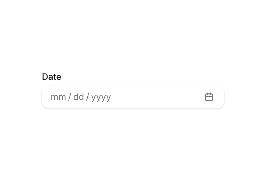
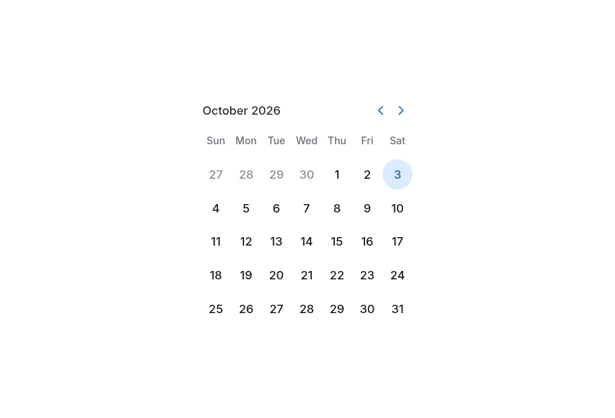
DateRangePicker
Combines start and end date fields and a RangeCalendar in a popover for picking a date range
Usage
<script setup lang="ts">
import { DateRangePicker } from '@hareui/vue'
</script><script setup lang="ts">import { DateRangePicker } from '@hareui/vue'</script><template> <DateRangePicker class="w-80" full-width start-name="startDate" end-name="endDate" label="Trip dates" calendar-label="Trip dates" /></template>Anatomy
DateRangePicker renders a Label, a segmented date-input-group holding the start and end segments, a range separator and a calendar trigger button, a Description/FieldError, and a popover with an embedded RangeCalendar. The text parts come from props; each can be replaced with a slot.
<template>
  <DateRangePicker label="…" calendar-label="…" start-name="…" end-name="…" description="…" error-message="…">
    <template #label />       <!-- Label content -->
    <template #separator />   <!-- replaces the default " - " between the inputs -->
    <template #indicator />   <!-- replaces the default calendar icon in the trigger -->
    <template #description /> <!-- Description content -->
    <template #error />       <!-- FieldError content, rendered when invalid -->
    <template #calendar />    <!-- replaces the default RangeCalendar rendered inside the popover -->
  </DateRangePicker>
</template>
ui key | data-slot | Element |
|---|---|---|
base | date-range-picker | <div role="group"> root |
| — | label | Label (iff label / #label) |
group | date-input-group | <div role="group"> holding the inputs and the trigger |
inputContainer | date-input-group-input-container | scrollable wrapper around both inputs (iff input-container) |
input | date-input-group-input | one per end (slot="start" / slot="end") |
segment | date-input-group-segment | one per date part (year, month, day, …) |
rangeSeparator | date-range-picker-range-separator | <span> between the start and end inputs |
trigger | date-range-picker-trigger | <button> that opens the popover, rendered in the group's suffix |
triggerIndicator | date-range-picker-trigger-indicator | <span> holding the default/custom calendar icon |
| — | description | Description (iff description / #description) |
| — | field-error | FieldError (while invalid, iff error-message / #error / validation errors) |
popover | date-range-picker-popover | the popover content wrapping the RangeCalendar |
DateRangePicker values are
{ start, end }objects of@internationalized/datevalues (CalendarDate,CalendarDateTimeorZonedDateTime) — the same types HeroUI uses. Like React Aria,v-modelonly emits complete ranges (ornullonce both ends are cleared).
Examples
Disabled
<script setup lang="ts">import { getLocalTimeZone, today } from '@internationalized/date'import { DateRangePicker } from '@hareui/vue'const start = today(getLocalTimeZone())</script><template> <DateRangePicker disabled class="w-80" full-width start-name="startDate" end-name="endDate" label="Trip dates" calendar-label="Trip dates" :model-value="{ start, end: start.add({ days: 4 }) }" description="This date range picker is disabled." /></template>Controlled
<script setup lang="ts">import type { DateRangeValue } from '@hareui/vue'import { getLocalTimeZone, today } from '@internationalized/date'import { Button, DateRangePicker, Description } from '@hareui/vue'import { shallowRef } from 'vue'const start = today(getLocalTimeZone())const value = shallowRef<DateRangeValue | null>({ start, end: start.add({ days: 4 }) })function setWeek() { const nextStart = today(getLocalTimeZone()) value.value = { start: nextStart, end: nextStart.add({ days: 6 }) }}</script><template> <div class="flex w-80 flex-col gap-4"> <DateRangePicker v-model="value" full-width start-name="startDate" end-name="endDate" label="Trip dates" calendar-label="Trip dates" /> <Description> Current value: {{ value ? `${value.start.toString()} -> ${value.end.toString()}` : '(empty)' }} </Description> <div class="flex gap-2"> <Button variant="tertiary" @click="setWeek"> Set week </Button> <Button variant="tertiary" @click="value = null"> Clear </Button> </div> </div></template>Validation
<script setup lang="ts">import type { DateRangeValue } from '@hareui/vue'import { getLocalTimeZone, today } from '@internationalized/date'import { DateRangePicker } from '@hareui/vue'import { computed, shallowRef } from 'vue'const value = shallowRef<DateRangeValue | null>(null)const currentDate = today(getLocalTimeZone())const isInvalid = computed(() => value.value != null && (value.value.start.compare(currentDate) < 0 || value.value.end.compare(value.value.start) < 0))</script><template> <DateRangePicker v-model="value" required class="w-80" full-width :invalid="isInvalid" :min-value="currentDate" start-name="startDate" end-name="endDate" label="Booking period" calendar-label="Booking period" error-message="Select a valid range starting today or later." /></template>Format Options
Control how DateRangePicker values are displayed with props such as granularity, hour-cycle and hide-time-zone. For granularities beyond "day", the #calendar slot composes two TimeFields alongside the RangeCalendar; onChange commits a time edit without closing the popover.
<script setup lang="ts">import type { CalendarDateTime, DateValue, ZonedDateTime } from '@internationalized/date'import type { DateRangeValue, ListBoxItem } from '@hareui/vue'import type { TimeValue } from 'reka-ui'import { DateFormatter, getLocalTimeZone, parseDate, parseZonedDateTime, Time } from '@internationalized/date'import { DateRangePicker, Label, RangeCalendar, Select, Separator, Switch, TimeField } from '@hareui/vue'import { computed, ref, shallowRef } from 'vue'type Granularity = 'day' | 'hour' | 'minute' | 'second'type HourCycle = 12 | 24const granularityOptions: ListBoxItem[] = [ { label: 'Day', value: 'day' }, { label: 'Hour', value: 'hour' }, { label: 'Minute', value: 'minute' }, { label: 'Second', value: 'second' },]const hourCycleOptions: ListBoxItem[] = [ { label: '12-hour', value: 12 }, { label: '24-hour', value: 24 },]const granularity = ref<Granularity>('minute')const hourCycle = ref<HourCycle>(12)const hideTimeZone = ref(false)const timeGranularity = computed(() => (granularity.value === 'day' ? undefined : granularity.value))function defaultValueFor(g: Granularity): DateRangeValue { const tz = getLocalTimeZone() if (g === 'day') return { start: parseDate('2025-02-03'), end: parseDate('2025-02-10') } return { start: parseZonedDateTime(`2026-02-03T08:45:00[${tz}]`), end: parseZonedDateTime(`2026-02-10T18:45:00[${tz}]`) }}const value = shallowRef<DateRangeValue | null>(defaultValueFor(granularity.value))function onGranularityChange(next: string | number) { granularity.value = next as Granularity value.value = defaultValueFor(granularity.value)}const dateFormatter = new DateFormatter('en-US', { day: 'numeric', month: 'short', year: 'numeric' })function formatRange(range: DateRangeValue) { const tz = getLocalTimeZone() return dateFormatter.formatRange(range.start.toDate(tz), range.end.toDate(tz))}type WithTime = CalendarDateTime | ZonedDateTimefunction hasTime(v: DateValue | undefined): v is WithTime { return !!v && 'hour' in v}function timeOf(v: DateValue | undefined) { return hasTime(v) ? new Time(v.hour, v.minute, v.second) : undefined}// The calendar only edits the date and the time fields only edit the time; each merges onto the other.function withDate(picked: DateValue, current: DateValue | undefined): DateValue { return hasTime(current) ? current.set({ year: picked.year, month: picked.month, day: picked.day }) : picked}function withTime(time: TimeValue, current: DateValue): DateValue { return hasTime(current) ? current.set({ hour: time.hour, minute: time.minute, second: time.second }) : current}</script><template> <div class="flex w-full flex-col gap-4"> <DateRangePicker :key="granularity" v-model="value" class="w-max min-w-80" input-container :granularity="granularity" :hour-cycle="hourCycle" :hide-time-zone="hideTimeZone" start-name="startDate" end-name="endDate" label="Date range" :ui="{ popover: 'flex w-63 max-w-63 flex-col gap-3' }" > <template #calendar="{ value: range, onSelect, onChange }"> <RangeCalendar aria-label="Trip dates" class="w-full" year-picker :model-value="range ?? undefined" @update:model-value="(r) => r?.start && r.end && onSelect({ start: withDate(r.start, range?.start), end: withDate(r.end, range?.end) })" /> <div v-if="timeGranularity && range" class="flex flex-col gap-3"> <div class="flex items-center justify-between"> <Label>Start Time</Label> <TimeField aria-label="Start Time" name="startTime" variant="secondary" :granularity="timeGranularity" :hour-cycle="hourCycle" :hide-time-zone="hideTimeZone" :model-value="timeOf(range.start)" @update:model-value="(t) => t && onChange({ start: withTime(t, range.start), end: range.end })" /> </div> <div class="flex items-center justify-between"> <Label>End Time</Label> <TimeField aria-label="End Time" name="endTime" variant="secondary" :granularity="timeGranularity" :hour-cycle="hourCycle" :hide-time-zone="hideTimeZone" :model-value="timeOf(range.end)" @update:model-value="(t) => t && onChange({ start: range.start, end: withTime(t, range.end) })" /> </div> </div> <span class="mt-1 text-xs text-muted"> Selected: {{ range ? formatRange(range) : 'No date selected' }} </span> </template> </DateRangePicker> <Separator class="my-5" /> <Label class="text-xs font-medium text-muted"> Format Options </Label> <div class="flex flex-wrap gap-4"> <Select class="w-[120px]" label="Granularity" name="granularity" variant="secondary" :items="granularityOptions" :model-value="granularity" @update:model-value="(v) => onGranularityChange(v as string)" /> <Select class="w-[120px]" label="Hour cycle" variant="secondary" :items="hourCycleOptions" :model-value="hourCycle" @update:model-value="(v) => (hourCycle = Number(v) as HourCycle)" /> </div> <div class="flex min-w-[529px] flex-col gap-2"> <Switch v-model="hideTimeZone" label="Hide timezone" /> </div> </div></template>Input Container
input-container wraps the start and end inputs in a horizontally scrollable container (HeroUI's DateField.InputContainer), so long date-time ranges scroll inside the group instead of overflowing it.
<script setup lang="ts">import type { DateValue } from '@internationalized/date'import type { DateRangeValue } from '@hareui/vue'import { getLocalTimeZone, parseZonedDateTime, Time } from '@internationalized/date'import { DateRangePicker, Label, RangeCalendar, TimeField } from '@hareui/vue'const localTimeZone = getLocalTimeZone()const defaultValue: DateRangeValue = { start: parseZonedDateTime(`2026-02-03T08:45:00[${localTimeZone}]`), end: parseZonedDateTime(`2026-02-10T18:45:00[${localTimeZone}]`),}type WithTime = DateValue & { hour: number, minute: number, second: number, set: (fields: object) => DateValue }const timeOf = (v: DateValue) => new Time((v as WithTime).hour, (v as WithTime).minute, (v as WithTime).second)const withDate = (picked: DateValue, current: DateValue | undefined) => current ? (current as WithTime).set({ year: picked.year, month: picked.month, day: picked.day }) : pickedconst withTime = (time: Time, current: DateValue) => (current as WithTime).set({ hour: time.hour, minute: time.minute, second: time.second })</script><template> <DateRangePicker class="w-full max-w-2xs min-w-80" input-container granularity="second" :hour-cycle="12" :default-value="defaultValue" label="Date range" :ui="{ popover: 'flex w-fit flex-col gap-3' }" > <template #calendar="{ value: range, onSelect, onChange }"> <RangeCalendar aria-label="Trip dates" year-picker :model-value="range ?? undefined" @update:model-value="(r) => r?.start && r.end && onSelect({ start: withDate(r.start, range?.start), end: withDate(r.end, range?.end) })" /> <div v-if="range" class="flex flex-col gap-3"> <div class="flex items-center justify-between"> <Label>Start Time</Label> <TimeField aria-label="Start Time" variant="secondary" granularity="second" :hour-cycle="12" :model-value="timeOf(range.start)" @update:model-value="(t) => t && onChange({ start: withTime(t as Time, range.start), end: range.end })" /> </div> <div class="flex items-center justify-between"> <Label>End Time</Label> <TimeField aria-label="End Time" variant="secondary" granularity="second" :hour-cycle="12" :model-value="timeOf(range.end)" @update:model-value="(t) => t && onChange({ start: range.start, end: withTime(t as Time, range.end) })" /> </div> </div> </template> </DateRangePicker></template>Form Example
<script setup lang="ts">import type { DateRangeValue } from '@hareui/vue'import { getLocalTimeZone, today } from '@internationalized/date'import { Button, DateRangePicker, Form } from '@hareui/vue'import { computed, ref, shallowRef } from 'vue'const value = shallowRef<DateRangeValue | null>(null)const isSubmitting = ref(false)const currentDate = today(getLocalTimeZone())const isInvalid = computed(() => value.value != null && (value.value.start.compare(currentDate) < 0 || value.value.end.compare(value.value.start) < 0))function handleSubmit(event: Event) { event.preventDefault() if (!value.value || isInvalid.value) return isSubmitting.value = true setTimeout(() => { value.value = null isSubmitting.value = false }, 1200)}</script><template> <Form class="flex w-80 flex-col gap-3" @submit="handleSubmit"> <DateRangePicker v-model="value" required full-width :invalid="isInvalid" :min-value="currentDate" start-name="tripStartDate" end-name="tripEndDate" label="Trip dates" calendar-label="Trip dates" description="Select your check-in and check-out dates." error-message="Please choose a valid range in the future." /> <Button class="w-full" :disabled="!value || isInvalid" :pending="isSubmitting" type="submit"> {{ isSubmitting ? 'Submitting...' : 'Submit' }} </Button> </Form></template>Custom Indicator
The #indicator slot replaces the default calendar icon rendered inside the trigger.
<script setup lang="ts">import { Icon } from '@iconify/vue'import { DateRangePicker } from '@hareui/vue'</script><template> <DateRangePicker class="w-80" full-width start-name="startDate" end-name="endDate" label="Trip dates" calendar-label="Trip dates" description="Replace the default calendar icon by passing custom children." > <template #indicator> <Icon class="size-4" icon="gravity-ui:chevron-down" /> </template> </DateRangePicker></template>Render Function
HeroUI's render prop replaces the root element. Option A has no render prop; attributes you pass to DateRangePicker fall through to the root element instead.
<script setup lang="ts">import { DateRangePicker } from '@hareui/vue'</script><template> <!-- HeroUI's render-function demo swaps the root element through a `render` prop. Option A has no `render` prop; attributes passed to `DateRangePicker` fall through to the root element instead. --> <DateRangePicker data-custom="foo" class="w-80" full-width start-name="startDate" end-name="endDate" label="Trip dates" calendar-label="Trip dates" /></template>International Calendar
By default, DateRangePicker displays dates using the calendar system for the given locale. The example below shows the Indian calendar system.
<script setup lang="ts">import { getLocalTimeZone, today } from '@internationalized/date'import { DateRangePicker } from '@hareui/vue'const start = today(getLocalTimeZone())</script><template> <DateRangePicker class="w-80" full-width locale="hi-IN-u-ca-indian" start-name="startDate" end-name="endDate" label="Trip dates" calendar-label="Trip dates" :default-value="{ start, end: start.add({ days: 7 }) }" /></template>Note: update:modelValue always emits dates in the same calendar system as model-value or default-value (Gregorian if neither is given), regardless of the displayed locale.
Customization
Tailwind CSS
Style the field parts through :ui; the #calendar slot lets you fully restyle (or replace) the embedded RangeCalendar — bind its value and call onSelect to keep it wired to the picker.
<script setup lang="ts">import { DateRangePicker, RangeCalendar } from '@hareui/vue'</script><template> <!-- HeroUI restyles the composed RangeCalendar's parts directly. Option A reaches the field parts through `:ui`, and the `#calendar` slot replaces the embedded RangeCalendar; bind `value` and call `onSelect` to keep it wired to the picker. --> <DateRangePicker class="w-80" full-width variant="secondary" start-name="checkin" end-name="checkout" label="Stay dates" :ui="{ group: 'rounded-xl border border-border/80 bg-default shadow-sm', rangeSeparator: 'text-muted', trigger: 'text-muted', popover: 'border border-border/80 shadow-sm', }" > <template #calendar="{ value, onSelect }"> <RangeCalendar aria-label="Stay dates" class="rounded-2xl bg-surface p-2" :ui="{ heading: 'font-medium text-foreground', navButton: 'text-muted hover:bg-default', headerCell: 'text-xs text-muted' }" :model-value="value ?? undefined" @update:model-value="(range) => range?.start && range.end && onSelect({ start: range.start, end: range.end })" /> </template> </DateRangePicker></template>Global Configuration
app.use(createHareUI({
  ui: { dateRangePicker: { slots: { triggerIndicator: 'text-muted', rangeSeparator: 'px-2 text-default', popover: 'p-0' } } },
}))
Styling Reference
Slots
base→[data-slot="date-range-picker"]– root field container (inline-flex flex-col gap-1)group,inputContainer,input,segment→ the internaldate-input-group's slots, shared with DateFieldtrigger→[data-slot="date-range-picker-trigger"]– button that opens the popovertriggerIndicator→[data-slot="date-range-picker-trigger-indicator"]– default/custom calendar iconrangeSeparator→[data-slot="date-range-picker-range-separator"]– separator between the start and end inputspopover→[data-slot="date-range-picker-popover"]– popover content wrapping the RangeCalendar
Note: Label, Description, FieldError and RangeCalendar have their own themes. See their respective pages for customization options.
Interactive States
- Open:
[data-state="open"|"closed"]on the trigger and the popover - Disabled:
:disabledon the trigger,[data-disabled]on the root, the group and each segment - Invalid:
[data-invalid="true"]on the group — automatically hides the description while invalid - Required:
[data-required="true"]on the root — shows the label's required asterisk - Focus visible:
:focus-visibleon the trigger - Hover:
:hoveron the trigger
Reka UI Limitations
shouldForceLeadingZeroshas no equivalent: Reka'sDateRangeFieldRootdoesn't expose a flag to force leading zeros, so theformat-optionsdemo drops the "Force leading zeros" switch.v-modelis driven through a local draft: Reka'sDateRangeFieldRootemits every partial edit ({ start, end: undefined }) as its model value, while React Aria keeps an incomplete range as an internal placeholder and only emits complete ranges. DateRangePicker feeds Reka the draft and emits only complete ranges (ornull), matching HeroUI.- Reka's
DateRangePickerRootreadsisDateUnavailableonce at setup, with a single argument. The field side calls the matcher with anullanchor (as React Aria does outside the calendar); the anchor-aware form only applies inside the embedded RangeCalendar. - HeroUI's composed
RangeCalendarpasses its own 1900/2099minValue/maxValuedefaults, which override the picker's bounds, so its popover never greys out-of-range days (the field still validates them). The embedded RangeCalendar here matches that:min-value/max-valuevalidate the field but don't disable calendar days.
API Reference
Props
| Prop | Type | Default | Description |
|---|---|---|---|
label | string | - | Label text rendered above the group. |
calendarLabel | string | - | Accessible label for the range calendar inside the popover. |
description | string | - | Helper text rendered below the group. Hidden while the field is invalid. |
errorMessage | string | - | Error message rendered below the group while invalid. Defaults to the validation errors. |
id | string | useId() | The id of the field; label, description and error ids derive from it. |
startName | string | - | The name of the start date, used when submitting a form. |
endName | string | - | The name of the end date, used when submitting a form. |
defaultValue | DateRangeValue | null | - | The initial range when uncontrolled (no v-model). |
placeholder | DateValue | - | The placeholder date, used to determine which segments/month to show when no range is selected. |
defaultPlaceholder | DateValue | - | The placeholder date when uncontrolled. |
granularity | Granularity | 'day' (a `CalendarDate` value), otherwise 'minute' | The granularity of the fields: which segments are rendered, up to and including this unit. |
hourCycle | HourCycle | - | The hour cycle used to format times. Defaults to the locale's preference. |
step | DateStep | - | The stepping interval for the time segments. |
hideTimeZone | boolean | - | Whether to hide the time zone segment. |
minValue | DateValue | - | The minimum selectable date. |
maxValue | DateValue | - | The maximum selectable date. |
locale | string | - | The locale used to format the fields and the calendar. Defaults to the ConfigProvider locale. |
isDateUnavailable | ((date: DateValue, anchorDate: DateValue | null) => boolean) | - | Callback returning whether a date is unavailable. Inside the calendar, anchorDate is the already-picked
start of an in-progress selection (null otherwise), matching React Aria's isDateUnavailable(date, anchorDate). |
allowNonContiguousRanges | boolean | false | Whether a range may contain unavailable dates. |
variant | "primary" | "secondary" | 'primary' | Visual variant of the group. |
fullWidth | boolean | false | Whether the field takes the full width of its container. |
inputContainer | boolean | false | Wraps the start/end inputs in a horizontally scrollable container (HeroUI's DateField.InputContainer),
for long time ranges that overflow the group. |
disabled | boolean | false | Whether the picker is disabled. |
invalid | boolean | undefined | Whether the field is invalid. Overrides validation when set. |
required | boolean | false | Whether a range is required. |
readonly | boolean | false | Whether the range can be selected but not changed. |
validate | ValidateFn<DateRangeValue> | - | Validates the committed range. Return an error message (or several) when invalid. |
validationBehavior | ValidationBehavior | 'native' | native blocks form submission and shows errors on commit or submit; aria shows errors in realtime.
Defaults to the surrounding Form. |
open | boolean | undefined | The controlled open state of the popover. |
defaultOpen | boolean | false | The open state of the popover when it is initially rendered. |
ui | (ComponentSlots<{ slots: { base: string; trigger: string[]; triggerIndicator: string; rangeSeparator: string; popover: string[]; }; variants: { fullWidth: { false: { base: string; }; true: { base: string; }; }; }; defaultVariants: { fullWidth: boolean; }; }> & { group?: C; } & Pick<ComponentSlots<{ slots: { base: string[]; inputContainer: string; input: string[]; segment: string[]; prefix: string; suffix: string; }; variants: { variant: { primary: { base: string; }; secondary: { base: string[]; }; }; fullWidth: { false: { base: string; }; true: { base: string; }; }; }; defaultVariants: { fullWidth: boolean; variant: string; }; }>, "input" | "inputContainer" | "segment">) | - | Per-slot class overrides. group, inputContainer, input and segment are the internal date-input-group's. |
modelValue | DateRangeValue | null | - | The selected range (null when empty). Bind with v-model. Only complete ranges are emitted, as in React Aria. |
Slots
| Slot | Props | Description |
|---|---|---|
label | any | Label content. Replaces the label prop. |
indicator | any | Replaces the default calendar icon inside the trigger. |
separator | any | Replaces the default - between the start and end inputs. |
description | any | Description content. Replaces the description prop. |
error | ValidationResult | Error content, rendered while invalid. Replaces the errorMessage prop. |
calendar | DateRangePickerCalendarSlotProps | Replaces the default RangeCalendar rendered inside the popover. |
Emits
| Event | Payload | Description |
|---|---|---|
update:modelValue | [value: DateRangeValue | null | undefined] | - |
update:open | [value: boolean] | - |
update:placeholder | [value: DateValue] | - |
Accessibility
- The label names the input group (
aria-labelledby); each end is its own segmented spinbutton group - The field's
aria-describedbylists the ids of the rendered description (<id>-description) and error (<id>-error) start-name/end-namesubmit each end through its own hidden input, which also carries nativerequired- Keyboard: ←/→ move between segments (across the separator), ↑/↓ increment/decrement the focused segment, digits type directly into the focused segment and auto-advance
- Opening the popover moves focus into the calendar (the range start, else today); Esc or an outside click closes it, and completing a range closes it and returns focus to the trigger